SVG Animated Linear Gradient
This component make Animated Linear Gradient for all SVG components as child props. You can use this component as loading component like Facebook or Instagram, used for any group of svg.
This component is using expo, if you don't want to use expo, feel free to fork this repo and remove expo, and use react-native-svg instead, or use the forked repo rn-content-loader.
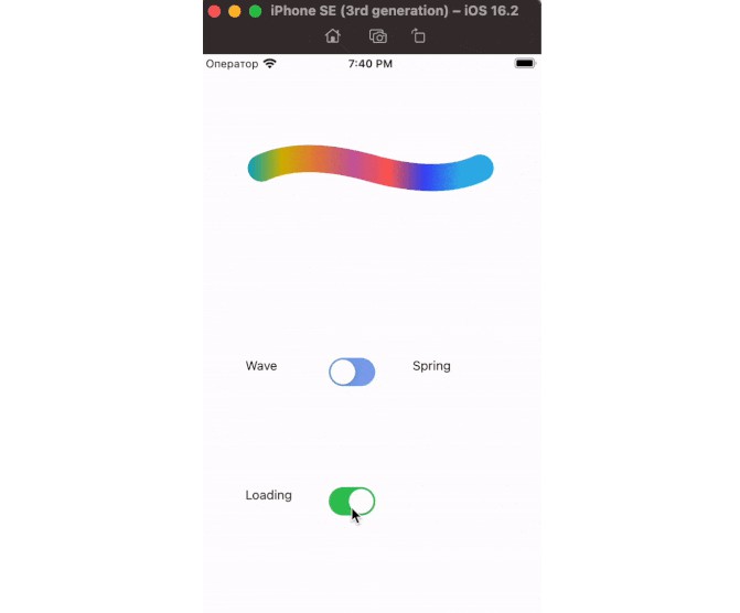
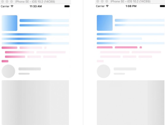
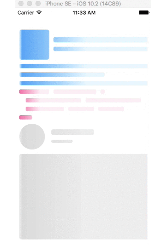
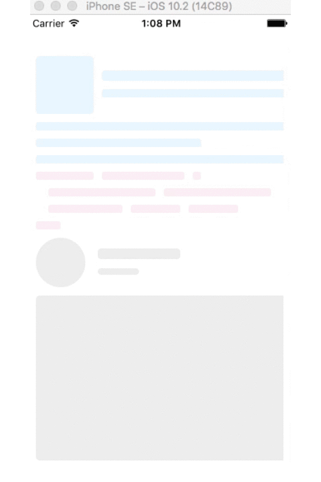
Demo
Usage
npm i react-native-svg-animated-linear-gradient --save
Inside your component:
import SvgAnimatedLinearGradient from 'react-native-svg-animated-linear-gradient';
Examples
Instagram style
<SvgAnimatedLinearGradient height={300}>
  <Svg.Circle cx="30" cy="30" r="30" />
  <Svg.Rect x="75" y="13" rx="4" ry="4" width="100" height="13" />
  <Svg.Rect x="75" y="37" rx="4" ry="4" width="50" height="8" />
  <Svg.Rect x="0" y="70" rx="5" ry="5" width="400" height="200" />
</SvgAnimatedLinearGradient>
Facebook style
<SvgAnimatedLinearGradient
  primaryColor="#e8f7ff"
  secondaryColor="#4dadf7"
  height={140}
>
  <Svg.Rect x="0" y="0" rx="5" ry="5" width="70" height="70" />
  <Svg.Rect x="80" y="17" rx="4" ry="4" width="300" height="13" />
  <Svg.Rect x="80" y="40" rx="3" ry="3" width="250" height="10" />
  <Svg.Rect x="0" y="80" rx="3" ry="3" width="350" height="10" />
  <Svg.Rect x="0" y="100" rx="3" ry="3" width="200" height="10" />
  <Svg.Rect x="0" y="120" rx="3" ry="3" width="360" height="10" />
</SvgAnimatedLinearGradient>
Code style
<SvgAnimatedLinearGradient
  primaryColor="#fff0f6"
  secondaryColor="#f783ac"
  height={80}
>
  <Svg.Rect x="0" y="0" rx="3" ry="3" width="70" height="10" />
  <Svg.Rect x="80" y="0" rx="3" ry="3" width="100" height="10" />
  <Svg.Rect x="190" y="0" rx="3" ry="3" width="10" height="10" />
  <Svg.Rect x="15" y="20" rx="3" ry="3" width="130" height="10" />
  <Svg.Rect x="155" y="20" rx="3" ry="3" width="130" height="10" />
  <Svg.Rect x="15" y="40" rx="3" ry="3" width="90" height="10" />
  <Svg.Rect x="115" y="40" rx="3" ry="3" width="60" height="10" />
  <Svg.Rect x="185" y="40" rx="3" ry="3" width="60" height="10" />
  <Svg.Rect x="0" y="60" rx="3" ry="3" width="30" height="10" />
</SvgAnimatedLinearGradient>
Props
| Prop | Type | Default | Description |
|---|---|---|---|
| primaryColor | String | '#eeeeee' | Primary color, also background color |
| secondaryColor | String | '#dddddd' | Secondary color |
| width | Number | 300 | Width of SVG |
| height | Number | 200 | Height of SVG |
| x1 | String | '0' | x of point star gradient, accept Number or Percentage |
| y1 | String | '0' | y of point star gradient, accept Number or Percentage |
| x2 | String | '100%' | x of point end gradient, accept Number or Percentage |
| y2 | String | '0' | y of point end gradient, accept Number or Percentage |
TODO
- Write test