react-native-switch-button
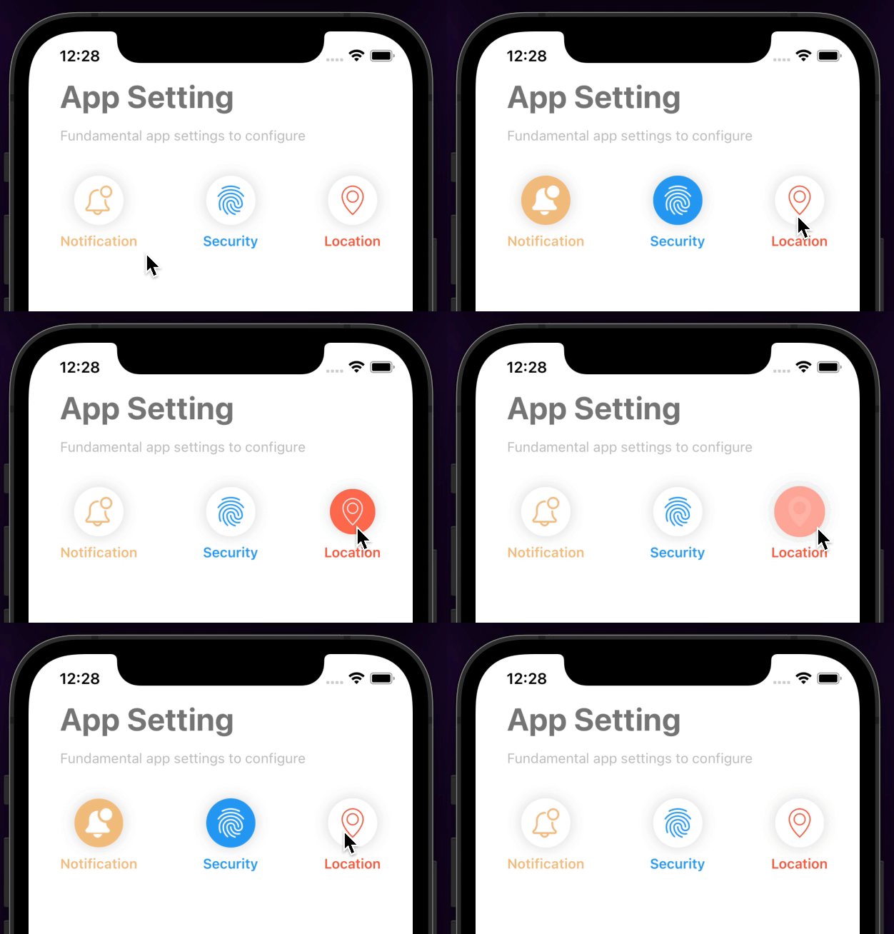
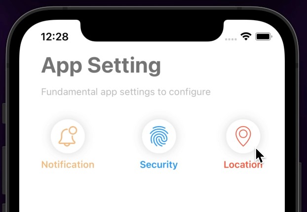
Animated switch button with fully customizable React Native Component
Installation
Add the dependency:
npm i @freakycoder/react-native-switch-button
Peer Dependencies
IMPORTANT! You need install them
"@freakycoder/react-native-bounceable": ">= 0.2.5"
Usage
Import
import SwitchButton from "@freakycoder/react-native-switch-button";
Fundamental Usage
<SwitchButton
  text="Notification"
  inactiveImageSource={require("./assets/notification.png")}
  activeImageSource={require("./assets/notification-3.png")}
  onPress={(isActive: boolean) => console.log(isActive)}
/>
Example Project ?
You can checkout the example project ?
Simply run
npm ireact-native run-ios/android
should work of the example project.
Configuration - Props
| Property | Type | Default | Description |
|---|---|---|---|
| text | string | undefined | set the text of the button |
| activeImageSource | Image Source | undefined | set the active image source |
| inactiveImageSource | Image Source | undefined | set the inactive image source |
| isActive | boolean | false | set the active state initially |
| onPress | function | default | set your own logic for onPress functionality |
| mainColor | string | #f1bb7b | change the main animated color |
| originalColor | string | #fff | change the original/default animated color |
| tintColor | string | #f1bb7b | change the tint color for the image |
| disableText | boolean | false | disable the text part if you only want to use switch button itself |
| style | ViewStyle | default | set or override the style object for the main container |
| textStyle | TextStyle | default | set or override the style object for the text |
| imageStyle | ImageStyle | default | set or override the style object for the image |
| textContainerStyle | ViewStyle | default | set or override the style object for text container |
Future Plans
- [x]
LICENSE - [ ] Write an article about the lib on Medium
Author
FreakyCoder, [email protected]
