? React Native Custom Toggle Input
? Customizable React Native Toggle Switch with easy to use props”

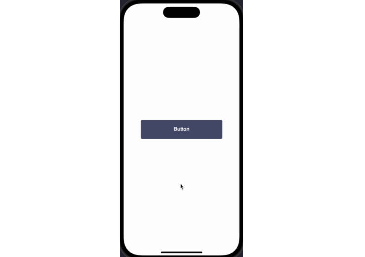
Toggle Input Demo
Customizable and Easy to use toggle switch.
- Use the color of your choice
- Use bordered or filled toggle switch upon your choice
- Works on all the platforms Android, Ios and Web in the same way
- Zero dependencies
Compatibility
| iOS | Android | Web | Expo |
|---|---|---|---|
| ✅ | ✅ | ✅ | ✅ |
? Installation
$ npm install react-native-toggle-input
OR
$ yarn add react-native-toggle-input
? Basic Usage
import Toggle from 'react-native-toggle-input'

const App = () => {

  const [toggle, setToggle] = React.useState(false);


  return(
    <Toggle toggle={toggle} setToggle={setToggle} />
  )

};
For Live Demo (Expo Snack)
⭐ Props
| Name | Type | Description |
|---|---|---|
| color | String | Color of the toggle switch (Optional) |
| size | Number | Size of the toggle switch (Optional) |
| filled | boolean | If you want to use filled toggle switch set it to true (Optional) |
| circleColor | String | Use the color you want to give to the circle inside swith (Required for filled switch) |
| toggle | boolean | Default value of the toggle switch (Required) |
| setToggle | Function | Pass the function that will be used to set toggle status (Required) |
? Advanced Usage
import Toggle from 'react-native-toggle-input'

const App = () => {

  const [toggle, setToggle] = React.useState(false);


  return(
    <Toggle
        color={"#4C956C"}
        size={30}
        filled={true}
        circleColor={"white"}
        toggle={toggle}
        setToggle={setToggle}
    />
  )

};

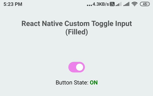
Toggle Input Filled Demo
For Live Demo (Expo Snack)