react-native-intro-carousel
An introduction page carousel animated with pagination
Installation
npm install react-native-intro-carousel
or
yarn add react-native-intro-carousel
Usage
import Carousel from "react-native-intro-carousel";

// ...

<Carousel
  data={[
    {
      key: '1',
      title: 'Cool package',
      description: 'This is a cool package',
      backgroundColor: '#e879f2',
      image: require('./..'),
      titleStyle: {
        color: 'white',
      },
      descriptionStyle: {
        color: 'white',
      },
    },
  ]}
  paginationConfig={{
    dotSize: 20,
  }}
/>
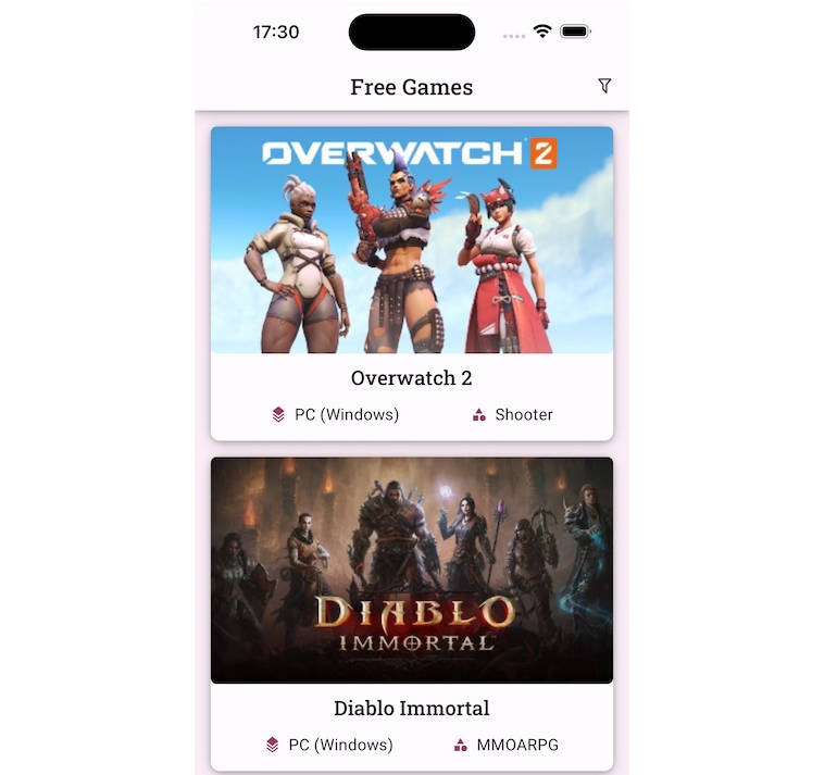
Demo

Customizable
You can use your own component
<Carousel
  data={[
    {
      key: '1',
      title: 'Cool package',
      description: 'This is a cool package',
      image: require('./..'),
      data: {
        ... // you can add any data here
      }
    },
  ]}
  buttonsConfig={{
    disabled: true,
  }}
  renderItem={({ item, index }, goToSlide) => (
    <View style={styles.content}>
      <Image
        source={item.image}
        style={styles.image}
      />
      <Text>{item.title}</Text>
      <Text>{item.description}</Text>
      <View style={styles.buttonsContainer}>
        <Pressable
          style={styles.button}
          onPress={() => goToSlide(index - 1)}
        >
          <Text>Previous</Text>
        </Pressable>
        <Pressable
          style={[styles.button, { marginLeft: 10 }]}
          onPress={() => goToSlide(index + 1)}
        >
          <Text>Next</Text>
        </Pressable>
      </View>
    </View>
  )}
/>
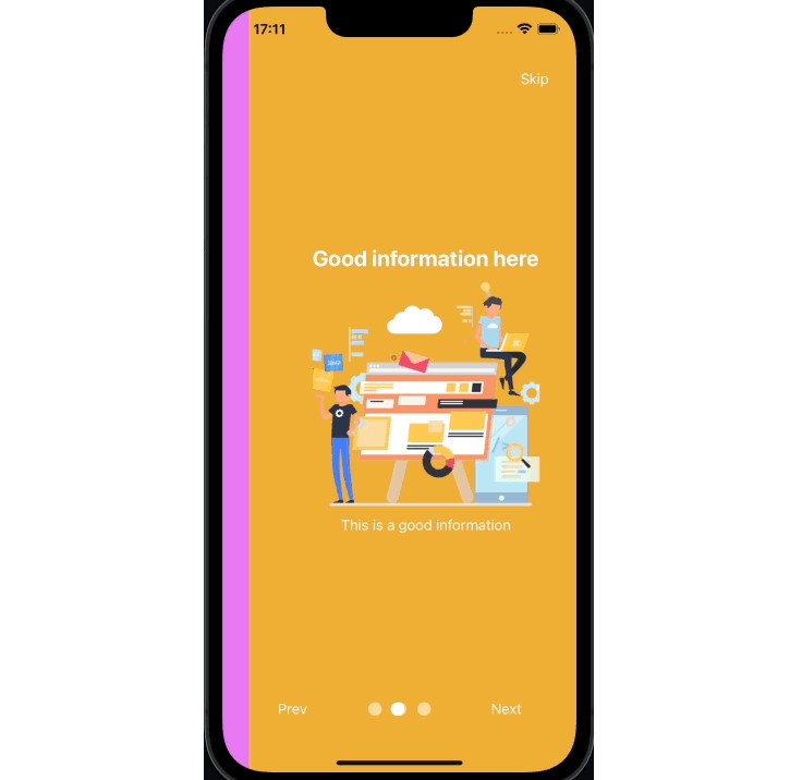
will result in:

Props
| Name | Type | Default | Description |
|---|---|---|---|
| data | object | None, required | Array of pages in carousel |
| paginationConfig | object | None | Pagination configurations (see table below) |
| renderItem | function | None | You can create your own component to be rendered on the page |
| onPressSkip | function | None | Called when user press ‘skip’ (null = hide skip button) |
| onFinish | function | None | Called when user press ‘Done’ on last slider |
| buttonsConfig | object | None | Buttons configuration (see table below) |
paginationConfig
| Name | Type | Default | Description |
|---|---|---|---|
| dotSize | number | 15 | Size of pagination dots |
| bottomOffset | number | 50 | pagination distance from bottom |
| animated | boolean | true | allows disabling dots animation |
| disabled | boolean | false | hide the pagination |
| dotIncreaseSize | number | 1.4 | size the dot will grow when it is on a page (hint: use 1 if you don’t want the dot to grow) |
| color | string | #ffffff80 | Default dot color |
| activeColor | string | #fff | Active dot color |
buttonsConfig
| Name | Type | Default | Description |
|---|---|---|---|
| disabled | boolean | false | Hide the buttons |
| next | { label?: string; textStyle?: TextStyle; buttonStyle: ViewStyle; } | None | Next button configurations |
| prev | same as the line above | None | Previous button configurations |
| skip | same as the line above | None | Skip button configurations |
| done | same as the line above | None | Last slide button configurations |
Contributing
See the contributing guide to learn how to contribute to the repository and the development workflow.
License
MIT