Galio
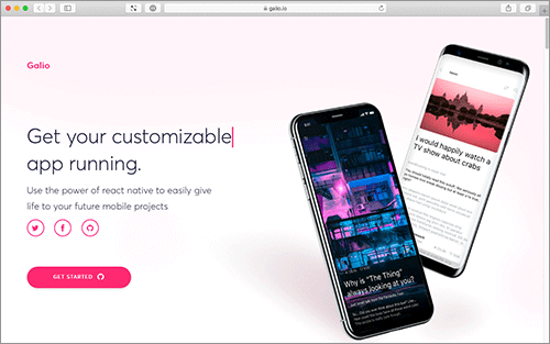
Galio is a beautifully designed, Free and Open Source React Native Framework.
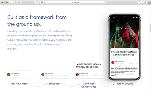
Galio is a 100% free and open source project, licensed under MIT License. You'll be building Android and iOS apps in style. Galio will always remain free to use and it is powered by a massive world-wide community. It comes with a lot of carefully crafted, ready to be used components and a beautiful typography. Galio has a gorgeous base theme that adaps to each project. Built with real app examples, component demos, guides, and how-to's to get you up and running with mobile apps faster than ever before.
Quick Start
1. Project Setup
git clone https://github.com/galio-org/galio.git
cd galio
npm install or yarn install
2. Project testing
Terminal cli:
npm run ios or yarn run ios
User our iOS or Android app to directly view Expo projects on your phone.
3. SDK library instructions
npm install galio-framework
or
yarn add galio-framework
Import UI components to new screens:
import { Block, Button, Card, Icon, Input, NavBar, Text } from 'galio-framework';
Components
Under Galio's belt:
:white_check_mark: NavBar
:white_check_mark: Block
:white_check_mark: Card
:white_check_mark: Button
:white_check_mark: Icon
:white_check_mark: Input
:white_check_mark: Text
:construction: Will follow: :construction:
TBA
Examples
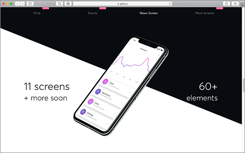
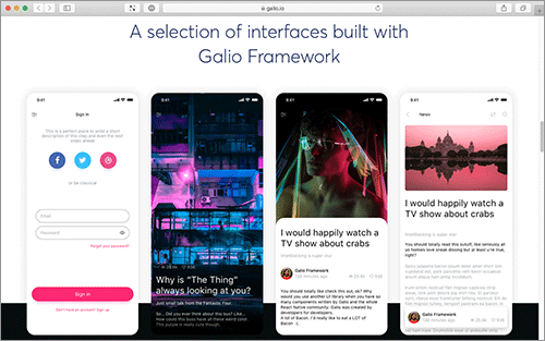
Here we will showcase some screens and some sample code of how we've used Galio in order to create them.

renderCard = (props, index) => {
  const gradientColors = index % 2 ? GRADIENT_PINK : GRADIENT_BLUE;

  return (
    <Block row center card shadow space="between" style={styles.card} key={props.title}>
      <Gradient
        start={[0.45, 0.45]}
        end={[0.90, 0.90]}
        colors={gradientColors}
        style={[styles.gradient, styles.left]}
      >
        <Icon
          size={BASE_SIZE}
          name={props.icon}
          color={COLOR_WHITE}
          family={props.iconFamily}
        />
      </Gradient>

      <Block flex>
        <Text h5>{props.title}</Text>
        <Text muted>{props.subtitle}</Text>
      </Block>
      <Button style={styles.right}>
        <Icon size={BASE_SIZE * 1.5} name="ios-arrow-forward" family="Ionicons" color={COLOR_GREY} />
      </Button>
    </Block>
  );
}

<Block flex space="between" center style={styles.absolute}>
  <NavBar transparent leftIconColor={theme.COLORS.WHITE} onLeftPress={() => props.navigation.openDrawer()} />
  <Block style={styles.articleSummary}>
    <Block row style={{ marginBottom: theme.SIZES.BASE }}>
      <Block row middle style={{ marginHorizontal: theme.SIZES.BASE }}>
        <Icon name="eye" family="MaterialCommunityIcons" color={theme.COLORS.WHITE} size={theme.SIZES.FONT * 0.8} />
        <Text p color={theme.COLORS.WHITE} style={{ marginLeft: theme.SIZES.BASE * 0.25 }}>25.2k</Text>
      </Block>
      <Block row middle>
        <Icon name="heart-outline" family="MaterialCommunityIcons" color={theme.COLORS.WHITE} size={theme.SIZES.FONT * 0.8} />
        <Text p color={theme.COLORS.WHITE} style={{ marginLeft: theme.SIZES.BASE * 0.25 }}>936</Text>
      </Block>
    </Block>
    {/*...more code in the open source files...*/}
  </Block>
</Block>

<Block>
  <Input
    rounded
    type="email-address"
    placeholder="Email"
    autoCapitalize="none"
    style={{ width: width * 0.9 }}
    onChangeText={text => this.handleChange('email', text)}
  />
  <Input
    rounded
    password
    viewPass
    placeholder="Password"
    style={{ width: width * 0.9 }}
    onChangeText={text => this.handleChange('password', text)}
  />
  <Text
    color={theme.COLORS.ERROR}
    size={theme.SIZES.FONT * 0.75}
    onPress={() => Alert.alert('Not implemented')}
    style={{ alignSelf: 'flex-end', lineHeight: theme.SIZES.FONT * 2 }}
  >
    Forgot your password?
  </Text>
</Block>