animation-wrapper-view
AnimationWrapperView is a collection of a well defined set of component level animations, that a developer can utilize just by providing some configurations. AnimationWrapperView will add plug and play type support to the already robust Animated API, and will take care of all the intricate details of each animation type.
Sample code
const bounceConfig: BounceAnimation = {
    type: AnimationType.BOUNCE,
    triggerType: AnimationTriggerType.ON_CLICK,
    bounceHeight: 20,
    animationDuration: 1000
};

<AnimationWrapperView animationConfig={bounceConfig}>
    {/* {your component} */}
</AnimationWrapperView>
Installation
npm i animation-wrapper-view
Live Demo
An Expo snack is created illustrating capabilities of animation-wrapper-view, visit and play around!!
https://snack.expo.dev/@swapnil1104/animationwrapperview-playground
AnimationWrapperView capabilities
- Robustly exposed API to allow developer to have control over various aspects of predefined animations.
- Ability to compose your own animations on the fly by providing a custom JSON.
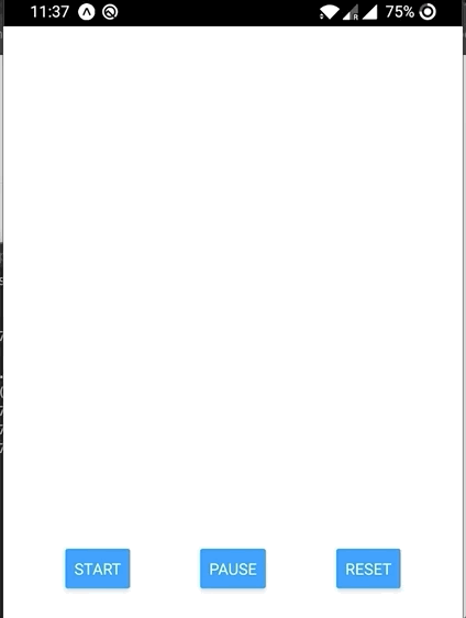
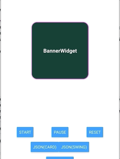
Start, Pause and Reset Animation
private _wrapperRef: AnimationWrapperView | null;

render() {
    return (
        <AnimationWrapperView
            ref={(ref) => (this._wrapperRef = ref)}
            animationConfig={this.state.animationConfig}
            onAnimationFinish={this._onComplete}>
                {your component}
        </AnimationWrapperView>
    );
}

// Start animation on button press.
private _onPressToStart = (_: GestureResponderEvent) => {
    this._wrapperRef?.startAnimation();
}

// Pause animation on button press.
private _onPressToPause = (_: GestureResponderEvent) => {
    this._wrapperRef?.pauseAnimation();
}

// Reset animation on button press.
private _onPressToReset = (_: GestureResponderEvent) => {
    this._wrapperRef?.resetAnimation();
}
AnimationWrapperView props
| Prop name | Prop Type | Description |
|---|---|---|
| animationConfig | BaseAnimation | Object which will contain all optional and non-optional parameters needed to render the animation, including AnimationType, AnimationTriggerType, etc. |
| onAnimationFinish | () => void | (optional) Callback function, if provided will be invoked once animation is finished. |
| onAnimationStart | () => void | (optional) Callback function, if provided will be invoked when the animation is triggered. |
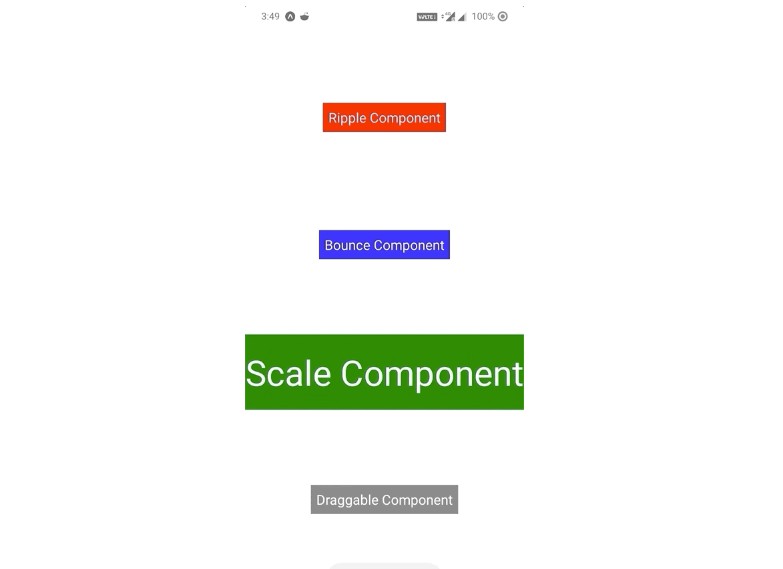
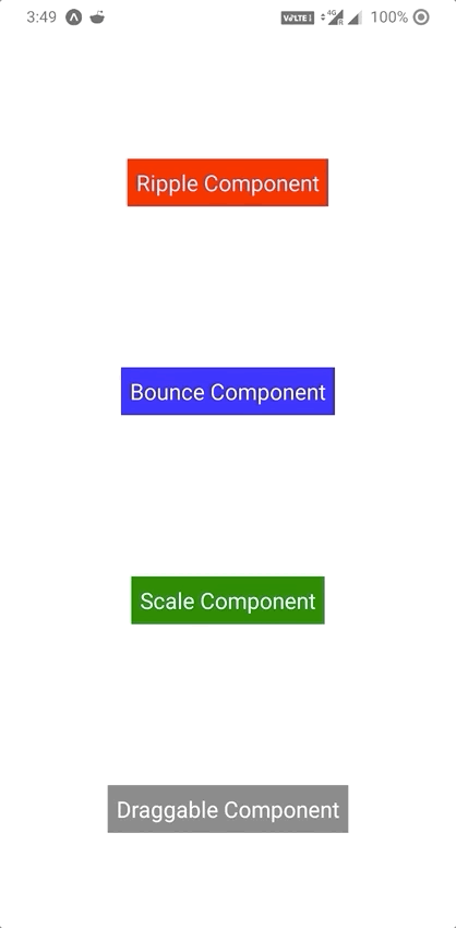
Types of supported Animations
Different types of animation configs
To note, all the AnimationConfig objects extend from, so animationDuration, triggerType, triggerDelay, and interpolation properties are available to each of the animation definitions.
| AnimationConfig | Property name | Type | Description | Demo |
|---|---|---|---|---|
| BaseAnimationConfig | type | AnimationType | AnimationType enum will determine which type of animation will be rendered | |
| triggerType | AnimationTriggerType | AnimationTriggerType enum defines the trigger critera of animation invokation; ON_LOAD, ON_CLICK | ||
| interpolation | InterpolationDef | InterpolationDef defines the property related to interpolation that will be applied to the animation timing function. | ||
| triggerDelay | number | This controls the animation trigger for ON_LOAD animation, it'll introduce delay before the animation is started | ||
| animationDuration | number | This defines how long the animation will be played before stopping. | ||
| BounceAnimationConfig | bounceHeight | number | This param defines the value of Y axis translation which will give the visual appearance of the view bouncing. | 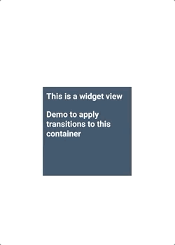 |
| FadeAnimationConfig | initialOpacity | number | This will define the initial opacity of the view when the Animation starts playing | 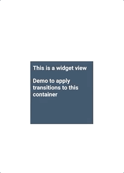 |
| finalOpacity | number | This will define the final opacity of the view once animation ends | 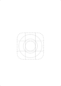 |
|
| RippleAnimationConfig | rippleColor | string | This will define the ripple color, the input value could be a supported color name, or a hexcode value. | 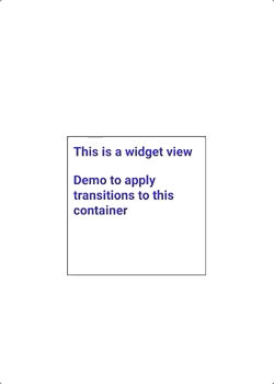 |
| rippleCount | number | This determines how many ripples will be shown before animation ends | ||
| rippleDuration | number | This determines for how long an individual ripple will animate. | ||
| rippleIntervalDuration | number | This determines the time duration interval between each ripple. | ||
| rippleRadius | number | This will define the size of the ripple in its fully expanded state. | ||
| ScaleAnimationConfig | fromScale | number | This will define the initial scale of the view before animation starts. | 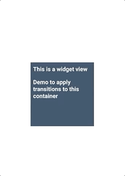 |
| toScale | number | This will define the final scaale of the view once animation ends. | 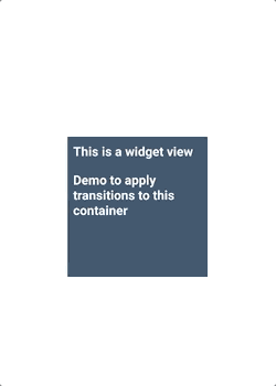 |
|
| SlideHorizontalAnimationConfig | initialOffset | number | This will define the initial offset from the view's original position before starting the animation. |  |
| finalOffset | number | This will define the final offset of the view once animation ends, 0 value will lead the view back to its original position. | 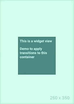 |
|
| direction | SlideHorizontalDirection | The direction param in this case will define the slide direction; 'ltr': left to right, or 'rtl': Right to left | ||
| SlideVerticalAnimationConfig | initialOffset | number | This will define the initial offset from the view's original position before starting the animation. | |
| finalOffset | number | This will define the final offset of the view once animation ends, 0 value will lead the view back to its original position. | ||
| direction | SlideVerticalDirection | The direction param in this case will define the slide direction; 'up_down': top to down, or 'down_up': below the view to upwards. | ||
| DraggableAnimationConfig | TBD | TBD | TBD |
In Action
Define your custom animations!
AnimationWrapperView also gives you the capability to define your custom animation using JSON.
This tool is very powerful as it allows you to play with various transformation attributes that can be applied to any Animated.View.
- A
TransformDefobject defines an individual piece of transformation,f(from) tot(to) value and thep(property) to transform. - An array of
TransformDefalong with thedurationand theInterpolationDefwill create anAnimationDefobject. All the transformations defined in the array will play in parallel. - An array of
AnimationDefdefinitions can be played in sequence to render any type of animation (limited by imagination :P).
Type definitions:
| Type name | params | usage |
|---|---|---|
| TransformDef | property: TransformType | Defines the property to transform: scale, fade, opacity, translateY, rotate, translateX, rotateX, rotateY , scaleX, scaleY |
| to:number | The starting value of the transformation | |
| from:number | The final value of transformation after animation |
| Type name | params | usage |
|---|---|---|
| InterpolationDef | easing: EasingType | Defines the easing that will be applied to the transformation set: linear, quad, circle, elastic, bounce, back. |
| params: InterpolationParams | Some easing functions require extra params, we use this object to populate the optional params for easing functions, please note if a non optional param is not provided for the specified easing function, it will fallback to linear easing. |
| Type name | params | usage |
|---|---|---|
| InterpolationParams | back: number | https://reactnative.dev/docs/easing#back |
| bounciness: number | https://reactnative.dev/docs/easing#bounce | |
| bezierCurvePoints: Array<[x1: number, y1: number, x2: number, y2: number]> | https://cubic-bezier.com/ |
| Type name | params | usage |
|---|---|---|
| AnimationDef | TransformDef[] | An array of transformation functions can be defined, that will be applied to the object in parallel |
| duration | Duration in which the set of transformations complete animating. | |
| InterpolationDef | This param will describe the easing function that will be applied to this set of transformations. |
Multiple set of transformations can be played in a sequence.
Usage of JSON based custom animation
const animationConfig: JsonAnimationConfig = {
        type: AnimationType.JSON,
        triggerType: AnimationTriggerType.ON_LOAD,
        animationConfig: {
            transforms: [
                {
                    key: 'scale',
                    from: 0,
                    to: 1,
                },
                {
                    key: 'rotate',
                    from: 0,
                    to: 90,
                },
                {
                    key: 'rotateX',
                    from: 0,
                    to: 180,
                }
            ],
            duration: 1000,
            interpolation: {
                easing: "linear"
            }
        }
    };

<AnimationWrapperView animationConfig={bounceConfig}>
    {/* {your component} */}
</AnimationWrapperView>
GitHub
https://github.com/flipkart-incubator/animation-wrapper-view