react-native-shadow-2
Cross-platform shadow for React Native. Improved version of the abandoned react-native-shadow package.
react-native-shadow is dead for years. This one is an improved version with more functionalities, Typescript support and written from scratch. Also, it doesn't require the usage of the size property.
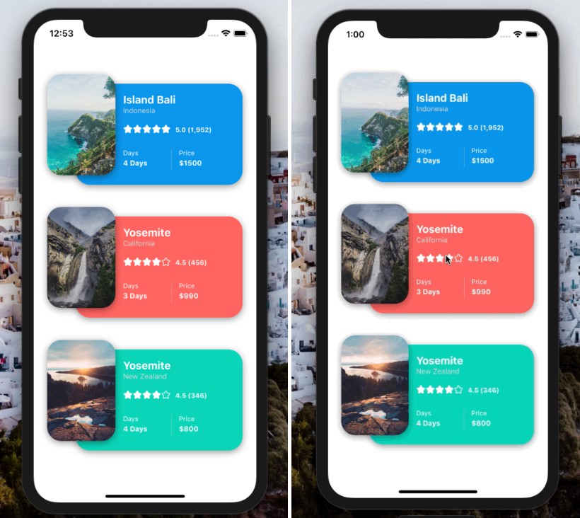
It solves the old React Native issue of not having the same shadow appearence and implementation for Android, iOS and Web.
? Installation
1. First install react-native-svg.
2. Then install react-native-shadow-2:
npm i react-native-shadow-2
# or
yarn add react-native-shadow-2
? Usage
Structure
import { Shadow } from 'react-native-shadow-2';

<Shadow>
   {/* Your component */}
</Shadow>
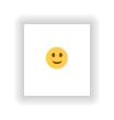
Basic
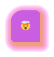
<Shadow>
  <View>
    <Text style={{ margin: 20, fontSize: 20 }}>?</Text>
  </View>
</Shadow>
Advanced
<Shadow distance={15} startColor={'#eb9066d8'} finalColor={'#ff00ff10'} offset={[3, 4]} paintInside>
  <View style={{ borderTopLeftRadius: 24, borderBottomRightRadius: 0, borderRadius: 10, backgroundColor: '#c454f0dd' }}>
    <Text style={{ margin: 20, fontSize: 20 }}>?</Text>
  </View>
</Shadow>
Properties
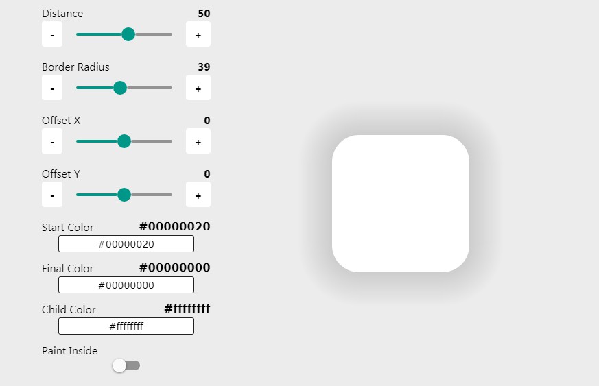
| Property | Type | Default | Description |
|---|---|---|---|
| startColor | string |
'#00000020' |
The color of the shadow when it's right next to the given content, leaving it. Accepts alpha channel. |
| finalColor | string |
'#0000', transparent. |
The color of the shadow at the maximum distance from the content. Accepts alpha channel. |
| distance | number |
10 |
How far the shadow will go. |
| radius | number \| { default?: number ; topLeft?: number ; topRight?: number ; bottomLeft?: number ; bottomRight?: number } |
undefined |
The radius of each corner of your child component. Passing a number will apply it to all corners. If passing an object, undefined corners will have the radius of the default property if it's defined.If undefined and if getChildRadius, it will attempt to get the child radius from the borderRadius style. Fallbacks to 0. |
| getChildRadiusStyle | boolean |
true |
If it should try to get the radius from the child view style if radius property is undefined. It will get the values for eachcorner, like borderTopLeftRadius, and also borderRadius. If a specific corner isn't defined, borderRadius value is used. |
| sides | ("left" \| "right" \| "top" \| "bottom")[] |
['left', 'right', 'top', 'bottom'] |
The sides of your content that will have the shadows drawn. Doesn't include corners. |
| corners | ("topLeft" \| "topRight" \| "bottomLeft" \| "bottomRight")[] |
['topLeft', 'topRight', 'bottomLeft', 'bottomRight'] |
The corners that will have the shadows drawn. |
| offset | [x: string \| number, y: string \| number] |
[0, 0] |
Moves the shadow. Negative x moves it to the left, negative y moves it up. Accepts 'x%' values, in relation to the child's size.Read paintInside property description for related configuration. |
| paintInside | boolean |
false |
If the shadow should be applied inside the external shadows, below the child. startColor is used as fill color.You may want this as true when using offset or if your child have some transparency. |
| viewStyle | ViewStyle |
undefined |
The style of the view that wraps your child component. |
| containerViewStyle | StyleProp<ViewStyle> |
undefined |
The style of the view that contains the shadow and your child component. |
| size | [width: number, height: number] |
undefined |
If you don't want the 2 renders of the shadow (first applies the relative positioning and sizing that may contain a quick pixel gap, second uses exact pixel size from onLayout) or you are having noticeable gaps/overlaps on the first render, you can use this property. Using this won't trigger the onLayout, so only 1 render is made. It's also good if you want an animated view. It will apply the corresponding width and height styles to the viewStyle property.The values will be properly rounded using our R() function. |