react-native-awesome-alert
This package offers customizable modal components with ✔️check options in React Native
INSTALLATION
npm
Run npm install react-native-awesome-alert --save
yarn
Run yarn add react-native-awesome-alert
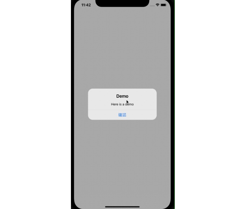
DEMO
- Works well on both iOS and Android
- Fully customizable style (example below)

API
Props
The props for react-native-awesome-alert share similarities with react-native-check-box (author : crazycodeboy)
| Prop | Type | Default | Description |
|---|---|---|---|
styles |
object |
AwesomeAlert.style.js |
please refer to STYLING section ? |
modalProps |
object |
original react-native Modal Props. please refer to offcial Document | |
leftCheck |
bool |
true |
set where the checkbox will be located. default is left |
checkedImage |
element |
Default image |
Custom checked Image |
unCheckedImage |
element |
Default image |
Custom unchecked Image |
checkBoxColor |
string |
black |
Tint color of the checkbox image |
Methods
alert(title, messageView, buttons)
| Arguments | type | default | optional |
|---|---|---|---|
title |
string |
none |
false |
messageView |
element |
none |
false |
buttons |
array |
none |
false |
neverAskAlert(title, messagesView, buttons, checkText = " ")
| Arguments | type | default | optional |
|---|---|---|---|
title |
string |
none |
false |
messageView |
element |
none |
false |
buttons |
array |
none |
false |
checkText |
string |
" " |
true |
randomAskAlert(title, messagesView, buttons, checkText = " ", invisibleTime)
| Arguments | type | default | optional |
|---|---|---|---|
title |
string |
none |
false |
messageView |
element |
none |
false |
buttons |
array |
none |
false |
checkText |
string |
" " |
true |
invisibleTime |
number(minute) |
none |
false |
HOW TO USE
import CheckAlert from "react-native-awesome-alert"
const NeverAskView = (
<View style={styles.sampleView}>
<Text style={styles.sampleViewText}>This is "Do not ask again" checkable alert</Text>
</View>
)
...
export default class App extends Component {
onPressSimpleAlert() {
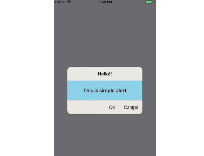
this.checkAlert.alert("Hello!!", SimpleView, [
{ text: "OK", onPress: () => console.log("OK touch") },
{ text: "Cancel", onPress: () => console.log("Cancel touch") }
])
}
onPresshNeverAskAlert() {
this.checkAlert.neverAskAlert(
"Hello CheckAlert",
NeverAskView,
[
{ text: "OK", onPress: () => console.log("OK touch"), id: "helloAlert" },
{ text: "Cancel", onPress: () => console.log("Cancel touch") }
],
"Do not ask again"
)
}
onPresshNot24HAlert() {
this.checkAlert.randomAskAlert(
"Hello CheckAlert",
RandomAskView,
[
{ text: "OK", onPress: () => console.log("OK touch"), id: "helloAlert2" },
{ text: "Cancel", onPress: () => console.log("Cancel touch") }
],
"Do not ask for 3 minutes",
3
)
}
render() {
return (
<View style={styles.container}>
<CheckAlert
styles={{
modalContainer: { backgroundColor: "rgba(49,49,49,0.8)" },
checkBox: { padding: 10 },
modalView: { marginBottom: 10, borderRadius: 0 }
}}
ref={ref => (this.awesomAlert = ref)}
// available Modal's props options: https://facebook.github.io/react-native/docs/modal.html
modalProps={{
transparent: true,
animationType: "slide",
onShow: () => alert("onShow!")
}}
checkBoxColor="red"
/>
<TouchableOpacity style={styles.touchButton} onPress={this.onPressSimpleAlert.bind(this)}>
<Text style={styles.toucaButtonTxt}>simple Alert</Text>
</TouchableOpacity>
<TouchableOpacity
style={styles.touchButton}
onPress={this.onPresshNeverAskAlert.bind(this)}
>
<Text style={styles.toucaButtonTxt}>neverAsk Alert</Text>
</TouchableOpacity>
<TouchableOpacity style={styles.touchButton} onPress={this.onPresshNot24HAlert.bind(this)}>
<Text style={styles.toucaButtonTxt}>randomAsk Alert</Text>
</TouchableOpacity>
</View>
)
}
}
The method is similar to React Native's Alert, however be careful when passing the button's id. The id is used like a primary Key in a local DB, and will cause a warning if the id is not passed properly.
STYLING
export default {
    modalContainer : {
        flex: 1,
        backgroundColor: 'rgba(49,49,49, 0.7)',
        justifyContent: 'center',
        alignItems: 'center'
    },
    modalView: {
        backgroundColor: '#rgb(235,233,227)',
        borderRadius: 15,
        width: 275,
        borderColor: 'black',
        borderWidth: StyleSheet.hairlineWidth
    },
    checkBox: {
        marginBottom: 10
    },
    checkBoxText: {
        marginLeft: 4,
        alignSelf: 'center',
        fontSize: 15,
        justifyContent: 'center'
    },
    titleText: {
        fontSize: 17,
        fontWeight: '600',
        padding: 15,
        alignSelf: 'center'
    },
    buttonContainer: {
        flexDirection: 'row',
        justifyContent: 'flex-end',
        borderColor: 'gray',
        borderTopWidth: StyleSheet.hairlineWidth
    },
    buttonText: {
        fontSize: 17
    },
    button: {
        justifyContent: 'center',
        alignItems: 'center',
        padding: 15,
        borderColor: 'gray'
    }
}
The above keys are used for styling the entire view. You just pass the object value like this
<AwesomeAlert
    styles={{
      modalContainer: { backgroundColor: "rgba(49,49,49,0.8)" },
      checkBox: { padding: 10 },
      modalView: { marginBottom: 10, borderRadius: 0 }
    }}
/>
WHAT YOU NEED TO KNOW
- If the alert is set to not be visible again, the action of the
button with the IDis executed. - The checkbox is activated only when the
button with the IDis pressed.