React cross Form
Easy form for react and react-native apps with validation.
We use the great validate.js library but you can use a custom validator.
Optional - You can use react-cross-inputs , Example with react cross inputs
This is only a logic component, react-cross-form just render your inputs with value, methods, validators.
Installation
npm i react-cross-form --save
Basic Usage
import React from "react";
import DocForm from "react-cross-form";
import TextInput from "./TextInput"; // You can use any component you want.

const FORM_FIELDS = [
  {
    key: "firstName",
    label: "First Name",
    placeholder: "Type your name...",
    component: TextInput,
    validators: { presence: { message: "is required" }, length: { minimum: 3 } }
  },
  {
    key: "email",
    label: "Email",
    placeholder: "Type your name...",
    component: TextInput,
    validators: { email: true }
  }
];

export default class Example extends React.Component {
	constructor(props) {
		super(props);
		this.state = {
			form: {
				firstName: null,
				email: null
			},
			isValid: false
		};
		this.onChange = this.onChange.bind(this)
	}
	onChange({updateData}){
		this.setState({ form: updateData })
	}
  render() {
    const { form, isFormValid } = this.state;
    return (
      <div>
        <h2>Easy form validation example</h2>
        <form>
        <DocForm
          fields={FORM_FIELDS}
          data={this.state.form}
          onChange={this.onChange}
          validateType="all"
          onValidateStateChanged={({ isValid }) => {
            this.setState({ isFormValid: isValid });
          }}
        />
        </form>
      </div>
    );
  }
};
Props
| key | type | Description |
|---|---|---|
| data | object (required) |
Document data |
| fields | array (required) |
fileds to render. [{ key : 'age', component : NumberInput, label : 'Your Age', validators: { presence: true }: // And you can add here everything you need and your input will get this from props }] |
| validateType | string (default: 'all') |
Choose When to show validation errors in each of the inputs fields? none - hide all. all - Show all onFocus - Show only on fields that then been focus onBlur - how only on fields that then been blur onChange- how only on fields that then been changed. |
| showSkippingFieldsWarnings | boolean | Set true if you want to display validation error even if user skip on the input |
| onFocus | function | Function that get called When input is focus, you need to call props.onFocus from your input |
| onBlur | function | Function that get called When input is blur, you need to call porps.onBlur from your input |
| onChange | function (required) |
The function that gets called When the input is changed, you need to call props.onChange and pass the new value from your input. See Input event for more details. |
| onValidateStateChanged | function | Function that get called when the form validation state was changed, With this value you can enable/disable the form submit button |
| requiredPrefix | string (Default is * ) |
You can use this to render input label with a required fields labels will render with '*' at the start of the string |
| disabledAll | boolean | Set true if you want to disable all fields |
| focusNextOnlyIfEmpty | boolean | Set true if you want to focus on the next input only if is empty |
| render | fonction | if you want to customize the layout, for example, you want to wrapper any input with other element or put between the inputs some other element, you can use render props function that will get an object with all the inputs and return the view to render |
| onChanged | function | This function will run after field onChange, helpful for manipulating other field onChange, see onChanged example |
Fields
Each field in the Fields array is an object that must to contain a key and component.
more info about field object:
| key | type | Description |
|---|---|---|
| key | string(required) | Key of for the value in the data |
| component | element(required) | Any component that you want to render, see what your componant will get Component props |
| formatter | function | If you want to format the value, you can pass a function the received ({field, documentData}) and return the input value |
| validators | object | For example: { presence: true, email: true }, you can learn more in https://validatejs.org/#validators and see More validate examples) |
| customValidation | function | Pass function that get ()field, value and return array of validation errros, see CustomValidation exmple |
| disabled | boolean | Input disabled value |
| placeholder | string | Input placeholder value |
| label | string | Input label value |
| helpText | string | Sometimes we want to render help text under the field |
| render | function | You can pass render method that return a component |
Fields configuration example
const FIELDS = [
	{
	key:  'firstName',
	label:  i18n.t('First Name'),
	component:  TextInput,
	validators: { presence:  true, length: { minimum:  2 }},
	autoFocus:  true
	},
	{
		key: 'options',
		label: 'Options',
		render: (props) => {
			return  <TextInput  {...props}  />
		},
	}
]
<DocForm fields={FIELDS}/>
Input props
This exmple with all this props that input will get from react-cross-form
import React from 'react';

export default class MyInput extends React.Component {
constructor(props) {
  super(props);
}

render() {
  const {
    id, // the field.key
    value, // input value
    onFocus, // function
    onChange, // function
    onBlur, // function
    isValid, // boolean
    showWarnings, // boolean
    validatorMessage, // array of errors
    required, // boolean
    placeholder, // string
    label, // string,
    requiredPrefix, // string
    labelWithPrefix, //string
    disabled, // boolean
    autoFocus, // boolean
    requiredPrefix, // string
    onRef, // function
    focusNext // function (Run to focus on the next input)
    getOtherFieldRefByKey// function that return other field ref by the field key
    // and all the rest from your field config
  } = this.props;
  return (
    <div>
      <label> {labelWithPrefix} </label>
      <input
        ref={ref => {
          onRef(ref);
        }}
        value={value}
        onFocus={onFocus}
        onChange={e => onChange(e.target.value)}
        onBlur={onBlur}
        disabled={disabled}
      />
      {showWarnings && <p>{validatorMessage}</p>}
    </div>
  );
}
}
FocusNext
Your input will get focusNext funciton from props.
react native - use inside onSubmitEditing
<TextInput
	onSubmitEditing={this.props.focusNext}
validators
We recommend you to work with validate.js guide to build your validators object.
but if you want, you can use our helper that can help you to build the object but he didn't include all the options
buildValidateJsObject
import  Form, {buildValidateJsObject} from  'react-cross-form';

const validtors = buildValidateJsObject({
	required: true,
	min: 3,
	max:6,
	isEmail: false,
	isNumber: true,
	isUrl: false,
	isDate: false,
	earliest: null,
	latest: null
})
/*
The result will be-
{
	"presence":true,
	"numericality:{
		"greaterThan":3,
		"lessThan":6
	}
}
*/
validators examples
// Email
{ email: true }

// Length
{length: {is: 3}}
{length: {minimum: 20}}
{length: {maximum: 3}}

// Numbers
{numericality: {noStrings: true}}

// Reuired
{presence: true}

// Custom message
{presence: {message: "is required"}}
You can learn more with validatejs docs: https://validatejs.org/#validator
Input event
There are 3 events that will pass to your inputs and you handle from the parent:
| event | input side(event) | parent side(callback) |
|---|---|---|
| onFocus | Just run the funtion , you didn't need to pass any value | Your callback will get {key, value, isValid, initialValue, info} |
| onChange | onChange(value) | Your callback will get {key, value, isValid, initialValue, updateData, info} |
| onBlur | Just run the funtion , you didn't need to pass any value | Your callback will get {key, value, isValid, initialValue, updateData, info} |
info- you can pass to component parent any parameters you need with this events callbacs.
const info = {someKey: '123'}
// When you call onChange, info is the second parameters
// When you call onBlur or onFocus the info is the first one
<input
	onFocus={e => this.props.onChange(info)}
	onChange={value => this.props.onChange(value, info)}
	onBlue={e => this.props.onChange(info)}
Parent events call backs
The parent will get an object with relevant data from the input event
{key, updateData , initialValue , isValid , info}**
- key - this value from the Field object
- updateData (only when onChange is called)
- initialValue - this is the inital value of your field from componentDidmount
- isValid - boolean value base of your validators from Field object
- value - this is the new value from your input
*when you call the onChange() from your input the first parameter is the new value
- info- all other info that your input will be passing thru the event call back
// Example
return (
    <DocForm
        data={this.state.form}
        fields={FORM_FIELDS}
        onChange={({key, value, updateData}) => {
        let  form = {...this.state.form, [key]: value}
        this.setState({form})
        // or just use the updateData:
        // this.setState({form: updateData})
        }}
        onBlur={res => {console.log(res.key, ' is blue')}}
        onFocus={res => {console.log(res.key, ' is focus')}}
    />
)
customValidation exmple
In this example we use libphonenumber-js to validate a phone number.
this customValidation need to be a function that get (field, value) and return an array of strings errors
import { isValidNumber } from  'libphonenumber-js'

const  formFields  = [
{
	key: 'mobile',
	label: i18n.t('Mobile'),
	component: MobileInput,
	customValidation : function (field, value, data, formProps){
		let  errors  = []
		if(value  ===  ''){
			errors.push('can\'t be blank')
		} else  if(!isValidNumber(value)){
			errors.push('Please enter a valid phone number')
			}
			return  errors
	}}
]
Example with react cross inputs
import { isValidNumber } from  'libphonenumber-js'
import {TextInput, NumberInput, MobileInput, UploadFile, DateTime, Pointer, DropDown, ObjectsDropDown} from 'react-cross-inputs';

const DocFields = [
  {
    key: 'firstName',
    label: 'First Name',
    validators: { presence: true, length: { minimum: 2 } },
    component: TextInput,

  },
  {
    key: 'lastName',
    label: 'Last Name',
    validators: { presence: true, length: { minimum: 2 } },
    component: TextInput,
  },
  {
    key: 'mobile',
    label: 'Mobile',
    customValidation: function (field, value) {
      let errors = []
      if(!value || value === '') {
        errors.push('can\'t be blank')
      } else if(!isValidNumber(value)) {
        errors.push('Please enter a valid phone number')
      }
      return errors
    },
    component: MobileInput,
  },
  {
    key: 'image',
    label: 'Image',
    component: UploadFile,
    validators: { presence: true }
  },
  {
    key: 'age',
    label: 'Age',
    component: NumberInput,
  },
  {
    key: 'birthday',
    label: 'Birthday',
    component: DateTime,
  },
  {
    key: 'city',
    label: 'City',
    component: Pointer,
    schemaName: 'City',
    targetName: 'CityDropDown',
    labelKey: 'name'
  },
  {
    key: 'favoriteColor',
    label: 'Favorite Color',
    component: DropDown,
    options: [
      {key: 'red', label: 'red'},
      {key: 'green', label: 'green'},
      {key: 'blue', label: 'blue'},
      {key: 'yellow', label: 'yellow'},
      {key: 'pink', label: 'pink', customRender: ({label}) => <p style={{color: 'pink'}}>{label}</p>},
    ]
  },
  {
    key: 'favoritePhone',
    label: 'Favorite Phone',
    component: ObjectsDropDown,
    valueKey: 'model', // default is key
    labelKey: 'fullName', // default is label
    options: [
      {company: 'Samsung', OS: 'Android 8', model: 'Galaxy S9 Plus', fullName: 'Samsung Galaxy S9 Plus'},
      {company: 'Samsung', OS: 'Android 8', model: 'Galaxy S9', fullName: 'Samsung Galaxy S9'},
      {company: 'Huawei', OS: 'Android 8.1', model: 'P20 Pro', fullName: 'Huawei P20 Pro'},
    ]
  }
 ]
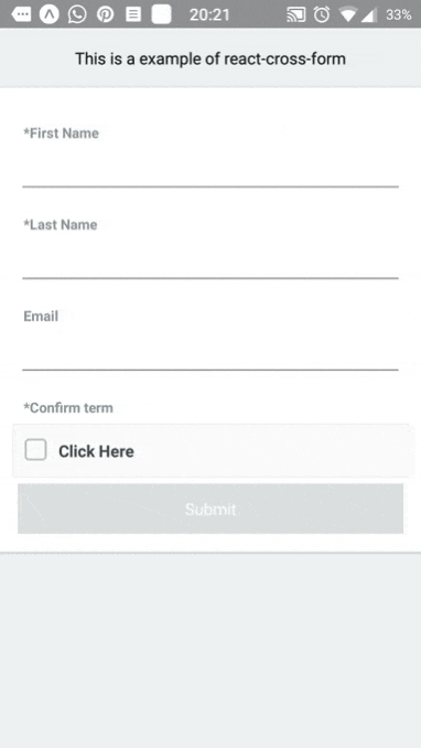
The result of this exmple is:

Complex uses
1- Group number of inputs to one componet
const FIELDS = [
{
   key: 'email',
   label: 'Email',
   component: TextInput
},
{
   group: [
   	{
   		key: 'firstName',
   		label: 'FirstName',
   		component: TextInput
   	},
   	{
   		key: 'lastName',
   		label: 'LastName',
   		component: TextInput
   	},
   ],
   	component: FullNameComponent
   }
]
In this example FullNameComponent will get props with a object call inputsGroup that include the firstName and lastName component as a function that return the comoponent, you can run the function with props that you eant to pass to the input,
see FullNameComponent as a group component example:
import React from 'react';

export default class FullNameComponent extends React.Component {
  render() {
    const {inputsGroup} = this.props
    return (
      <div>
        {inputsGroup.firstName({style: {color: 'red'}})}
        {inputsGroup.lastName()}
      </div>
    )
  }
}
2 - Get ref of other field and change is value
Sometimes you want to enable value changing in what value to trigger a change in another field, for this case you can get from any input the ref of another input and run is props.change with the value
Example:
In this example AddressAutoComplete is a component with a dropdown of countries, when we select an option we get address and coordinates.
We want to achieve an update in the location input.
We pass in the field config onSelect function that called when user select address from the dropdown, the input will call the onSelect with the option and the input props, one of the props is the getOtherFieldRefByKey function.
we call getOtherFieldRefByKey from the input props and get the refs to location input and is parent.
in this example we use the parent props, the parent is the wrapper of the location input, we call the onChange with the new coordinates.
 const FIELDS = [
  {
    key: 'address',
    label: 'Address',
    component: AddressAutoComplete,
    onSelect: (option, props) => {
      const coordinates = option.geometry.coordinates
      let locationRefs = props.getOtherFieldRefByKey('location')
      const {input, parent} = locationRefs
	  parent.props.onChange({
          __type: 'GeoPoint',
          latitude: coordinates[1],
          longitude: coordinates[0]
        });
    },
    accessToken: envConfig.MAP_BOX_ACCESS_TOKEN
  },
  {
    key: 'location',
    label: 'Location',
    component: GeoLocationMapView,
    accessToken: envConfig.MAP_BOX_ACCESS_TOKEN
  },
]
3 - onChanged example
export  const  DocFields  = [
	{
		key: 'value',
		label: 'Value',
		onChanged: (field, props) => {
		const  displayValue  = props.getOtherFieldRefByKey('display').parent.props.value
		if(!displayValue  ||  displayValue  ===  '') {
		props.getOtherFieldRefByKey('display').parent.props.onChanged(field.value)
		}
		},
		component: TextInput
	},
	{
		key: 'display',
		label: 'Display',
		validators: { presence: true },
		component: TextInput
	}
];
Dependencies
- isEmpty/lodash
- validate.js