react-native-seach-header
Easy to use React Native search header component based on material design patterns.
Installation
$ npm install react-native-search-header --save
NOTE
To get TextInput clear to work with current react native version 55.4. Please apply this patch.
Example
To use search header you simply import the component factory function to create a renderable component:
import React, { Component } from 'react';
import {
Dimensions,
AppRegistry,
StyleSheet,
View,
Text,
Button,
StatusBar
} from 'react-native';
import SearchHeader from 'react-native-search-header';
const DEVICE_WIDTH = Dimensions.get(`window`).width;
const styles = StyleSheet.create({
container: {
flex: 1,
justifyContent: 'flex-start',
alignItems: 'center',
backgroundColor: '#f5fcff'
},
status: {
zIndex: 10,
elevation: 2,
width: DEVICE_WIDTH,
height: 21,
backgroundColor: '#0097a7'
},
header: {
justifyContent: 'center',
alignItems: 'center',
width: DEVICE_WIDTH,
height: 56,
marginBottom: 6,
backgroundColor: '#00bcd4'
},
label: {
flexGrow: 1,
fontSize: 20,
fontWeight: `600`,
textAlign: `left`,
marginVertical: 8,
paddingVertical: 3,
color: `#f5fcff`,
backgroundColor: `transparent`
},
button: {
justifyContent: 'center',
alignItems: 'center',
width: 130,
height: 40,
marginTop: 40,
borderRadius: 2,
backgroundColor: `#ff5722`
}
});
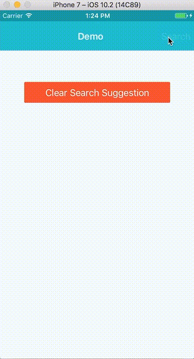
export default class Demo extends Component {
constructor (props) {
super(props);
}
render () {
return (
<View style = { styles.container }>
<StatusBar barStyle = 'light-content' />
<View style = { styles.status }/>
<View style = { styles.header }>
<Text style = { styles.label }> Demo </Text>
<Button
title = 'Search'
color = '#f5fcff'
onPress = {() => this.searchHeader.show()}
/>
</View>
<SearchHeader
ref = {(searchHeader) => {
this.searchHeader = searchHeader;
}}
onClear = {() => {
console.log(`Clearing input!`);
}}
onGetAutocompletions = {async (text) => {
if (text) {
const response = await fetch(`http://suggestqueries.google.com/complete/search?client=firefox&q=${text}`, {
method: `get`
});
const data = await response.json();
return data[1];
} else {
return [];
}
}}
/>
<View style = { styles.button }>
<Button
title = 'Open Search'
color = '#f5fcff'
onPress = {() => this.searchHeader.show()}
/>
</View>
<View style = { styles.button }>
<Button
title = 'Clear'
color = '#f5fcff'
onPress = {() => {
this.searchHeader.clear();
}}
/>
</View>
</View>
);
}
}
AppRegistry.registerComponent('Demo', () => Demo);
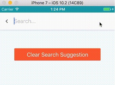
Public Methods Access via Reference
These are methods that are accessible via "ref":
| Methods | description |
|---|---|
| isHidden | Call to check if the SearchHeader is visible. |
| show | Call to show the SearchHeader. |
| hide | Call to hide the SearchHeader. |
| clear | Call to clear the SearchHeader text input. |
| clearSuggestion | Call to clear search suggestion list. |
Props
Below are the props you can pass to the React Component to customize the SearchHeader.
| Prop | Type | Default | description |
|---|---|---|---|
| headerHeight | string | #5d5d5d |
Custom header bar height. |
| headerBgColor | string | #5d5d5d |
Custom header background color. |
| inputColor | string | #5d5d5d |
Search text input color. |
| placeholderColor | string | #bdbdbd |
Text input placeholder color. |
| suggestionEntryColor | string | #bdbdbd |
Search suggestion text color. |
| iconColor | string | #5d5d5d |
SearchHeader component icon button color. |
| topOffset | number | 21 | The offset above the SearchHeader component. Usually where the phone status is. |
| dropShadowed | boolean | true | Enable drop shadow styling. |
| visibleInitially | boolean | false | Set to false to hide and to true to show the SearchHeader component. |
| autoFocus | boolean | true | Enable text input auto focus when open. |
| autoCorrect | boolean | true | Enable text input autocorrect. |
| persistent | boolean | false | Enable persistent search. |
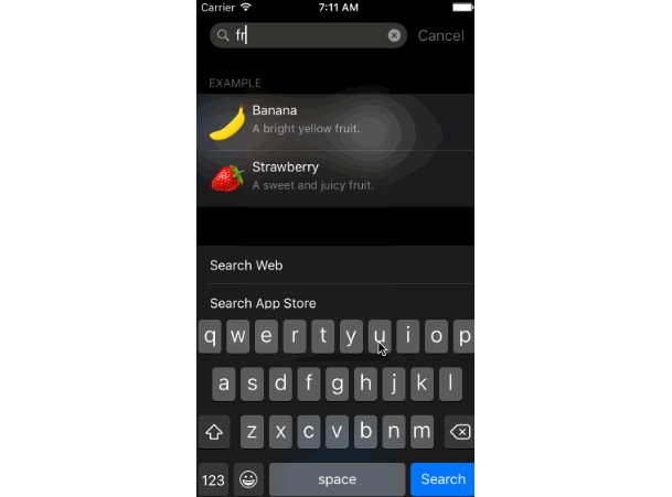
| enableSuggestion | boolean | true | When enabled, search suggestion list will be display accordingly. |
| suggestionHistoryEntryRollOverCount | number | 16 | The max number of search suggestion history items. |
| placeholder | string | Search... |
A string placeholder when there is no text in text input. |
| entryAnimation | string | from-left-side |
Set the direction of SearchHeader entry animation. Possible values are from-left-side, from-right-side |
| iconImageComponents: | function | Internal | An array of custom icon image components for the buttons. |
| onGetAutocompletions | function | None | This function is called during search change (componenWillUpdate) to get a string array of search autocompletions. |
| onClear | function | None | This function is called when text input is cleared. |
| onSearch | function | None | This function is called after return/done key is pressed. Return text input event. |
| onEnteringSearch | function | None | This function is called after text is entered/changed in text input. Return text input event. |
| onFocus | function | None | This function is called when text input in focused. |
| onBlur | function | None | This function is called when text input in blurred. |
| onHide | function | None | This function is called right after hide animation is completed. |
| onShow | function | None | This function is called right after show animation is completed. |
Style Overrides
SearchHeader component default style can be override. Below are examples of how to override each default style element.
<SearchHeader
	style = {{
		container: {
			...myContainerStyle
		},
		header: {
			...mySearchHeaderStyle
		},
		suggestion: {
			...mySearchSuggestionStyle
		},
		input: {
			...mySearchInputTextStyle
		},
		suggestionEntry: {
			...mySearchSuggestionEntryTextStyle
		},
		icon: {
			...myIconStyle
		}
	}}
/>
Change Log
Release Version 0.2.8 (08/30/2018)
Notes:
    Updated compatibility to latest react native version 0.56
New Features:
Breaking Changes:
Improvements:
Bug fixes:
    - Fixed suggestion text display to have tail ellipsize if there are too many words in one line.
    - Fixed text input clearing issue.
Release Version 0.2.7 (04/09/2018)
Notes:
    Updated compatibility to latest react native version 0.55.4
New Features:
    - Added onClear callback when text input is cleared
Breaking Changes:
Improvements:
Bug fixes:
    - Add note to get clear method to work with react native 55.4.
    - Fixed no spacing for text entry in search suggestion box view.
Release Version 0.2.6 (03/19/2018)
Notes:
    Updated compatibility to latest react native version 0.54.2
New Features:
Breaking Changes:
Improvements:
Bug fixes:
    - Fixed bug where clearing text input or if text input is empty will not close the suggestion view
    - Fixed documentation in README
        onHidden -> onHide
        onVisible -> onShow
Release Version 0.2.5 (02/05/2018)
Notes:
    Updated compatibility to latest react native version 0.53.0
New Features:
    Added onClearSuggesstion callback prop to clear suggestion history
Breaking Changes:
Improvements:
Bug fixes:
    - Fixed topOffset spelling error.
    - Fixed key index warning in FlatList.
Release Version 0.2.4 (12/27/2017)
Notes:
New Features:
    Added  headerHeight prop
    Added  headerBgColor prop
Breaking Changes:
Improvements:
Bug fixes:
Release Version 0.2.3 (11/26/2017)
Notes:
New Features:
Breaking Changes:
Improvements:
Bug fixes:
    - Drop custom deepMerge in favor of lodash.merge
Release Version 0.2.2 (11/25/2017)
Notes:
    - Updated to latest React Native version 0.50.4
    - Removed Hyperflow dependency as it is not needed.
New Features:
Breaking Changes:
Improvements:
Bug fixes:
    - Resolving babel transform error. Hopefully...
Release Version 0.2.1 (10/17/2017)
Notes:
    - Updated to latest React Native version
New Features:
    - Added persistent search bar
    - iconImageComponents prop for easy custom button styling
Breaking Changes:
    - No longer needed to do this const SearchHeaderView = SearchHeaderComponent()
      Just import and use as any react native component.
    - Renaming properties:
        searchInputTextColor -> inputColor
        placeholderTextColor -> placeholderColor
        searchSuggestionTextColor -> suggestionEntryColor
        statusHeightOffet -> topOffset
        searchSuggestionHistoryItemRollOverCount ->suggestionHistoryEntryRollOverCount
        dropShadow -> dropShadowed
        enableSearchSuggestion -> enableSuggestion
        onGetSearchAutocompletions -> onGetAutocompletions
        onSearchChange -> onEnteringSearch
        onHidden -> onHid
        onVisible -> onShow
Improvements:
Bug fixes:
Release Version 0.2.0 (09/08/2017)
Notes:
    - Updated to latest React Native
    - updated to latest Hyperflow
New Features:
Breaking Changes:
Improvements:
    - Added autoFocus prop
Bug fixes:
    - Fixed FlatList missing list item "key" warning
Release Version 0.1.9 (05/27/2017)
Notes:
    - Updated to latest React Native
New Features:
Breaking Changes:
Improvements:
    - Used FlatList instead of ScrollView to render search suggestion list
Bug fixes:
    - Fixed clearSearchSuggestion bug
Release Version 0.1.8 (05/17/2017)
Notes:
New Features:
Breaking Changes:
    - Renamed property searchSuggestionItemRollOverCount to searchSuggestionHistoryItemRollOverCount
    - Renamed property onGetSearchSuggestions to onGetSearchAutocompletions
Improvements:
    - Improved onGetSearchAutocompletions implementation
    - Added onGetSearchAutocompletions to example
Bug fixes:
Release Version 0.1.7 (05/10/2017)
Notes:
    - Updated package dependencies.
New Features:
Breaking Changes:
Improvements:
Bug fixes:
Release Version 0.1.6 (02/16/2017)
Notes:
New Features:
    - Added isHidden and clear methods, accessible via "ref"
Breaking Changes:
Improvements:
Bug fixes:
    - Fixed issues with onHidden and onVisible not firing.
Release Version 0.1.5 (01/27/2017)
Notes:
New Features:
Breaking Changes:
Improvements:
    - Improved search suggestion implementation. Matching it closer to other material design search implementations.
Bug fixes:
Release Version 0.1.4 (01/26/2017)
Notes:
	- Update to latest hyperflow version.
New Features:
    - New prop "entryAnimation" for setting SearchHeader entry animation direction.
Breaking Changes:
Improvements:
    - Added public methods access via "ref"
Bug fixes:
    - Fixed react "refs" warning message.
Release Version 0.1.3 (01/25/2017)
Notes:
	- Update to latest hyperflow version.
New Features:
Breaking Changes:
    - Props renaming:
        searchTextColor               -> searchInputTextColor
        searchSuggestionItemTextColor -> searchSuggestionTextColor
        searchVisibleInitially        -> visibleInitially
        onSearchBlur                  -> onBlur
        onSearchFocus                 -> onFocus
        onMinimized                   -> onHidden
        onMaximized                   -> onVisible
Improvements:
    - Added public methods access via "ref"
Bug fixes:
    - Fixed issue with search container covering underlining components when hidden.
Release Version 0.1.2 (01/23/2017)
Notes:
	- Update to latest hyperflow version.
New Features:
Breaking Changes:
    - Props renaming:
        statusBarHeightOffet      -> statusHeightOffet
        textInputPlaceholderColor -> placeholderTextColor
        minimized                 -> searchVisibleInitially
        onBlur                    -> onSearchBlur
        onFocus                   -> onSearchFocus
        onMinimized               -> onSearchHidden
        onMaximized               -> onSearchVisible
Improvements:
    - Added public methods access via "ref"
Bug fixes:
Release Version 0.1.1 (01/23/2017)
Notes:
	- Update to latest hyperflow version.
New Features:
Breaking Changes:
Improvements:
Bug fixes:
Release Version 0.1.0 (01/22/2017)
Notes:
    - Initial commit with features
	    Search header component based on material design.
	    Search suggestions and history with autocomplete. patterns
New Features:
Breaking Changes:
Improvements:
Bug fixes: