react-native-emoji-modal
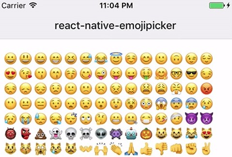
Feature-complete emoji picker for React Native that mimics the look and feel of native ones.
This is a rewrite of react-native-emoji-picker.
Features:
- Vertically scrolling with 7 columns of emoji
- Search field
- Category shortcuts
- Supports iOS
- Supports Android
- It’s aware of Android versions and thier availability of emojis
- Supports react-native-web
- Except for category shortcuts (PRs welcome to fix this!)
- Written in TypeScript
- Lightweight
- Loads just 163 kB worth of emoji data, versus 1.2 MB in react-native-emoji-picker
Installation
pnpm add react-native-emoji-modal
or
npm install --save react-native-emoji-modal
Usage
import EmojiModal from 'react-native-emoji-modal';
// ...
<EmojiModal onEmojiSelected={(emoji) => {}} />;
Props
| Prop name | Description | Type | Required | Default |
|---|---|---|---|---|
onEmojiSelected |
Function called when the user presses one of the emojis shown | function | true | |
onPressOutside |
Function called when the user taps outside of the emoji picker region | function | false | |
columns |
How many columns of emojis to render in the grid | number | false | 7 |
localizedCategories |
Customize the labels for each category | Array | false | ['Smileys & Emotion', 'People & Body', 'Animals & Nature', 'Food & Drink', 'Activities', 'Travel & Places', 'Objects', 'Symbols', 'Flags'] |
emojiSize |
Customize the size of each emoji, in pixels | number | false | 32 |
emojiStyle |
Custom style for each emoji | TextStyle | false | |
headerStyle |
Custom style for the label for each category | TextStyle | false | |
scrollStyle |
Custom style for the FlatList with the grid of emojis | ViewStyle | false | |
searchStyle |
Custom style for the search TextInput | ViewStyle | false | |
shortcutColor |
Color for inactive category shortcuts | color | false | #bcbcbc |
activeShortcutColor |
Color for the active category shortcut | color | false | #0c0c0c |
containerStyle |
Custom style for the “box” in the center | ViewStyle | false | |
backgroundStyle |
Custom style for the background of the modal | ViewStyle | false | |
modalStyle |
Custom style for top-level container | ViewStyle | false |
Support us!
This library was created for Manyverse and we’re very thankful for our backers on OpenCollective, and we need more donations! ?


