react-native-advanced-forms
Flexible React Native architecture for building and managing forms.

Features:
- Cross-platform (iOS, Android)
- Allow for flexible form layouts
- Easily manage and validate field input values
- Auto-focussing of next field for better user experience
- Easily integrate your own custom components
- Component-based - use with or without Redux
- Compatible with React Native 0.40+
- Successfully used in production apps
Installation
Use NPM/Yarn to install package: react-native-advanced-forms
Note: You must also have the prop-types package installed.
npm install
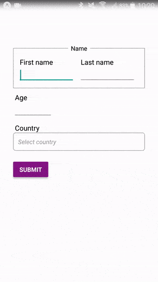
Demo
A working demo app can be found in the demo folder (Note that you will need
to copy src to demo/src for the app to successfully build).
Usage
This code will render a form similar to what can be seen in the demo animation above:
import React from 'react'
import { Button, Alert, StyleSheet, Text, View } from 'react-native'
import Form from 'react-native-advanced-forms'

export default class App extends React.Component {
  constructor (props, ctx) {
    super(props, ctx)

    this.state = {
      firstName: null,
      lastName: null,
      age: null,
      country: null,
    }
  }

  render() {
    const {
      firstName, lastName, age, country
    } = this.state

    return (
      <View style={styles.container}>
        <Form ref={this._onFormRef} onChange={this.onChange} onSubmit={this.onSubmit} validate={this.validate}>
          <Form.Layout style={styles.row}>
            <Form.Layout style={styles.columns}>
              <Form.Field name="firstName" label="First name" style={styles.field}>
                <Form.TextField value={firstName} />
              </Form.Field>
              <Form.Field name="lastName" label="Last name" style={styles.field}>
                <Form.TextField value={lastName} />
              </Form.Field>
            </Form.Layout>
          </Form.Layout>
          <Form.Layout style={styles.row}>
            <Form.Field name="age" label="Age" style={styles.ageField}>
              <Form.TextField value={age} keyboardType='numeric'/>
            </Form.Field>
          </Form.Layout>
          <Form.Layout style={styles.row}>
            <Form.Field name="country" label="Country" style={styles.field}>
              <Form.TextField value={country} />
            </Form.Field>
          </Form.Layout>
        </Form>
        <View style={styles.button}>
          <Button
            disabled={this.form && !this.form.canSubmit()}
            onPress={() => this.form.validateAndSubmit()}
            title="Submit"
            color="#841584"
          />
        </View>
      </View>
    )
  }

  _onFormRef = e => {
    this.form = e
  }

  onChange = (values) => {
    this.setState(values)
  }

  onSubmit = (values) => {
    Alert.alert('Submitted: ' + JSON.stringify(values))
  }

  validate = (values) => {
    const ret = Object.keys(this.state).reduce((m, v) => {
      if (!values[v] || !values[v].length) {
        m[v] = Form.VALIDATION_RESULT.MISSING
      }
      return m
    }, {})

    if (!ret.age && isNaN(values.age)) {
      ret.age = Form.VALIDATION_RESULT.INCORRECT
    }

    return ret
  }
}

const styles = StyleSheet.create({
  container: {
    flex: 1,
    backgroundColor: '#fff',
    paddingTop: 100,
    paddingHorizontal: 30
  },
  row: {
    marginBottom: 20,
  },
  columns: {
    flexDirection: 'row',
    alignItems: 'center',
    justifyContent: 'flex-start',
  },
  field: {
    marginRight: 10,
  },
  ageField: {
    width: 60,
  },
  button: {
    width: 80,
    marginTop: 15,
  },
  error: {
    marginTop: 10,
  },
  errorMsg: {
    color: 'red'
  }
})
API and props
Form
This is the root component for a form and is responsible for co-ordinating
form value changes and auto-focussing components.
Properties:
| Prop | Type | Default | Description |
|---|---|---|---|
submitOnReturn |
boolean |
true |
If turned off then the form will NOT be auto-submitted when the user presses the Return key after filling in the final field |
onChange |
function (Object values) |
required | Called whenever form values change |
onSubmit |
function (Object values) |
required | Called form values have passed validation and form is to be submitted |
validate |
function (Object values) |
required | Called to validate form values. Must return an Object mapping field name to validation error. If it returns {} then it means all fields are valid. |
onValidationError |
function (Array badFieldNames) |
null |
Called when validation fails. |
onFocusField |
function (String fieldName, Function callback) |
null |
Called when form is about to auto-focus a field. The callback must be invoked for focussing to proceed. |
style |
Any | null |
Styling to apply to form container element. |
Methods:
| Method | Returns | Description |
|---|---|---|
validateAndSubmit |
undefined |
Validate the form field values and submit it if validation succeeds. |
validate |
undefined |
Validate the form field values and highlight errors if any. Returns true if validation passed. |
unfocus |
undefined |
Unfocus all form fields. |
getValues |
Object |
Get current form field values. |
canSubmit |
boolean |
Get whether current form field values are valid such that form can be submitted. |
Form.Layout
This component works similarly to React Native View and is to be used to create whatever type of layout your require for your form. Form.Layout instances can be nested within each other to multiple levels without issue.
Properties:
| Prop | Type | Default | Description |
|---|---|---|---|
style |
Any | null |
Styling to apply to form container element. |
Form.Section
This is a convenience component which constructs a Form.Layout to wrap its children but additionally attaches text above it:

Properties:
| Prop | Type | Default | Description |
|---|---|---|---|
title |
String |
null |
The title text to show. |
style |
Any | null |
Style to apply to root container. |
layoutStyle |
Any | null |
Style to apply to nested Form.Layout. |
titleTextStyle |
Any | null |
Style to apply to title text, is shown. |
Form.Field
This component must wrap every actual input element. It is responsible for setting up onChange and onSubmit handlers as well as pass through focus/unfocus and error display commands from the parent form.
If a label gets passed in it will use Form.LabelGroup and Form.Label to render a label above the wrapped form field component.
| Prop | Type | Default | Description |
|---|---|---|---|
name |
String |
required | The field name. |
label |
String |
null |
The field label. |
labelStyle |
Any | null |
The field label container style. |
labelTextStyle |
Any | null |
The field label text style. |
labelRightContent |
Any | null |
What to show in the right-hand side of the field label container (using Form.LabelGroup). |
style |
Any | null |
The style for the root container. |
onSubmit |
Function |
null |
Usually set by the parent Form. |
onChange |
Function |
null |
Usually set by the parent Form. |
Form.TextField
A text field designed to work well with a Form. It handles validation error display and scroll view integration.
| Prop | Type | Default | Description |
|---|---|---|---|
value |
Any | null |
The field value. |
error |
Any | null |
The current field validation error. If set then the field is in "error" mode. |
style |
Any | null |
The style for the text field in non-error mode. |
errorStyle |
Any | null |
The style for the text field in error mode. |
getParentScrollView |
Function |
null |
Function to get reference to scroll view further up the UI hierarchy (if any). This is used to auto-scroll the scroll view such that the text field is visible whenever it receives focus. |
onSubmit |
Function |
null |
Usually set by the parent Form.Field. |
onChange |
Function |
null |
Usually set by the parent Form.Field. |
Methods:
| Method | Returns | Description |
|---|---|---|
focus |
undefined |
Focus this field (should show the keyboard). |
unfocus |
undefined |
Unfocus this field (should hide the keyboard). |
getValue |
Any | Get current field value (will return this.props.values). |
Form.Label
Text to display above a form field element as its label. Gets automatically rendered by Form.Field if a label has been set.
| Prop | Type | Default | Description |
|---|---|---|---|
style |
Any | null |
The style for the root container. |
textStyle |
Any | null |
The style for the label text. |
Form.LabelGroup
A helper component which wraps a Form.Label, allowing for additional components to be displayed alongside it.
Flexible layouts
The Form.Layout component is key to achieving flexible layouts. By default, if you don't use Form.Layout then components will be stacked on top of each other (assuming default flexDirection for the Form):
<Form onChange={this.onChange} onSubmit={this.onSubmit} validate={this.validate}>
  <Form.Field name="firstName">
    <Form.TextField value={firstName} />
  </Form.Field>
  <Form.Field name="lastName">
    <Form.TextField value={lastName} />
  </Form.Field>
  <Form.Field name="age">
    <Form.TextField value={age} />
  </Form.Field>
</Form>
If you wish to place the first two components next to each other then simply wrap them within a Form.Layout with the appropriate styling:
<Form onChange={this.onChange} onSubmit={this.onSubmit} validate={this.validate}>

  <Form.Layout style={{ flexDirection: 'row' }}>
    <Form.Field name="firstName">
      <Form.TextField value={firstName} />
    </Form.Field>
    <Form.Field name="lastName">
      <Form.TextField value={lastName} />
    </Form.Field>
  </Form.Layout>

  <Form.Field name="age">
    <Form.TextField value={age} />
  </Form.Field>

</Form>
And you can nest layouts:
<Form onChange={this.onChange} onSubmit={this.onSubmit} validate={this.validate}>

  <Form.Layout style={{ marginBottom: 10 }}>
    <Form.Layout style={{ flexDirection: 'row' }}>
      <Form.Field name="firstName">
        <Form.TextField value={firstName} />
      </Form.Field>
      <Form.Field name="lastName">
        <Form.TextField value={lastName} />
      </Form.Field>
    </Form.Layout>
  </Form.Layout>

  <Form.Layout style={{ marginBottom: 10 }}>
    <Form.Field name="age">
      <Form.TextField value={age} />
    </Form.Field>
  </Form.Layout>

</Form>
Note: A working example of the above can be found in the demo folder.
Form validation and submission
You must provide a validate property to the form, the value of which is a
function which returns which fields have failed validation, for example:
render () {
  return (
    <Form onSubmit={this.onSubmit} validate={this.validate} ...>
      ...
    </Form>
  )
}

validate = (values) => {
  const ret = {}

  if (!values.firstName) {
    ret.firstName = Form.VALIDATION_RESULT.MISSING
  }

  if (isNaN(values.age)) {
    ret.age = Form.VALIDATION_RESULT.INCORRECT
  }

  return ret
}

onSubmit = (values) = {
  ...
}
Note: The default VALIDATION_RESULT values can be found in src/utils.js:
If all fields have valid values then validate() must return {}. If
validation thus succeeds the form will be submitted and the onSubmit
handler which you passed in will be called with the values.
If you try submit the form programmatically (by calling validateAndSubmit())
and some fields have not yet been filled in, then they will be highlighted. On
the other hand, if you submit a
field (i.e. you enter text and then press done or the equivalent on your
keyboard) then the form logic will auto-focus on the next field that needs to
be filled in:

Note: Form.Field components will pass an error object down to their children (the actual input elements) if a validation error occurs.
Custom components
You can integrate your own custom form component into a Form, as long as you follow certain rules:
- Your component must expose
focus(),unfocus()andgetValue()methods, just like asForm.TextFielddoes. - Your component must call
this.props.onChange()when its value changes. - Your component must call
this.props.onSubmit()when it gets "submitted", e.g. for text fields the user may be press Done on the keyboard to submit the input.
Let's say we wish to integrate the React Native Switch component. Here is how we might define it:
import { Switch } from 'react-native'

class CustomSwitch extends Component {
  render () {
    const { turnedOn } = this.props

    return (
      <Switch
        value={turnedOn}
        onValueChange={this.onPress}
      />
    )
  }

  onPress = () => {
    this.props.onChange(!this.props.turnedOn)
  }

  getValue () {
    return this.props.turnedOn
  }

  // still need these methods even if they're empty
  focus () { }
  unfocus () {}
}
In our form code we would then use it as such:
const { name, isMale } = this.state

<Form onChange={this.onChange} onSubmit={this.onSubmit} validate={this.validate}>
  <Form.Field name="name">
    <Form.TextField value={name} />
  </Form.Field>
  <Form.Field name="isMale">
    <CustomSwitch turnedOn={isMale} />
  </Form.Field>
</Form>
Your component will receive an error prop containing a validation error whenever validation fails. It is up to you if/when you make use of this.
Note: There is a working example of a custom component (a dropdown using react-native-modal-filter-picker) in the demo folder.
Auto-scrolling to fields (ScrollView)
Sometimes you will need to place your form within a React Native ScrollView because it is longer than the height of the screen. In such cases the problem with auto-focussing fields is that the focussed field may not be visible in the current scroll area.
Thus, when a field receives focus it must be able to tell the ScrollView to scroll to it such that it's visible. The Form.TextField component already does this, as long as you pass in the getParentScrollView prop:
<ScrollView ref={e => { this.scrollView = e; }}>
  <Form onChange={this.onChange} onSubmit={this.onSubmit} validate={this.validate}>

    <Form.Layout>{ /* other stuff here */ }</Form.Layout>

    <Form.Field name="name">
      <Form.TextField value={name} getParentScrollView={() => this.scrollView} />
    </Form.Field>

    <Form.Layout>{ /* other stuff here */ }</Form.Layout>

    <Form.Field name="age">
      <Form.TextField value={age} getParentScrollView={() => this.scrollView} />
    </Form.Field>

    <Form.Layout>{ /* other stuff here */ }</Form.Layout>

  </Form>
</ScrollView>
Internally, Form.TextField uses Form.utils.scrollToComponentInScrollView() to actually perform the scroll. When building your own form component you can use this method too to achieve the same effect.