react-native-card
Fully customizable Card View for React Native.
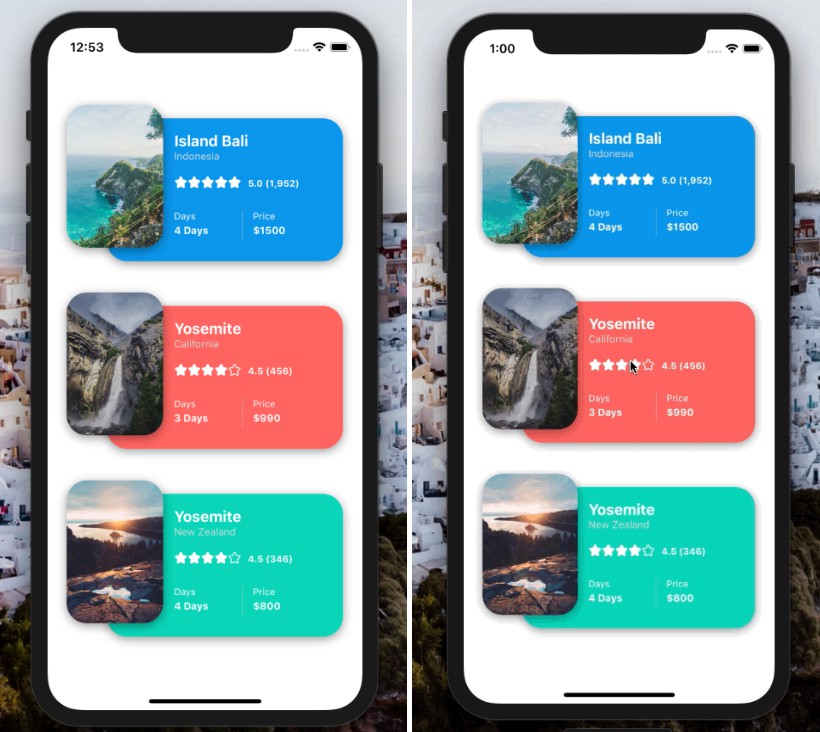
Card Component
SimpleCard Component
Components included:
- [x] Card
- [x] SimpleCard
Installation
Add the dependency:
npm i @paraboly/react-native-card
Peer Dependencies
IMPORTANT! You need install them.
"@freakycoder/react-native-helpers": ">= 0.1.2",
"react": ">= 16.x",
"react-native": ">= 0.55.x",
"react-native-material-ripple": ">= 0.8.x",
"react-native-dynamic-vector-icons": ">= x.x.x"
"react-native-vector-icons": ">= x.x.x"
Basic Usage
import { Card } from "@paraboly/react-native-card";

<Card
  iconDisable
  title="Title"
  content="Main Content"
  bottomRightText="30"
  onPress={() => {}}
/>;
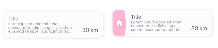
Card with Icon
<Card
  title="Title"
  iconName="home"
  defaultTitle=""
  iconType="Entypo"
  defaultContent=""
  onPress={() => {}}
  topRightText="50/301"
  bottomRightText="30 km"
  content="Lorem ipsum dolor sit."
/>
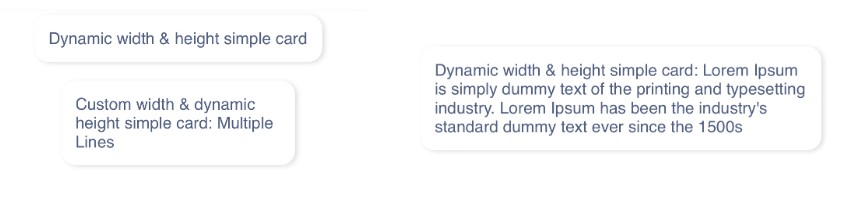
SimpleCard Basic Usage
import { SimpleCard } from "@paraboly/react-native-card";

<SimpleCard title="Dynamic width & height simple card" />;
SimpleCard Custom Usage
<SimpleCard
  title="Custom width & dynamic height simple card: Multiple Lines"
  styles={{ width: 200 }}
/>
Example Application
- check the code, and yes! :) all of the images, screenshots are directly taken
from the this example. Of course, you can simply clone the project and run the example on your own environment.
Configuration - Props
Card
| Property | Type | Default | Description |
|---|---|---|---|
| title | string | "" | use this to change the title |
| style | style | style | use this to change the main container's style |
| onPress | function | null | set the onPress function |
| content | string | "" | set content |
| iconComponent | component | Icon | use your own icon component |
| iconName | string | "home" | set icon from dynamic vector icons |
| iconColor | color | #ffffff | set icon's color |
| iconSize | number | 16 | set icon's size |
| iconType | string | "Entypo" | set icon's family type |
| iconDisable | boolean | false | disable the whole icon component |
| shadowStyle | style | default shadow style | change the card's shadow style |
| defaultTitle | string | "" | set the default title if title prop is not set |
| defaultContent | string | "" | set the default content if content prop is not set |
| titleStyle | style | style | set your own style for main title component |
| titleColor | color | "#505e80" | change title color |
| titleFontSize | number | 18 | change title's font size |
| titleFontFamily | FontFamily | default | change title's font family |
| contextStyle | style | style | set your own style for main context component |
| contextTextColor | color | "#959aa8" | change context color |
| contextFontSize | number | 14 | change context's font size |
| contextFontFamily | FontFamily | default | change context's font family |
| contentStyle | style | style | set your own style for content component |
| bottomRightStyle | style | style | set your own style for bottom right component |
| bottomRightComponent | component | component | use your own component for bottom right side |
| bottomRightText | string | "" | set the bottom right text |
| bottomRightFontSize | number | 20 | set the bottom right text's font size |
| bottomRightColor | color | "#505e80" | set the bottom right text's font color |
| topRightStyle | style | style | set your own style for top right component |
| topRightComponent | component | component | use your own component for top right side |
| topRightText | string | "" | set the top right text |
| topRightFontSize | number | 16 | set the top right text's font size |
| topRightColor | color | "#505e80" | set the top right text's font color |
| containerHeight | number | null | set the content's container height |
| iconBackgroundColor | color | "pink" | set the icon's background color |
| borderRadius | number | 15 | set the conten'ts container border radius |
SimpleCard
| Property | Type | Default | Description |
|---|---|---|---|
| title | string | "" | use this to change the title |
| style | style | style | use this to change the main container's style |
| innerContainerStyle | style | style | use this to change the inner container's style |
| onPress | function | null | set the onPress function |
| titleFontSize | number | 14 | change the text's font size |
| titleTextColor | number | "#505e80" | change the text's color |
| titleFontFamily | FontFamily | default | set your own FontFamily for the text component |
| backgroundColor | color | #ffffff | change the main card's background color |
| rippleColor | color | "rgba(110, 157, 251, 1.0)" | change onPress's ripple color |
| rippleContainerBorderRadius | number | 12 | change the ripple's border radius |
Author
FreakyCoder, [email protected] | [email protected]