react-native-dynamic-search-bar
Fully customizable Dynamic Search Bar for React Native.

Installation
Add the dependency:
React Native:
npm i react-native-dynamic-search-bar
Peer Dependencies
IMPORTANT! You need install them.
"react": ">= 16.x.x",
"react-native": ">= 0.55.x",
"react-native-vector-icons": ">= 6,x,x",
"react-native-dynamic-vector-icons": ">= x,x,x"
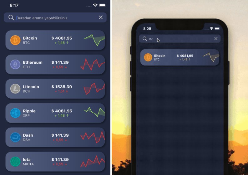
Usage
There are two modes in the library:
- Search Button
- Search TextInput
Basic Usage
<SearchBar
  placeholder="Search here"
  onChangeText={text => {
    console.log(text)
  }}
  onPressCancel={() => {
    this.filterList("");
  }}
  onPress={() => alert("onPress")}
/>
Advanced Usage
You can check the example for the advanced usage
<SearchBar
  fontColor="#c6c6c6"
  iconColor="#c6c6c6"
  shadowColor="#282828"
  cancelIconColor="#c6c6c6"
  backgroundColor="#353d5e"
  placeholder="Search here"
  onChangeText={text => {
    this.filterList(text);
  }}
  onPressCancel={() => {
    this.filterList("");
  }}
  onPress={() => alert("onPress")}
/>
Configuration - Props
| Property | Type | Default | Description |
|---|---|---|---|
| onPress | function | function | set your own function for the onPress functionality |
| fontSize | number | 13 | change the font size |
| fontColor | color | #b3b6c3 | change the font color |
| iconName | string | search | change the icon |
| iconType | string | Octicons | change the icon style |
| iconSize | number | 20 | change the icon size |
| iconColor | color | #807DE7 | change the icon color |
| iconComponent | component | Icon | set your own component instead of Icon |
| shadowColor | color | #757575 | change the shadow color |
| shadowStyle | style | shadow style | set your own shadow style |
| placeholder | string | null | set your own placeholder string |
| textInputDisable | boolean | false | disable the text input, and Text component will be available instead |
| textInputComponent | component | Text OR TextInput | set your own component instead of Text OR TextInput for the center component |
| textInputValue | string | value | set the value of the text input |
| onChangeText | function | function | set your own function for the onChangeText logic |
| cancelIconName | string | clear | change the cancel icon |
| cancelIconType | string | MaterialIcons | change the cancel icon style |
| cancelIconSize | number | 23 | change the cancel icon size |
| cancelIconColor | color | #b3b6c3 | change the cancel icon color |
| cancelIconComponent | component | Icon | set your own component instead of Icon for the cancel component (right component) |
| onPressCancel | function | function | set your own function for the cancel button's onPress functionality |
| cancelComponent | component | component | set your own component instead of cancel component |
| cancelButtonDisable | boolean | false | disable cancel button component |
ToDos
- [x] LICENSE
- [ ] Write an article about the lib on Medium