react-native-easy-state-view
Easy Peasy State View for React Native. StateView is fully customizable, make it your own state view.

Installation
Add the dependency:
npm i react-native-easy-state-view
Basic Usage
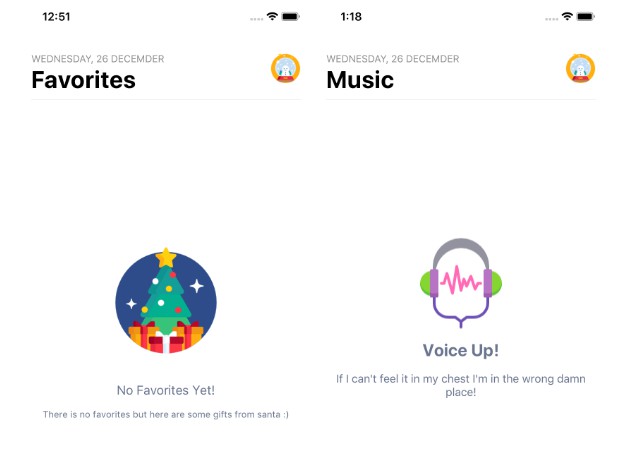
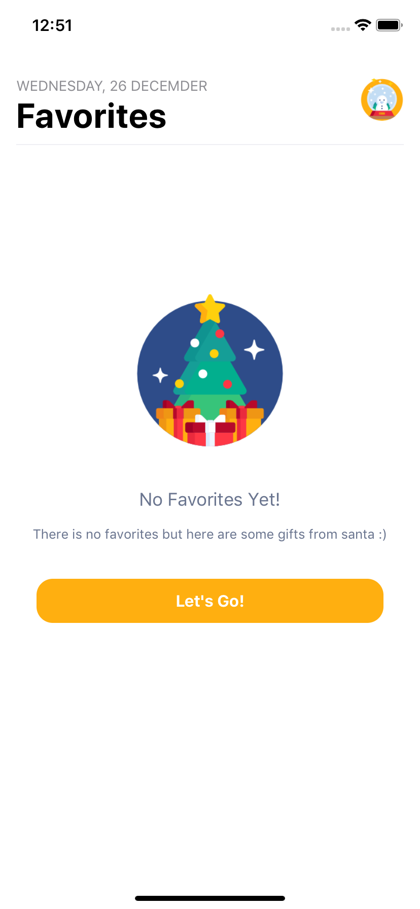
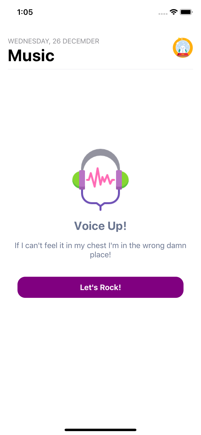
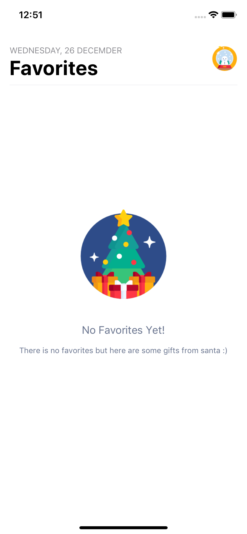
 <StateView
  isCenter
  imageSource={imageSource}
  enableButton
  style={{ top: "40%" }}
  title="No Favorites Yet!"
  subtitle="There is no favorites but here are some gifts from santa :)"
/>
Peer Dependencies
IMPORTANT! You need install them.
react-native-material-ripple // Main button component, but you can implement your button component as well. You do not need to use this.
Example Application
- I shared the example project to check what it is:
check the code, and yes! :) all of the images, screenshots are directly taken
from this example. Of course, you can simply clone the project and run the example on your own environment.
Configuration - Props
| Property | Type | Default | Description |
|---|---|---|---|
| style | style | { top: 0 } | use this to implement your own style for whole StateView. |
| title | string | " " | use this to write your title |
| titleStyle | style | check the source code | use this to change your title's style |
| onPress | function | undefined | use this to handle the press the button |
| subtitle | string | " " | use this to change your subtitle's style |
| subtitleStyle | style | check the source code | use this to change your subtitle's style |
| isCenter | boolean | false | use this to center the StateView's content (recommended) |
| imageStyle | style | check the source code | use this to change your own image STyle |
| imageResizeMode | string | "contain" | use this to change your image's resize mode |
| imageSource | image | Cutie Snow Globe Image | use this to set your own image source |
| enableButton | boolean | false | set the enableButton to use the button |
| buttonComponent | component | default ripple button | use this to implement your own button |
| rippleColor | color | "white" | use this to change ripple color |
| rippleDuration | int | 750 | use this to set ripple duration |
| rippleContainerBorderRadius | int | 16 | use this to change ripple's border radius |
| buttonContainerStyle | style | check the source code | use this to implement your own style for button container |
| buttonColor | color | "#FFAF10" | use this to change button's container color |
| buttonTextStyle | style | check the source code | use this to implement your own style for button's text style |
| buttonTextColor | color | "white" | use this to change button's text color |
| buttonText | string | "Let's Go!" | use this to set your button's text |
| shadowColor | color | "#000" | use this to change button's shadow color |
| shadowStyle | style | _shadowStyle | use this to set your own shadow style |