React SVG Icon Generator
Generate React Icon Component from SVG icons to show, resize and recolor them.
?Supports React Native ?
Fastest way to get your svg converted to React Component
yarn global add react-svg-icon-generator
yarn svg-icon-generate -- --svgDir ./icons --destination ./Icon.tsx
for detailed options run just yarn react-svg-icon-generator
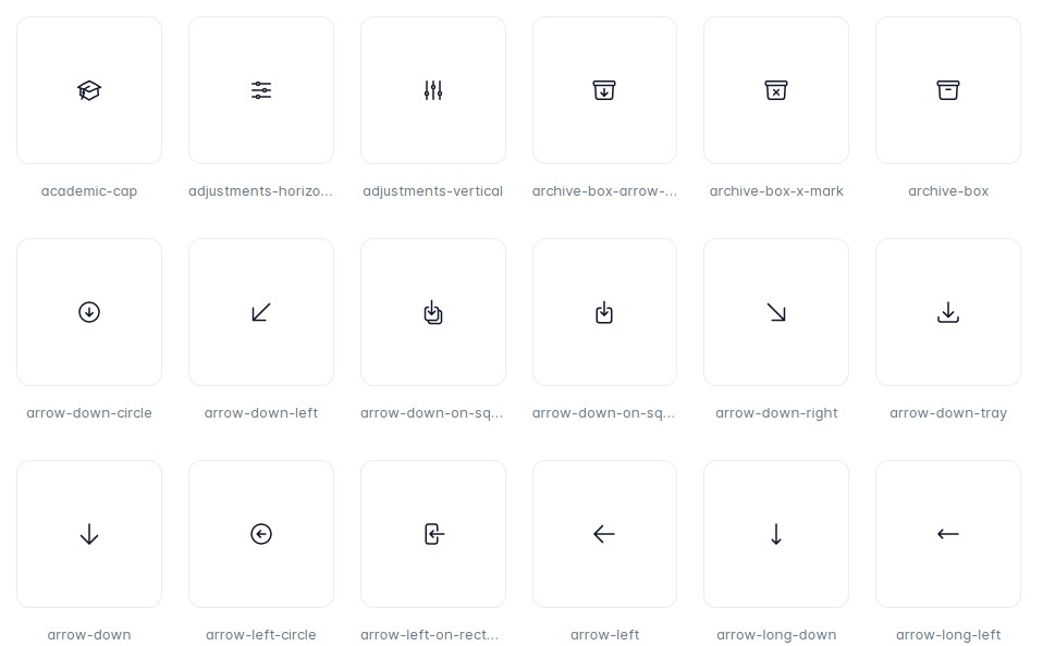
Preview of Generated Component
source directory with SVG and this is output component from gulp task so in production you are without any dependencies at all.
Instalation
you need to add this just to development, because it will generate self contained react component directly to your codebase
npm install --save-dev react-svg-icon-generator
Setup gulp task simple
const configureSvgIcon = require('react-svg-icon-generator').default;

configureSvgIcon({
  destination: path.join(__dirname, 'components', 'Icon.js'),
  svgDir: './icons',
});
- svgDir (required) - path to your directory with svg files. Can be relative path but it is better to use
path.join(__dirname, 'icons')absolute path so it will work in any directory of project - destination (required) - path.join(__dirname, 'components', 'Icon.js')
run it by gulp svg-icon
Setup gulp task full
const configureSvgIcon = require('react-svg-icon-generator').default;

configureSvgIcon({
  comment: 'Generated by gulp svg-icon, if you add new icon run gulp svg-icon',
  componentName: 'Icon',
  destination: path.join(__dirname, 'components', 'Icon.js'),
  keepFillColor: false,
  native: false,
  radium: true,
  reactPureRender: true,
  svgDir: path.join(__dirname, 'icons'),
  template: path.join(__dirname, 'template', 'icon.nunjucks'),
});
- comment (optional) - it will be added to generated component, so other developer will know what to do
- componentName (optional) - it will change the name of the component, default to 'Icon'
- keepFillColor (optional) - it will keep the original fill color from imported SVG in case you want to use multiple colors in your icon, therefore you will not be able to use
colorprop - native (optional) - it will generate component that can be used in React Native projects. This functionality depends on react-native-svg library that has to be installed separately (it is not included in dependencies). You can easily overwrite default native template using template option
- reactPureRender (optional) - it will use
import {PureComponent} from 'react';instead ofimport {Component} from 'react';. If you use this, make sure you use React >= v15.3.0. - radium (optional) - it will import radium and wrap Icon component with Radium wrapper. In order to use Radium it has to be installed separately (it is not part of dependencies).
- template (optional) - provide path to your custom template, you can look at example at Icon.template
run it by gulp svg-icon
Setup gulp task own name
const {configureGenerator} = require('react-svg-icon-generator').default;

const config = {
  comment: 'Generated by gulp svg-icon, if you add new icon run gulp svg-icon-whatever',
  destination: path.join(__dirname, 'components', 'Icon.js'),
  reactPureRender: true,
  svgDir: path.join(__dirname, 'icons'),
  template: path.join(__dirname, 'template', 'icon.nunjucks'),
}

gulp.task('svg-icon-whatever', configureGenerator(config));
same as previous + your own task name
Use generate Icon component
import React, {Component} from 'react';
import Icon from './Icon';
export default class App extends Component {
render() {
return (
<div>
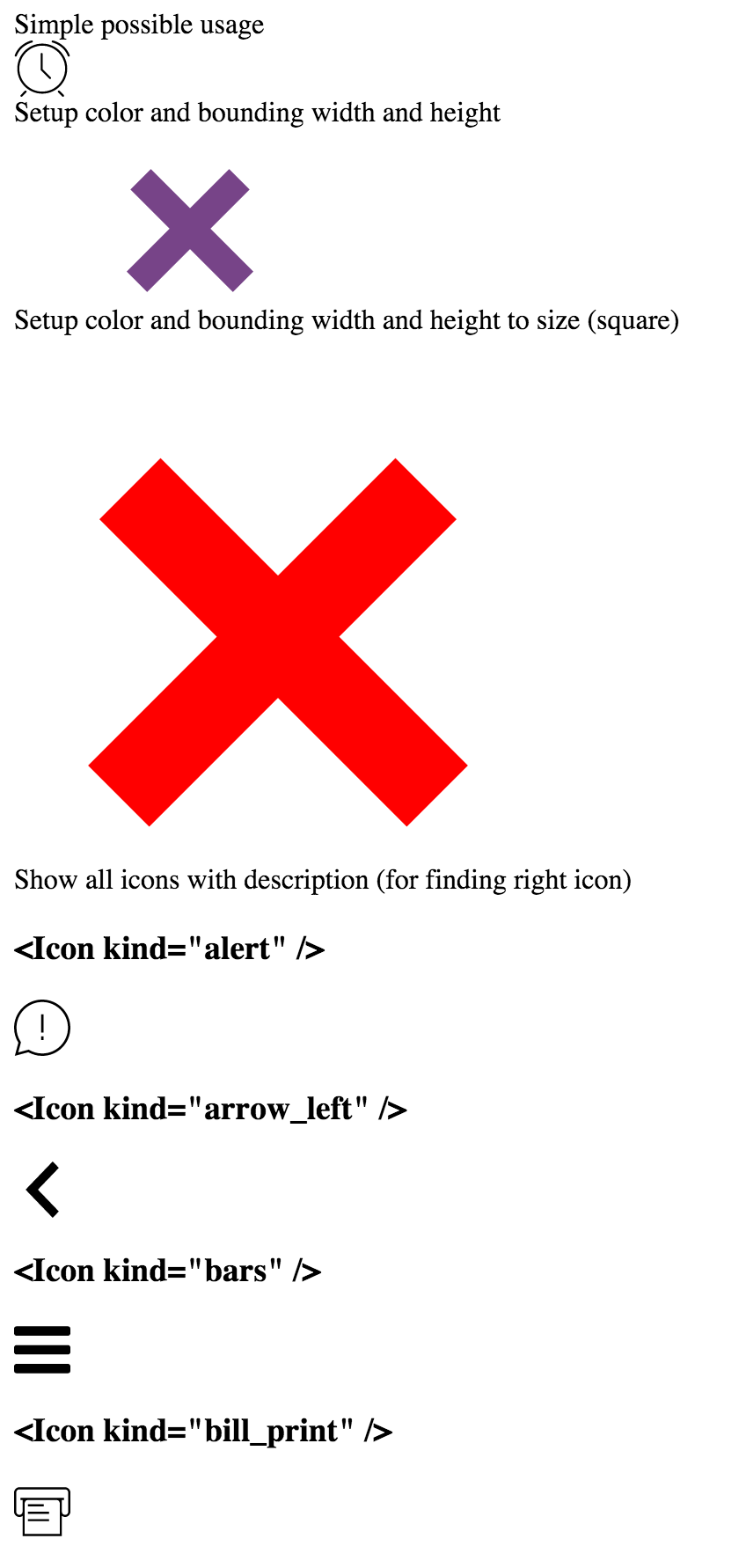
Simple possible usage
<Icon kind='clock' />
Setup color and bounding width and height
<Icon kind='close' color='#748' width={500} height={100} />
Setup color and bounding width and height to size (square)
<Icon kind='close' color='red' size={600} />
Setup custom style and className
<Icon kind="arrow_left" style={{transform: 'scaleX(-1)'}} className="custom-class" />
Setup onClick behavior
<Icon kind='close' onClick={() => alert('clicked on icon')} />
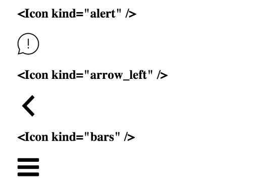
Show all icons at once with description (for finding right icon)
<Icon preview />
</div>
);
}
}
any prop which is not listed will be passed directly to svg as rest props.
Development
git clone [email protected]:blueberryapps/react-svg-icon-generator.git
cd react-svg-icon
npm i
npm link
cd examples/simple
npm link react-svg-icon-generator
npm i
gulp svg-icon
npm start
open http://127.0.0.1:3000