Expo Instagram Reels
It provides a component that allows you to display a list of reels similar to the Instagram app.
Features
- List of videos
- Seekable videos
- Play/Pause option
- Fully customizable
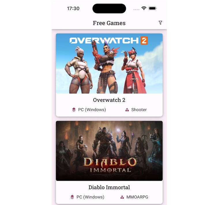
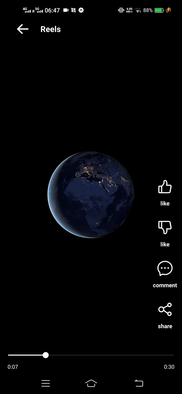
✨ App Preview

Video Preview
Installation
Just run the below command in your project folder
Note:- This runs only in an Expo Managed and Bare(expo) project and not in React Native CLI project.
To install,
npm install --save expo-instagram-reels
Usage
import Reels from 'expo-instagram-reels';
...
// Pass the array of objects with _id and uri as props
<Reels videos={videos} />
Parameters
Required Parameters
| Parameter | required | Default | Description |
|---|---|---|---|
| videos | YES | [] |
List of videos for reels |
Container Parameters
| Parameter | required | Default | Description |
|---|---|---|---|
| backgroundColor | NO | black |
Background color of the whole container |
Header Parameters
| Parameter | required | Default | Description |
|---|---|---|---|
| headerTitle | NO | "Reels" |
Title to be shown on the top header bar |
| headerIconName | NO | arrowright |
iconName from AntDesign family |
| headerIconColor | NO | white |
icon color for the header bar |
| headerIconSize | NO | 24 |
icon size for the header bar |
| headerIcon | NO | null | Custom icon component to display |
| headerComponent | NO | null | custom component to show instead of header bar |
| onHeaderIconPress | NO | null | function to execute when user presses the back icon in the header Bar |
Button Options Parameters
| Parameter | required | Default | Description |
|---|---|---|---|
| optionsComponent | NO | null | A custom component to show instead of default options such as like, comment etc. |
| pauseOnOptionsShow | NO | true | Whether to pause the playback when user touches the scren or not |
| onSharePress | NO | null | Function to execute when user presses the share button. Gives _id in props |
| onCommentPress | NO | null | Function to execute when user presses the comment button. Gives _id in props |
| onLikePress | NO | null | Function to execute when user presses the like button. Gives _id in props |
| onDislikePress | NO | null | Function to execute when user presses the dislike button. Gives _id in props |
Video Player Parameters
| Parameter | required | Default | Description |
|---|---|---|---|
| onFinishPlaying | NO | null | Function to execute on every video finish |
Slider component Parameters
| Parameter | required | Default | Description |
|---|---|---|---|
| minimumTrackTintColor | NO | null | The color used for the track to the left of the button. |
| maximumTrackTintColor | NO | null | The color used for the track to the right of the button. |
| thumbTintColor | NO | null | Color of the foreground switch grip. |
Time display Parameters
| Parameter | required | Default | Description |
|---|---|---|---|
| timeElapsedColor | NO | "grey" |
Color of the timestamp which shows total time that has been elapsed since the video started playing |
| totalTimeColor | NO | "grey" |
Color of the timestamp which shows total duration of the clip |