React Native Item Select
Sometimes selecting items from dropdowns or checkboxes just don't cut it. You may need a fancy grid item picker. May be this highly customizable List Grid item(s) picker for React Native is what you're looking for.
Installation
npm install --save react-native-item-select
Features :tada:
- List or Grid. If Grid, customizable no of items per row.
- Multiselect supported.
- Validation for minimum & maximum no of items to be selected.
- Fine-grained style control.
- Preselect items.
- Provision to implement search.
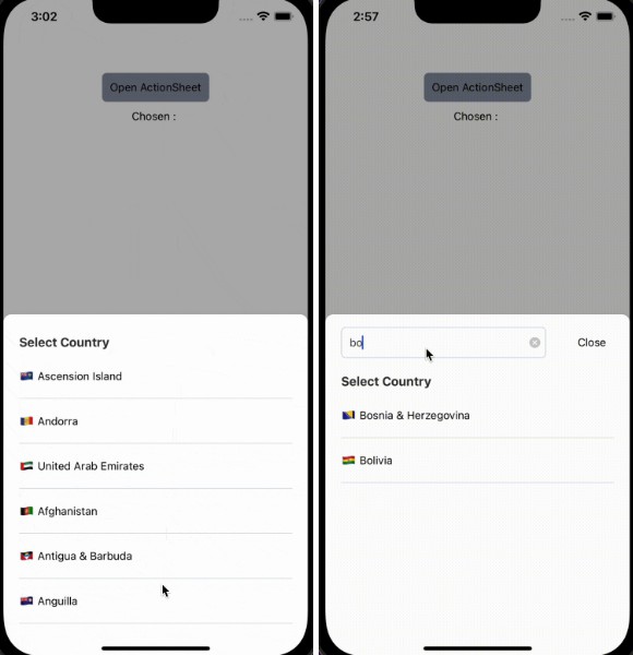
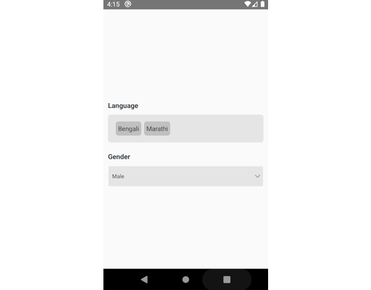
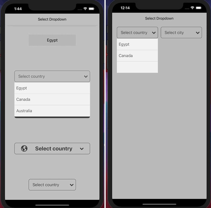
Demo
You can see the code for the GIF files given above at this repo.
Example
import React, {Component} from 'react';
import { Text, View } from 'react-native';
import ReactNativeItemSelect from 'react-native-item-select';

class LanguageSelectionScreen extends Component {
  render() {
    const textStyle = { textAlign: 'center', color: '#696969', fontWeight: 'bold' };
    const data = [
      { firstLetter: 'அ', displayName: 'தமிழ்', name: 'Tamil' },
      { firstLetter: 'A', displayName: 'English', name: 'English' },
      ...
    ];

    return (
      <ReactNativeItemSelect
        data={data}
        itemComponent={
          item => (
            <View>
                <Text style={{ ...textStyle, fontSize: 35 }}>{item.firstLetter}</Text>
                <Text style={textStyle}>{item.displayName}</Text>
            </View>
          )
        }
        onSubmit={item => navigate('Result')}
      />
    );
  }
}
Props
We can divide props into two types. One is mandatory other one is optional. Without optional props, this library will work properly with its default values. However, you've to pass all required props.
Required Props
| Name | Type | Description |
|---|---|---|
| data | Array | Array of items you pass to itemComponent callback. |
| itemComponent | Function | Takes 2 parameters and returns a React element. Two paramerts, (item, selected). item: data prop item, selected: boolean that suggests whether the item is selected. selected boolean is useful when you want to alter the content if it is selected. |
| onSubmit | Function | Callback function that consumes selected item(s). |
Optional Props
| Name | Type | Default | Description |
|---|---|---|---|
| multiselect | Boolean | false | Pass this to enable multiselect |
| countPerRow | Number | 2 | No of items to display per row, pass 1 for list view |
| floatSubmitBtn | Boolean | false | When the number of items increase, you may want to float the submit button at the botton of the screen. Pass this prop to do so. |
| lastRowMargin | Number | 50 | This only takes effect when you float submit button. Most often floating button will hinder the view of last row. This is to avoid it. |
| submitBtnTitle | String | Submit | Change submit button title |
| minSelectCount | Number | 1 | Valid only when multiselect is enabled. Minimum number of items to be selected to enable submit button. |
| maxSelectCount | Number | null | Valid only when multiselect is enabled. To set max limit on the number of items selected. Displays an alert when user tries to select more items. |
| maxSelectAlertTxt | String | Check description | To change the alert text. Default: You can't select more than N items. |
| tickStyle | String | Check description | Valid params: check, overlayCheck. For single select check is default. overlayCheck is default for multiselect |
| tickPosition | String | Check description | Default values: single select - topRight, multiselect - middle. However, you can override the default by passing custom value. Valid params: topLeft, topRight, topMiddle, bottomLeft, bottomRight, bottomMiddle, middle, leftMiddle, rightMiddle |
| submitBtnWidth | Number | 100 | This number represents percentage width. So, to set the width to 50% just pass 50. |
| tickTxt | String | ✔ | Pass some string to change the tick string rendered. |
| extraItemHighlighProps | Object | {} | This is to alter existing prop value or to add new values to the TouchableHighlight component that encloses your itemComponent. |
| extraBtnOpacityProps | Object | {} | Use this to pass props to TouchableOpacity that encloses the submit button. |
| styles | Object | {} | For custom styling you can use this prop. Refer styling section. |
| searchKey | String | null | If you want to implement search, you've to pass this prop. Check search implementation section. |
Preselect Items
In some cases, you may want to preselect items when ReactNativeItemSelect renders. That can be achieved by setting selected property of the items in data array. In the following example, Apple & Orange are preselected.
Example
<ReactNativeItemSelect
    data={[
      { name: 'Apple', selected: true},
      { name: 'Banana' },
      { name: 'Orange', selected: true}
    ]}
    itemComponent={this.itemComponent}
    onSubmit={this.onSubmit}
/>
Styling
You can alter the styles of any component of this library by passing appropriate prop. For now you can use 11 keys in styles prop to customize the look. They are, btn, btnOpacity, btnTxt, disabledBtnOpacity, disabledBtn, disabledBtnTxt, itemBoxHighlight, activeItemBoxHighlight, tickTxt, itemComponentWrapper, rowWrapper
Example
In the following component, styles prop will change the color of submit button, tick background and selected items border color to material blue.
<ReactNativeItemSelect
    data={data}
    itemComponent={this.itemComponent}
    onSubmit={this.onSubmit}
    styles={
        {
            btn: { backgroundColor: '#2196F3' },
            disabledBtn: { backgroundColor: '#2196F3' },
            tickTxt: { backgroundColor: '#2196F3' },
            activeItemBoxHighlight: { borderColor: '#2196F3' },
        }
    }
/>
btn, disabledBtn
For the Button View. You can use any of the View style props. Use disabledBtn key to style the button when it is in disabled state and use btn for enabled button.
btnOpacity, disabledBtnOpacity
For the TouchableOpacity that encloses the button view. You can use any View style props.
btnTxt, disabledBtnTxt
Use this to style the text inside submit button. Refer Text style props.
itemBoxHighlight, activeItemBoxHighlight
You can use this to style the TouchableHighlight which wraps your item component. All border styling must go here. You can use any View style props here.
itemComponentWrapper
This is a View that wraps your item component. Wrapping order is like this TouchableHighlight > View > itemComponent. You can use this to get rid of the padding inside box. Refer View style props.
tickTxt
You can use this to alter the View the encloses your tick character. Tick color is changed here. Refer Text style props.
rowWrapper
Used to alter the style of the View that wraps the items in a row. Refer View style props.
Search Implementation
To make ReactNativeItemSelect more customizable, styling & implementation of text box for search has to be implemented by the user. You can easily implement search by making use of the state of the parent component. You need to pass searchKey prop to make search work. Just make sure the value of the searchKey is unique for all items. For your better understanding, search has already been implemented in the customized example of demo app - source code.
NOTE: Search implementation is not part of the GIF shown above. Search feature was added after the creation of demo GIF.