react-native-otp-inputs
OTP inputs built in pure JS for React-Native.
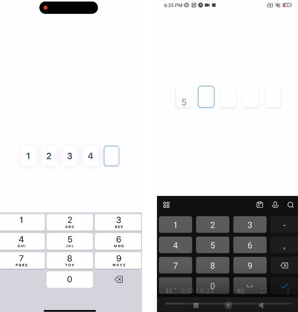
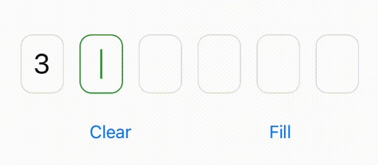
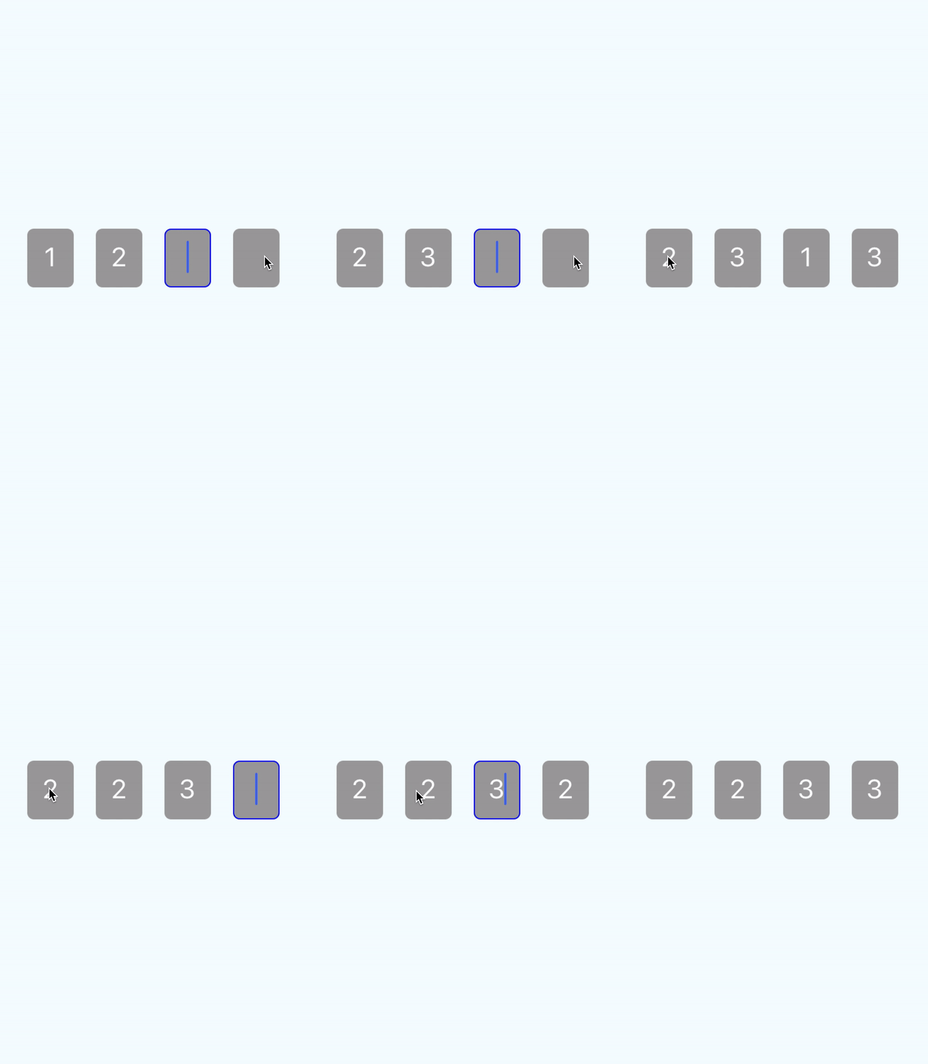
react-native-otp-inputs is fully customizable, pure JavaScript package, that provides solution for One-time password feature with user friendly events like moving to previous input with backspace or going to next when filled in. It supports pasting and otp code into inputs
Supported version of React Native >= 0.53.0
It's because of onKeyPress event implementation on android.
Basic usage
import React, { Component } from 'react'
import { View } from 'react-native'
import OtpInputs from 'react-native-otp-inputs'

export default class App extends Component {
  render() {
    return (
      <View style={styles.container}>
        <OtpInputs handleChange={code => console.log(code)} numberOfInputs={6} />
      </View>
    )
  }
}
API
| Method | Type | Required | Default | Description |
|---|---|---|---|---|
| autoCapitalize | string | false | 'none' | Defines input auto capitalization (only use with keyboardType) |
| clearTextOnFocus | boolean | false | false | Defines if input text should be cleared on focus |
| containerStyles | style (object) | false | none | Styles applied to whole container |
| errorMessage | string | false | none | Error message that is displayed above inputs |
| errorMessageContainerStyles | style (object) | false | none | Styles applied to error message container |
| errorMessageTextStyles | style (object) | false | none | Styles applied to error message text |
| focusedBorderColor | string | false | #0000ff | borderColor of input when focused |
| handleChange | function | true | console.log | Returns otp code which is typed in inputs |
| inputContainerStyles | style (object) | false | none | Styles applied to each input container |
| inputsContainerStyles | style (object) | false | none | Styles applied to inputs container |
| inputTextErrorColor | string | false | #ff0000 | Color of text inside input container when error is passed in |
| keyboardType | string | true | 'phone-pad' | Keyboard type for inputs |
| numberOfInputs | number | true (1..6) | 4 | How many inputs should be rendered |
| secureTextEntry | boolean | false | false | Defines if input will hide text inside |
| selectTextOnFocus | boolean | false | true | Defines if input text should be selected on focus |
| unfocusedBorderColor | string | false | transparent | borderColor of input when not focused |

