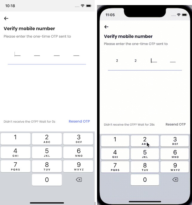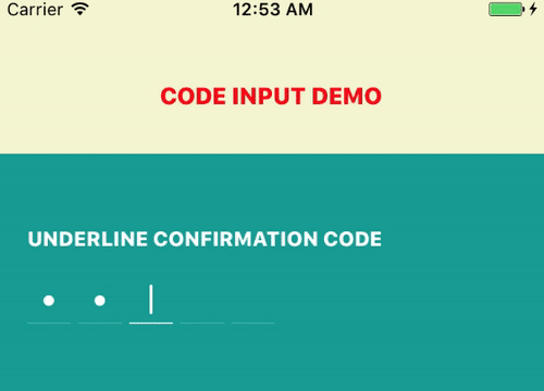
react-native-otp-entry
react-native-otp-entry is a simple and highly customizable React Native component for entering OTP (One-Time Password). It provides an intuitive and user-friendly interface for inputting one-time passwords in your React Native applications.

Features
- Supports OTP input with a fixed number of digits.
- Highly customizable appearance and styling.
- Supports autofill
- Seamless integration with React Native and Expo applications.
Installation
Install react-native-otp-entry using npm or yarn:
npm install react-native-otp-entry

# or

yarn add react-native-otp-entry
Usage
-
Import the
OTPInputcomponent fromreact-native-otp-entry:import { OTPInput } from 'react-native-otp-entry';
-
Render the
OTPInputViewcomponent in your screen/component:<OtpInput numberOfDigits={6} onTextChange={(text) => console.log(text)} />
-
Customize the styling as per your requirements:
 <OTPInput
     numberOfDigits={6}
     focusColor="green"
     onTextChange={text => console.log(text)}
     containerStyle={styles.container}
     inputsContainerStyle={styles.inputsContainer}
     pinCodeContainerStyle={styles.pinCodeContainer}
     pinCodeTextStyle={styles.pinCodeText}
     focusStickStyle={styles.focusStick}
     focusStickBlinkingDuration={500}
 />
Props
The react-native-otp-entry component accepts the following props:
| Prop | Type | Description |
|---|---|---|
numberOfDigits |
number | The number of digits to be displayed in the OTP entry. |
focusColor |
ColorValue | The color of the input field border and stick when it is focused. |
onTextChange |
(text: string) => void | A callback function that is invoked when the OTP text changes. It receives the updated text as an argument. |
theme |
Theme | Custom styles for each element. |
focusStickBlinkingDuration |
number | The duration (in milliseconds) for the focus stick to blink. |
| Theme | Type | Description |
|---|---|---|
containerStyle |
ViewStyle | Custom styles for the root View. |
inputsContainerStyle |
ViewStyle | Custom styles for the container that holds the input fields. |
pinCodeContainerStyle |
ViewStyle | Custom styles for the container that wraps each individual digit in the OTP entry. |
pinCodeTextStyle |
TextStyle | Custom styles for the text within each individual digit in the OTP entry. |
focusStickStyle |
ViewStyle | Custom styles for the focus stick, which indicates the focused input field. |
Note: The ViewStyle and TextStyle types are imported from react-native and represent the style objects used in React Native for views and text, respectively.
Ref
The react-native-otp-entry component exposes these functions with ref:
| Prop | Type | Description |
|---|---|---|
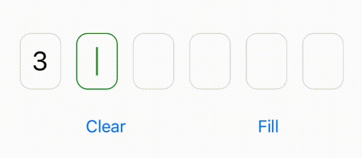
clear |
() => void; | Clears the value of the OTP input. |
setValue |
(value: string) => void; | Sets the value of the OTP input. |
License
This project is licensed under the MIT License.
Contributing
Contributions are welcome! Please feel free to open issues or submit pull requests.
If you find a bug or have any feature requests, please open an issue ?