react-native-size-scaling
Provide solutions to make your app flexible for different screen sizes, different devices, based on your device’s pixel ratio. When developing with react-native, you need to manually adjust your app to look great on a variety of different screen sizes. This package provides some simple tooling to make your scaling a whole lot easier.
Installation
npm install react-native-size-scaling
or
yarn add react-native-size-scaling
Jest setup
  jest.mock('react-native-size-scaling', () => {
      const sizeScaling = require('react-native-size-scaling/mock');
      return sizeScaling;
  });

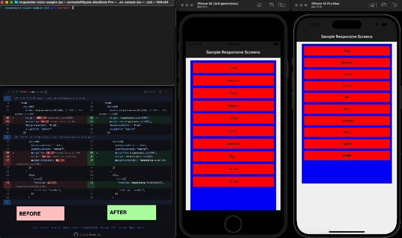
Demo
Before
 After
After

Documents
| API | Type | Description |
|---|---|---|
| StyleSheet | StyleSheet | Will take the same stylesObject a regular StyleSheet will take, plus a special (optional) annotation that will automatically apply the scale functions for you |
| scale | Function | Will return a linear scaled result of the provided size |
| isAndroid | Boolean | Tells if the device is Android operating system |
| isIOS | Boolean | Tells if the device is IOS operating system |
| isTablet | Boolean | Tells if the device is a tablet |
| width | Number | Screen width |
| height | Number | Screen height |
API
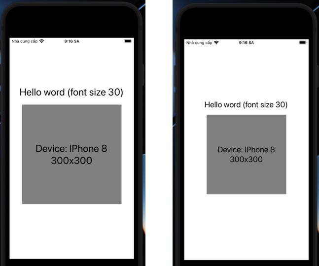
scale(size: number)
Will return a linear scaled result of the provided size, based on your device’s pixel ratio.
import { scale } from 'react-native-size-scaling';

export default function App() {
  return (
    <View style={styles.container}>
      <Text style={styles.text}>Hello word {scale(30)}</Text>
    </View>
  );
}
StyleSheet
Will take the same stylesObject a regular StyleSheet will take, plus a special (optional) annotation that will automatically apply the scale functions for you.
import * as React from 'react';

import { View, Text } from 'react-native';
import { StyleSheet } from 'react-native-size-scaling';

export default function App() {
  return (
    <View style={styles.container}>
      <Text style={styles.text}>Hello word</Text>
      <View style={styles.box}>
      <Text style={styles.text}>Device: IPhone 13</Text>
        <Text style={styles.text}>Before: 300x300</Text>
      </View>
    </View>
  );
}

const styles = StyleSheet.create({
  container: {
    flex: 1,
    alignItems: 'center',
    justifyContent: 'center',
  },
  text: {
    fontSize: 22,
  },
  box: {
    width: 300,
    height: 300,
    marginVertical: 20,
    backgroundColor: 'gray',
    justifyContent: 'center',
    alignItems: 'center',
  },
});