Office UI Fabric React
The React-based front-end framework for building experiences for Office and Office 365.
Fabric React is a collection of robust React-based components designed to make it simple for you to create consistent web experiences using the Office Design Language.
Using Fabric React
Here is a step by step tutorial on how to build a simple React app with an Office UI Fabric React component.
Integrating components into your project depends heavily on your setup. The recommended setup is to use a bundler such as Webpack which can resolve NPM package imports in your code and can bundle the specific things you import.
Within an npm project, you should install the package and save it as a dependency:
npm install --save office-ui-fabric-react
This will add the fabric-react project as a dependency in your package.json file, and will drop the project under node_modules/office-ui-fabric-react.
The library includes commonjs entry points under the lib folder. To use a control, you should be able to import it and use it in your render method:
import * as React from 'react';
import * as ReactDOM from 'react-dom';
import { PrimaryButton } from 'office-ui-fabric-react/lib/Button';

ReactDOM.render(<PrimaryButton>I am a button.</PrimaryButton>, document.body.firstChild);
Browser support
Fabric React supports all evergreen browsers, with IE 11 as the min-bar version of Internet Explorer. See the browser support doc for more information.
Right-to-left support
All components can render in LTR or RTL, depending on the dir attribute set on the html page. (dir="rtl" will flip the direction of everything.
Server-side rendering
If you need to render Fabric components on the server side in a node environment, there is a way to do this. The basic idea is that you need to tell the styles loader to pipe styles into a variable, which you can later use to inject into your page. Example:
import { configureLoadStyles } from '@microsoft/load-themed-styles';

// Store registered styles in a variable used later for injection.
let _allStyles = '';

// Push styles into variables for injecting later.
configureLoadStyles((styles: string) => {
  _allStyles += styles;
});

import * as React from 'react';
import * as ReactDOMServer from 'react-dom/server';
import { Button } from 'office-ui-fabric-react/lib/Button';

let body = ReactDOMServer.renderToString(<Button>hello</Button>);

console.log(
  `
  <html>
  <head>
    <style>${_allStyles}</style>
  </head>
  <body>
    ${body}
  </body>
  </html>
  `
);
Note: we are evaluating a more robust theming and style loading approach, which will allow a much more flexible server rendering approach, so this syntax may be simplified in the future.
Browserless Testing
In unit or end-to-end tests that run in an SSR-like (non-browser) environment such as Node, you'll need to disable style loading.
import { initializeIcons } from 'office-ui-fabric-react/lib/Icons';
initializeIcons('dist/');

// Configure load-themed-styles to avoid registering styles.
let themeLoader = require('@microsoft/load-themed-styles');
themeLoader.configureLoadStyles(styles => {
  // noop
});

// Set ssr mode to true, and rtl to false.
let library = require('office-ui-fabric-react/lib/Utilities');
library.setSSR(true);
library.setRTL(false);

// Assume a large screen.
let responsiveLib = require('office-ui-fabric-react/lib/utilities/decorators/withResponsiveMode');
responsiveLib.setResponsiveMode(responsiveLib.ResponsiveMode.large);
You'll also want to mock out requiring .scss files.
In Jest:
  moduleNameMapper: {
    // jest-style-mock.js should just contain module.exports = {};
    '\\.(scss)$': path.resolve(__dirname, 'jest-style-mock.js'),
  }
Advanced usage
For advanced usage including info about module vs. path-based imports, using an AMD bundler like Require, and deployment features, see our advanced documentation.
Contribute to Fabric React
Please take a look at our contribution guidelines for more info. Also read Contribute Bug fixes and Contribute New component.
Building the repo
Before you get started, make sure you have read the Git branch setup instrucions
To view the documentation including examples, contracts, component status, and to add functionality or fix issues locally, you can:
git clone https://github.com/OfficeDev/office-ui-fabric-react.gitnpm installFor Windows developers, please read the next section before running thisnpm start
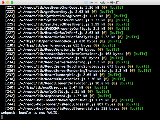
This will start a demo page from the office-ui-fabric-react package folder, which will open a web browser with the example page. You can make changes to the code which will automatically build and refresh the page using live-reload.
To build and run tests for all packages in the repo, you can run npm run build from the root.
To build individual packages within the packages/*/ folders, you can use npm run build in each individually. Note that because the packages are symlinked together, you must manage building dependencies in the right order, or use the rush tool to build to the specific package you want. (See advanced tips below.)
Note for Windows Developers on npm 6.x
Due to a known bug in #5174, Windows developers who are using npm 6.x should downgrade to use npm v5.6.0 for now:
npm i -g [email protected]
Testing
For testing see our testing documentation.
Advanced building tips
The repo contains many packages, each which may have dependencies on each other. You can use the rush tool to build projects in the correct order, if you have it globally installed.
npm install -g @microsoft/rush
To use rush to build, you can run rush build, which will incrementally build the entire repo (only build what has changed since the last build.)
To can also build up to a specific project using the --to <package> argument. For example, to build up to office-ui-fabric-react, you can run:
rush build --to office-ui-fabric-react


