accordion-collapse-react-native
is a react native javascript component that allow you to show an accordion or a collapse.
Installation
npm install --save accordion-collapse-react-native
Usage
import {Collapse,CollapseHeader, CollapseBody, AccordionList} from 'accordion-collapse-react-native';

//Simple collapsable
<Collapse>
    <CollapseHeader>
      <View>
        <Text>Click here</Text>
      </View>
    </CollapseHeader>
    <CollapseBody>
      <Text>Ta daa!</Text>
    </CollapseBody>
</Collapse>

//Accordion List
<AccordionList
        list={this.state.list}
        header={this._head}
        body={this._body}
      />
Collapse Components are considered as View , so you can use all the props of the View Component like style.
Demo
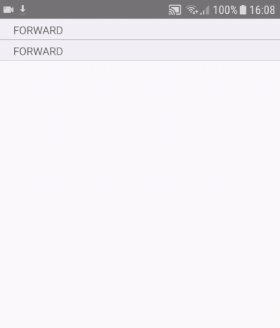
Simple Collapse

this is example is based on native base list separator combined with the Collapse Components.
import {  View,Text } from 'react-native';
import { Collapse, CollapseHeader, CollapseBody } from "accordion-collapse-react-native";
import { Thumbnail, List, ListItem, Separator } from 'native-base';

<View>
    <Collapse>
      <CollapseHeader>
        <Separator bordered>
          <Text>FORWARD</Text>
        </Separator>
      </CollapseHeader>
      <CollapseBody>
        <ListItem >
          <Text>Aaron Bennet</Text>
        </ListItem>
        <ListItem>
          <Text>Claire Barclay</Text>
        </ListItem>
        <ListItem last>
          <Text>Kelso Brittany</Text>
        </ListItem>
      </CollapseBody>
    </Collapse>
  </View>
Simple Collapse inception

  import { View,Text } from 'react-native';
  import {Collapse, CollapseHeader, CollapseBody} from "accordion-collapse-react-native";
  import { Thumbnail } from 'native-base';

<View>
    <Collapse style={{borderBottomWidth:1,borderTopWidth:1}}>
      <CollapseHeader style={{flexDirection:'row',alignItems:'center',padding:10,backgroundColor:'#E6E6E6'}}>
        <View style={{width:'25%',alignItems:'center'}}>
          <Thumbnail source={{uri: 'https://www.biography.com/.image/t_share/MTQ3NjYxMzk4NjkwNzY4NDkz/muhammad_ali_photo_by_stanley_weston_archive_photos_getty_482857506.jpg'}} />
        </View>
        <View style={{width:'60%'}}>
          <Text>Name : Mohammed Ali Kley</Text>
          <Text>Profession: Boxer</Text>
        </View>
      </CollapseHeader>
      <CollapseBody style={{alignItems:'center',justifyContent:'center',flexDirection:'row',backgroundColor:'#EDEDED'}}>
        <Collapse style={{flexDirection:'row'}}>
          <CollapseHeader>
            <Thumbnail source={{uri: 'https://cdn3.iconfinder.com/data/icons/trico-circles-solid/24/Circle-Solid-Phone-512.png'}} />
          </CollapseHeader>
          <CollapseBody style={{alignItems:'center',justifyContent:'center',padding:10}}>
            <Text>+1 310 346 0018</Text>
          </CollapseBody>
        </Collapse>
        <Collapse style={{flexDirection:'row'}}>
          <CollapseHeader>
            <Thumbnail source={{uri: 'https://d30y9cdsu7xlg0.cloudfront.net/png/1674-200.png'}} />
          </CollapseHeader>
          <CollapseBody style={{alignItems:'center',justifyContent:'center',padding:10}}>
            <Text>[email protected]</Text>
          </CollapseBody>
        </Collapse>
      </CollapseBody>
    </Collapse>
  </View>
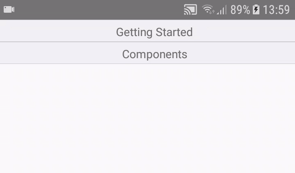
Accordion List
import {AccordionList} from "accordion-collapse-react-native";
import { Separator } from 'native-base';
import { View, Text} from 'react-native';

this.state={
  list:[
      {
        title: 'Getting Started',
        body: 'React native Accordion/Collapse component, very good to use in toggles & show/hide content'
      },
      {
        title: 'Components',
        body: 'AccordionList,Collapse,CollapseHeader & CollapseBody'
      }
      ],
}

_head(item){
    return(
        <Separator bordered style={{alignItems:'center'}}>
          <Text>{item.title}</Text>
        </Separator>
    );
}

_body(item){
    return (
        <View style={{padding:10}}>
          <Text style={{textAlign:'center'}}>{item.body}</Text>
        </View>
    );
}

render() {
    return (
          <AccordionList
            list={this.state.list}
            header={this._head}
            body={this._body}
          />
    );
}
Components
CollapseHeader & CollapseBody
Think about CollapseHeader and CollapseBody as a View that you can style it as you want.
When you touch the header it will show or hide the body.
Collapse
You need to wrap a CollapseHeader & a CollapseBody in the Collapse.
| Props Name | Default | Type | Description |
|---|---|---|---|
| isCollapsed | false | boolean | show the CollapseBody if true |
| disabled | false | boolean | disable the click on the collapse header if true |
| onToggle | ()=>undefined | Function(isCollapsed:boolean) | onToggle is a function take in input a boolean value that contains the state of the Collapse (if collapsed->true) |
| handleLongPress | undefined | Function() | handles the onLongPress event when longPressing on the collapseHeader content |
In case you want to use and change the state of the Collapse in the parent, You can use isCollapsed & onToggle as an input & output to synchronise the parent collapse state & the child (Collapse) state.
Example of use
You can control & use the state collapse of the Collapse in you're component as shown down below:
  import React, { Component } from 'react';
  import{ View,Text,Button } from 'react-native';
  import {Collapse, CollapseHeader, CollapseBody} from "accordion-collapse-react-native";

class Example extends Component<>{
constructor(props){
    super(props);
    this.state = {
    collapsed:false,//do not show the body by default
    }
}
render(){
    return (
    <View>
	    <Button
		    title={"Click here too"}
		    onPress={()=>this.setState({collapsed:!this.state.collapsed})}
	    />
        <Collapse
	        isCollapsed={this.state.collapsed}
	        onToggle={(isCollapsed)=>this.setState({collapsed:isCollapsed})}>
          <CollapseHeader>
            <Text>Click here</Text>
          </CollapseHeader>
          <CollapseBody>
            <Text>WHoooHo!</Text>
          </CollapseBody>
        </Collapse>
      </View>
      );
      }
}
AccordionList
AccordionList components allow you to show an accordion with list of sections (head&body)
| Props Name | Default | Type | Description |
|---|---|---|---|
| list | [] | Array | list of items that represents sections |
| header | (item)=>undefined | Function | a function that take as input an item of the list and output the render you want in the section header |
| body | (item)=>undefined | Function | a function that take as input an item of the list and output the render you want in the section header |
| onToggle | (index) => undefined | Function | a function that as input the index of the toggled item |