react-native-anchored-popup
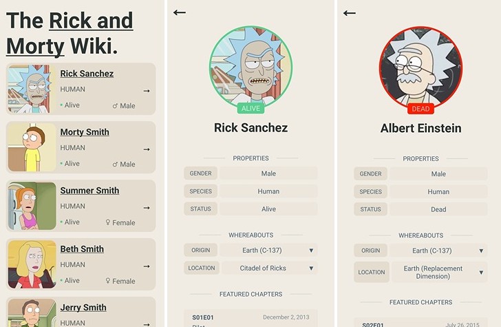
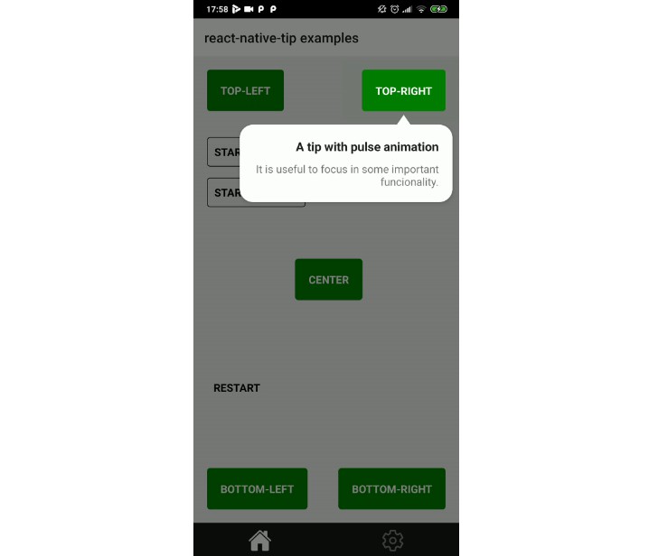
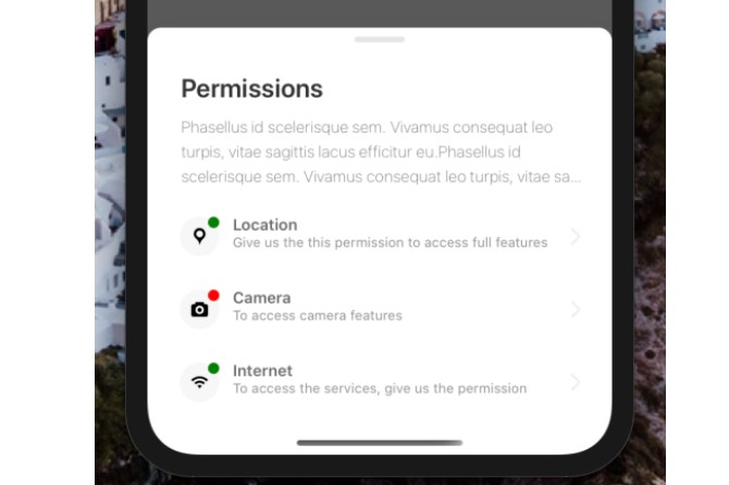
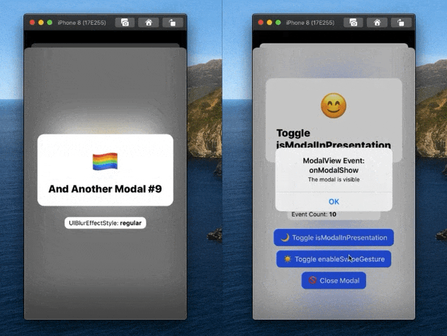
A slick popup element that expands towards the center of the screen from wherever the user presses down:
Screen.Recording.2022-09-19.at.1.17.17.PM.mov
Features
- Slick opening and closing animations that expand from user press location
- Supports 4 modes to customize positioning behavior
- Swipe to dismiss
- Intuitive API supporting any popup element.
- Written in typescript
Installation
This package depends on react-native-reanimated for animations and react-native-gesture-handler for handling gestures. If you already have those installed you can skip their installation steps and just do yarn add @good-react-native/anchored-popup.
Expo Managed Workflow:
If you’re using expo, you can just do:
npx expo install react-native-reanimated react-native-gesture-handler
And to finish installing react-native-reanimated, you’ll need to add their babel plugin to your babel.config.js:
module.exports = function (api) {
  api.cache(true);
  return {
    presets: ['babel-preset-expo'],
    plugins: ['react-native-reanimated/plugin'],
  };
};
yarn add @good-react-native/anchored-popup
Bare Workflow
If you’re not using Expo’s managed workflow, there will be some additional installation steps.
First, install all packages:
yarn add @good-react-native/anchored-popup react-native-reanimated react-native-gesture-handler
Then, wrap your app in GestureHandlerRootView to finish installing gesture handler:
function App() {
  return (
    <GestureHandlerRootView style={{flex: 1}}>
      <RestOfApp />
    </GestureHandlerRootView>
  );
}
And to finish installing react-native-reanimated, you’ll need to add their babel plugin to your babel.config.js:
module.exports = {
  //...
  plugins: ['react-native-reanimated/plugin'],
};
Lastly, install pods to run on iOS:
npx pod-install
Usage
Wrap your app in the AnchoredPopupProvider:
function App() {
  return (
    <AnchoredPopupProvider>
      <RestOfApp />
    </AnchoredPopupProvider>
  );
}
Create a touchable component with the component AnchoredPopupTouchableOpacity. When it is pressed, it will show the popupElement (which can be any React Native element or a render function):
<AnchoredPopupTouchableOpacity
  popupElement={
    <View>
      <Text>I Will be shown when the touchable is pressed!</Text>
    </View>
  }>
  <Text>A button that when pressed will show the popup element</Text>
</AnchoredPopupTouchableOpacity>
<AnchoredPopupTouchableOpacity/> works just like React Native’s touchable opacity =D.
Modes
The mode prop supports 4 different values to customize the positioning behavior of the popup. The mode determines the final position calculation.
'stick' Mode (default)
'stick' mode ensures that the user’s press position will be contained within the popup menu.
stick.mp4
'center-x' Mode
'center-x' mode will center the popup horizontally in the screen, while the vertical position will still stick to the users press position:
center-x.mp4
'center-y' Mode
'center-y' mode will center the popup vertically in the screen, while the horizontal position will stick to the users press position:
center-y.mp4
'center' Mode
'center' mode will center the popup in the screen horizontally and vertically:
center.mp4
Closing the popup
By default, popup will automatically close when it’s swiped away or when the backdrop is pressed (both behaviors can be disabled).
Closing programatically
There are two ways to close the popup programatically.
Either use a handle (similar to a normal ref):
function MyComponent() {
  const handle = usePopupHandle();

  function close() {
    if (handle.current) handle.current.close();
  }

  return (
    <AnchoredPopupTouchableOpacity
      //...
      handle={handle}
    />
  );
}
Or by call the close function that gets passed to the popup element (when popupElement is a render function):
function MyComponent() {
  return (
    <AnchoredPopupTouchableOpacity
      popupElement={({close}) => {
        return (
          <View>
            <TouchableOpacity onPress={close}>
              <Text>Press to Close</Text>
            </TouchableOpacity>
          </View>
        );
      }}
    />
  );
}
Each method should work equally well.
API
<AnchoredPopupTouchableOpacity/>
A touchable opacity that shows the popupElement prop when it is pressed.
Props
Accepts all TouchableOpacity props. Additionally, it accepts the following:
| Prop | Required? | Type | Description | Default |
|---|---|---|---|---|
| popupElement | Yes | ReactNode | (vars: {close: ()=>void})=>ReactNode | A React Native element or render function that will be shown when the popup is opened. | None |
| animationDuration | No | number | Time in ms that each of the animations take to complete. | 150 |
| backgroundColor | No | string | Color of the backdrop that is shown when the popup is shown. | ‘rgba(0,0,0,0.07)’ |
| closeOnBackdropPress | No | boolean | Whether the popup should close when the backdrop is pressed. | true |
| handle | No | MutableObjectRef | A handle that can be used to close the popup imperatively. | undefined |
| mode | No | ‘stick’ | ‘center-x’ | ‘center-y’ | ‘center’ | Determines how the popups final position is calculated. See mode | ‘stick’ |
| onAnchorChange | No | (anchor: AnchoredPopupAnchor | null)=>void | A callback function that is called when the anchor changes in case you want to synchronize other UI changes with the anchored popups. | undefined |
| swipeToClose | No | boolean | Whether the popup can be swiped to dismiss. | true |
| openOnEvent | No | ‘onPress’ | ‘onLongPress’ | Which event causes the popup to open. | ‘onPress’ |


