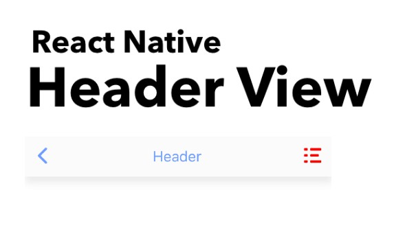
react-native-header-view
Fully customizable Header View for React Native.
Installation
Add the dependency:
Pure React Native:
npm i @freakycoder/react-native-header-view
Peer Dependencies
IMPORTANT! You need install them.
"react": ">= 16.x",
"react-native": ">= 0.55.x",
"react-native-iphone-x-helper": ">= 1.2.x",
"react-native-dynamic-vector-icons": ">= x.x.x"
Basic Usage
<Header
  headerTitle="Header"
  rightComponentDisable
  leftComponentOnPress={() => {}}
  hitSlops={
    top: 30,
    bottom: 30,
    left: 30,
    right: 30
  }
/>
Advanced Usage
<Header
  headerTitle="Header"
  leftComponent={
    <TouchableOpacity
      onPress={() => {}}>
      <Icon name="ios-arrow-back" type="Ionicons" size={30} color="blue" />
    </TouchableOpacity>
  }
  rightComponent={
    <TouchableOpacity
      onPress={() => {}}>
      <Icon name="github" type="AntDesign" size={30} color="purple" />
    </TouchableOpacity>
  }
/>
Example Application
- check the code, and yes! :) all of the images, screenshots are directly taken
from the this example. Of course, you can simply clone the project and run the example on your own environment.
Configuration - Props
| Property | Type | Default | Description |
|---|---|---|---|
| height | number | 50 | use this to change the header's height |
| width | number | 100% | use this to change the header's width |
| hitSlops | object | object: 30 | use this to change the header's left and right components' hitSlots |
| bottomStick | boolean | false | stick the header to bottom side |
| headerTitle | string | "" | use this to set header's title |
| backgroundColor | color | #ffffff | use this to change the header's background color |
| leftComponent | component | Icon | set the left component |
| leftComponentStyle | style | style | set the left component's style |
| leftComponentDisable | boolean | false | disable the left component |
| leftComponentOnPress | function | null | set the left component's onPress function |
| rightComponent | component | Icon | set the right component |
| rightComponentStyle | style | style | set the right component's style |
| rightComponentDisable | boolean | false | disable the right component |
| rightComponentOnPress | function | null | set the right component's onPress function |
| centerComponent | component | Icon | set the center component |
| centerComponentStyle | style | style | set the center component's style |