React Native Head Tab View
Add collapsible headers to your tab-view components.
v4.0.0-rc.2 has been released, I hope you can help me test and collect questions. In this version, there is a big change. All animations will run on the UI thread, which will make the components much smoother. Unfortunately, the version requiring React Native is greater than 0.62.2. Because we rely on react-native-reanimated2.0, that's what it requires.
Here are some changes and optimizations.
Disruptive Changes:
- Remove
makeHeaderHeightand change it toheaderHeight
It's not mandatory, but it would be nice if you did
- Removed
SlideAnimatedmode
this mode was used for ScrollView/FlatList scrolling stalling when dragging headers, no longer needed.
- Remove the scene's
refreshHeightproperty
Both the TabView and Scene used to have the refreshHeight property. Now I think they are duplicate, just set refreshHeight on the TabView, its default value is 80
- The usage of
HPageViewHochas changed
# Past usage:
import { HPageViewHoc } from 'react-native-head-tab-view'
const HScrollView = HPageViewHoc(ScrollView)
const HFlatList = HPageViewHoc(FlatList)
const HSectionList = HPageViewHoc(SectionList)
# Current usage
import { HScrollView,HFlatList,HSectionList } from 'react-native-head-tab-view'
The following components are currently supported:
react-native-scrollable-tab-view
react-native-tab-view
For detailed usage, please refer to Example and Installation.
Features
v4.0.0-rc
- Fix for TAB slider stuttering when dragging headers
- Optimized pull-down refresh for easier expansion and better performance
dependencies:
1.react-native-gesture-handler
2.react-native-reanimated
v3.0
- Support for extension of other Tabs components, support for shared collapsible headers
- The built-in tabs component is discarded
dependencies:
1.react-native-gesture-handler
v2.0
- Add a pull-down refresh for the Tab page(v2.0~)
- Add a pull-down refresh for the Tabview(v2.0.6~)
- Add the new slide mode to Collapsible Headers and Tabview(v2.1.0~)
v1.0
- Built-in Scrollable tabs
- All Tab pages share collapsible headers
- Collapsible Headers controls the slide of the Tabview in the vertical direction
- Collapsible Headers can respond to an event
dependencies:
1.react-native-gesture-handler
2.@react-native-community/viewpager
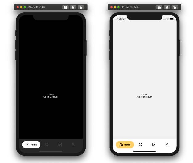
Demo
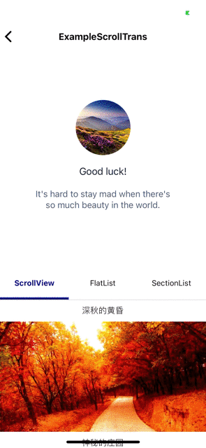
Example
If your tabs component is react-native-scrollable-tab-view
import * as React from 'react';
import { View } from 'react-native';
import { HScrollView } from 'react-native-head-tab-view'
import { CollapsibleHeaderTabView } from 'react-native-scrollable-tab-view-collapsible-header'
export default class ExampleBasic extends React.PureComponent<any> {
    render() {
        return (
            <CollapsibleHeaderTabView renderScrollHeader={() => <View style={{ height: 200, backgroundColor: 'red' }} />}>
                <HScrollView index={0}>
                    <View style={{ height: 1000, backgroundColor: '#ff4081' }} />
                </HScrollView>
                <HScrollView index={1}>
                    <View style={{ height: 1000, backgroundColor: '#673ab7' }} />
                </HScrollView>
            </CollapsibleHeaderTabView>
        )
    }
}
If your tabs component is react-native-tab-view
import * as React from 'react';
import { View, StyleSheet, Dimensions } from 'react-native';
import { SceneMap } from 'react-native-tab-view';
import { HScrollView } from 'react-native-head-tab-view'
import { CollapsibleHeaderTabView } from 'react-native-tab-view-collapsible-header'

const FirstRoute = () => (
    <HScrollView index={0}>
        <View style={[styles.scene, { backgroundColor: '#ff4081' }]} />
    </HScrollView>
);

const SecondRoute = () => (
    <HScrollView index={1}>
        <View style={[styles.scene, { backgroundColor: '#673ab7' }]} />
    </HScrollView>
);

const initialLayout = { width: Dimensions.get('window').width };

export default function TabViewExample() {
    const [index, setIndex] = React.useState(0);
    const [routes] = React.useState([
        { key: 'first', title: 'First' },
        { key: 'second', title: 'Second' },
    ]);

    const renderScene = SceneMap({
        first: FirstRoute,
        second: SecondRoute,
    });

    return (
        <CollapsibleHeaderTabView
            renderScrollHeader={() => <View style={{ height: 200, backgroundColor: 'red' }} />}
            navigationState={{ index, routes }}
            renderScene={renderScene}
            onIndexChange={setIndex}
            initialLayout={initialLayout}
        />
    );
}

const styles = StyleSheet.create({
    scene: {
        flex: 1,
    },
});
More examples:Example
Run the example
cd Example
yarn or npm install

//run Android
react-native run-android

//run iOS
cd ios
pod install
cd ../
react-native run-ios
Installation
- The first step is to add the base library and its dependencies
yarn add react-native-head-tab-view react-native-gesture-handler react-native-reanimated
or
npm install react-native-head-tab-view react-native-gesture-handler react-native-reanimated --save
- The second step is to select the extension library based on the tabs component you are using
If your tabs component is react-native-scrollable-tab-view
yarn add react-native-scrollable-tab-view-collapsible-header
If your tabs component is react-native-tab-view
yarn add react-native-tab-view-collapsible-header
Version
| react-native-head-tab-view | react-native-scrollable-tab-view | react-native-tab-view-collapsible-header |
|---|---|---|
| v1 ~ v2 | - | - |
| v3 | v0 | v0 |
| v4-rc.1 | v1 | v1 |
| v4-rc.2 | v2 | v2 |
Linking
- react-native-gesture-handler Refer to the official documentation
- react-native-reanimated Refer to the official documentation
Documentation
CollapsibleHeaderTabView
- If your tabs component is react-native-scrollable-tab-view
You need to add this dependency library
import { CollapsibleHeaderTabView } from 'react-native-scrollable-tab-view-collapsible-header'
- If your tabs component is react-native-tab-view
You need to add this dependency library
import { CollapsibleHeaderTabView } from 'react-native-tab-view-collapsible-header'
CollapsibleHeaderTabView extends the props for the tabs component by adding the CollapsibleHeaderProps
CollapsibleHeaderProps
renderScrollHeader (React.ComponentType<any> | React.ReactElement | null) (require)
render the collapsible header
renderScrollHeader={()=><View style={{height:180,backgroundColor:'red'}}/>}
headerHeight (optional)
The height of collapsible header.
tabbarHeight (optional)
The height of collapsible tabbar
frozeTop
The height at which the top area of the Tabview is frozen
overflowHeight
Sets the upward offset distance of the TabView and TabBar
makeScrollTrans (scrollValue: Animated.ShareValue<boolean>) => void
Gets the animation value of the shared collapsible header.
<CollapsibleHeaderTabView
    makeScrollTrans={(scrollValue) => {
        this.setState({ scrollValue })
    }}
/>
onStartRefresh (() => void)
If provided, a standard RefreshControl will be added for "Pull to Refresh" functionality.
Make sure to also set the isRefreshing prop correctly.
isRefreshing (boolean)
Whether the TabView is refreshing
renderRefreshControl (() => React.ReactElement)
A custom RefreshControl
refreshHeight (number)
If this height is reached, a refresh event will be triggered (onStartRefresh)
it defaults to 80
scrollEnabled (boolean)
Whether to allow the scene to slide vertically
HScrollView \ HFlatList \ HSectionList
index (number) (require)
The number of the screen.
If you use react-native-scrollable-tab-view, it should correspond to the number of the children element in the TabView.
If you use react-native-tab-view, it should correspond to the index of the navigationState of the TabView
Please check the Example .
onStartRefresh (() => void)
If provided, a standard RefreshControl will be added for "Pull to Refresh" functionality.
Make sure to also set the isRefreshing prop correctly.
isRefreshing (boolean)
Whether the scene is refreshing
renderRefreshControl (() => React.ReactElement)
A custom RefreshControl for scene
overflowPull (number)
It's the distance beyond the refreshHeight, the distance to continue the displacement, when the pull is long enough,
it defaults to 50.