React Native Slidable Drawer Panel
React Native slidable drawer designed using react native's Animated and PanResponder APIs. Purely Typescript.
Installation
Install package by running:
npm i react-native-slidable-drawer-panel
or
yarn add react-native-slidable-drawer-panel
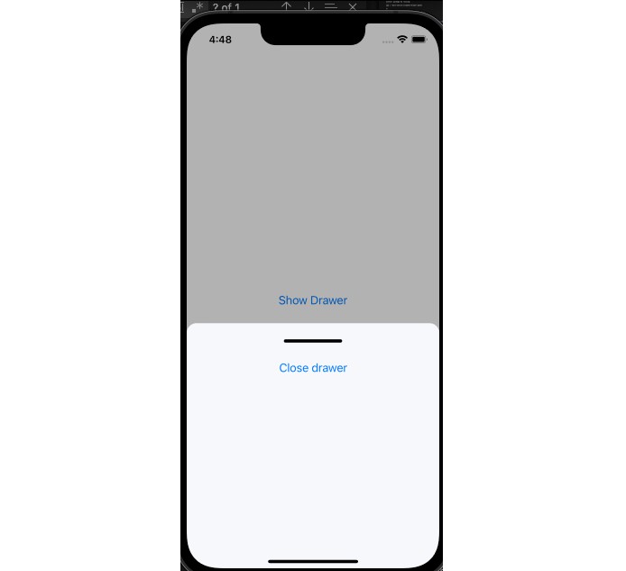
Demo

Open Source, check the bottom of this page/file for contribution guidelines.
Example
Basic Example:
import React, { useState } from 'react';
import { Button, SafeAreaView, StyleSheet } from 'react-native';
import SlidableDrawer from 'react-native-slidable-drawer-panel';

export default function App() {
	const [showDrawer, setShowDrawer] = useState(false);
	const [event, setEvent] = useState('none');
	const closeDrawer = () => {
		setEvent('close');
	};
	const showDrawerFn = () => {
		setShowDrawer(true);
	};
	const onSlideEnd = () => {
		setShowDrawer(false);
		setEvent('none');
	};
	return (
		<SafeAreaView style={styles.container}>
			<Button title='Show Drawer' onPress={showDrawerFn} />
			{showDrawer && (
				<SlidableDrawer
					onSlideEnd={onSlideEnd}
					drawerOpenSpeed={3}
					event={event}>
					<Button title='Close drawer' onPress={closeDrawer} />
				</SlidableDrawer>
			)}
		</SafeAreaView>
	);
}

const styles = StyleSheet.create({
	container: {
		flex: 1,
		backgroundColor: '#fff',
		alignItems: 'center',
		justifyContent: 'center',
	},
});
Component Props
| Property | Type | Description |
|---|---|---|
| onSlideEnd | Function | This gets called when the drawer finishes closing |
| event | string | Value is either none or close. When the event is set to close, the drawer closes completely |
| backdropColor | string | A regular react native color property value |
| drawerHandleColor | string | A regular react native color property value |
| useCustomDrawer | boolean | When set to true, the children of the SlidableDrawer are treated as a replacement of the default drawer. Set this to true if you want to display your custom drawer instead. Default value is false, this means the children of the SlidableDrawer are treated as contents of the drawer |
| noDrawerHandle | boolean | Drawer handle isn't displayed if this is set to true |
| drawerHeight | number | The value you provide gets multiplied by 100 to set the drawer height to a percentage of the device's window height. Valid values are from 0 to 0 to 1. Default is 0.45 |
| drawerBackgroundColor | string | A regular react native color property value. |
| drawerOpenSpeed | number | The speed at which the drawer opens (relative to time and friction) when the component renders. Values range from 1 to 5, 5 being the fastest. Default is 5. |
| children | React.Element | A react native component/element |
Contributions
To make contributions to this project; fork and make pull requests from your fork.
There is an example app in this repository to help you test your changes, whichever way feels convenient.
Pull requests would be approved once they have been reviewed and determined to be aligned with the intended cause of the project.
GitHub
https://github.com/alishalawani/react-native-slidable-drawer-panel