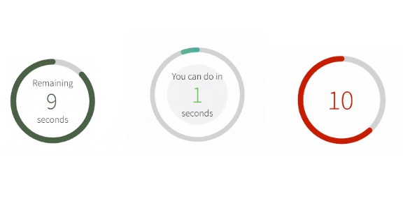
react-countdown-circle-timer
React/React Native countdown timer component in a circle shape with color and progress animation.
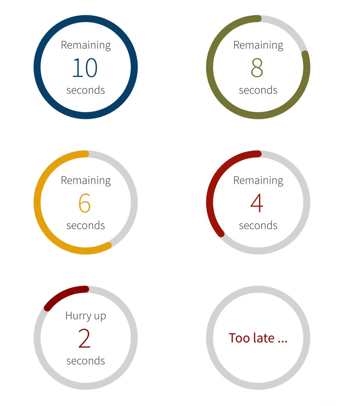
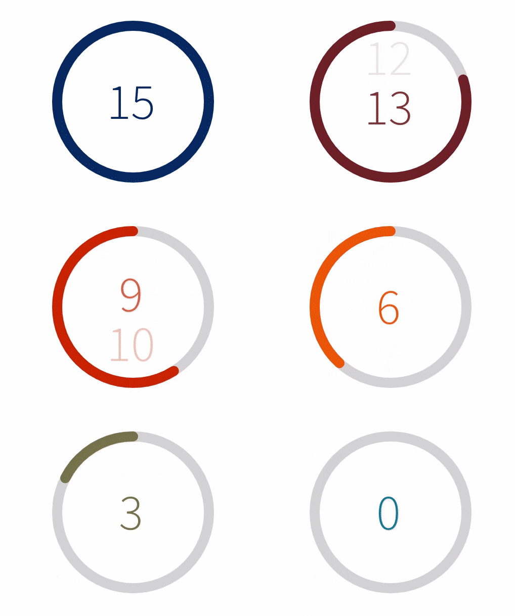
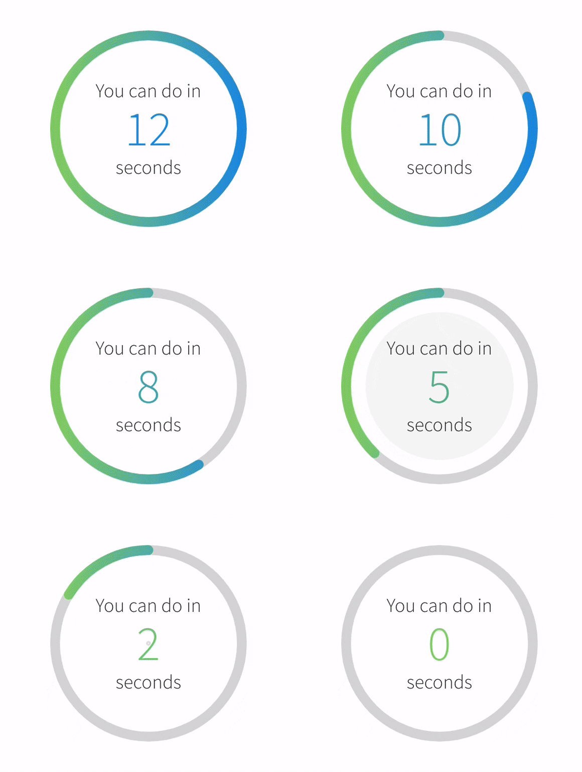
- Countdown animation independently optimized for the Web and Mobile
- Transition between colors during the countdown
- Fully customizable content in the center of the circle
a11ysupport- Built-in and ready-to-use TypeScript type definitions.
React
yarn add react-countdown-circle-timer
Check out the full documentation for demos and use cases.
React Native
yarn add react-native-countdown-circle-timer
This component has a peer dependency on react-native-svg. Read the full documentation for the installation guide, as well as demos and use cases.
Props for both React/React Native
| Prop Name | Type | Default | Description |
|---|---|---|---|
| duration | number | required | Countdown duration in seconds |
| colors | [color HEX: string, transition duration: number 0 ~ 1][] | required | Array of tuples: 1st param - color in HEX format; 2nd param - time to transition to next color represented as a fraction of the total duration |
| initialRemainingTime | number | - | Sets the initial remaining time when the countdown starts. By default the countdown starts at the duration provided. |
| size | number | 180 | Width and height of the SVG element |
| strokeWidth | number | 12 | Path stroke width |
| strokeLinecap | round | square | round | Path stroke line cap |
| trailColor | string | #d9d9d9 | Circle trail color - takes any valid color format (HEX, rgb, rgba, etc.) |
| rotation | clockwise | counterclockwise | clockwise | Progress path rotation direction |
| isPlaying | boolean | false | Play and pause animation |
| * isLinearGradient | boolean | false | * Apples linear gradient on top of the circle. The gradient doesn't follow the circle path. Works best with two colors. |
| gradientUniqueKey | string | - | Unique ID for the linearGradient element. It takes random ID if it's not provided. |
| children | ReactNode | function({ remainingTime: number, elapsedTime: number }): number|string|ReactNode | - | Render function or component to customize the time/content in the center of the circle. The content is centered using flexbox. |
| onComplete | function(totalElapsedTime: number): void | [shouldRepeat: boolean, delay: number] | - | On complete handler. It can be used to repeat the countdown by returning an array where the first element shouldRepeat indicates if the loop should start over and second element delay specifies the delay before looping again in milliseconds. The callback receives as an argument the total elapsed time in seconds. |
| ariaLabel | string | Countdown timer | Aria label for the whole component |
| renderAriaTime | function({ remainingTime: number, elapsedTime: number }): string | - | Render prop function to customize the text message that will be read by the screen reader during the countdown. |
