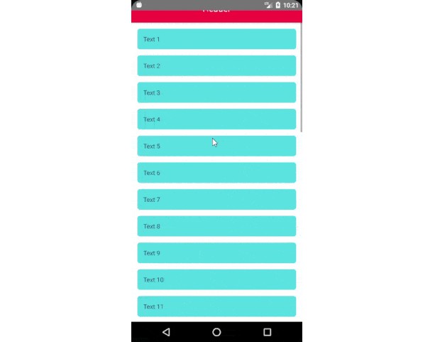
Create responsive layouts with React Native with sm, md, xl-prefixes (and others) like you would do with regular tailwind classes.
Install
npm install rn-use-tailwind
# or
yarn add rn-use-tailwind
Usage
This hook makes use of tailwind-rn to transform tailwind classes to the corresponding React Native styles. If you don’t need responsive styles, consider using the regular tailwind-rn package.
The hook returns a modified tailwind function to incorperate responsive styles.
const Example = () => {
  const tw = useTailwind();

  return (
    <View
      style={tw(
        'w-full h-full bg-red-500 md:bg-blue-500 lg:bg-green-500 xl:bg-indigo-500'
      )}
    />
  );
};
Why
Mobile apps are developed on a number of different screen sizes. Expo even permits the creation of web applications with the same source code your mobile app uses. If you like tailwind’s way of responsive styling, you’ll really like this package.
Future work
- Add tests
- Allow for your own tailwind config. The package now uses the default tailwind styles
Gotchas
React Native’s inline styling allows an array as input argument. Please make sure your styles are orderd from small to big screen sizes if you wish to use this feature as ordering matters in this array.
<View
  style={[
    tw('w-full h-full bg-red-500'),
    tw('md:bg-blue-500'),
    tw('lg:bg-green-500'),
    tw('xl:bg-indigo-500'),
  ]}
/>
License
MIT licensed. Can be found here


