react-native-neomorph-shadows
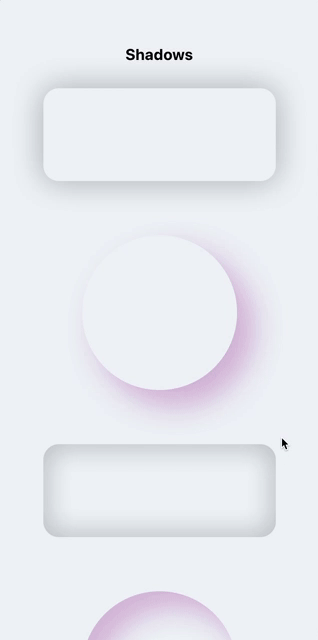
Shadows and neumorphism/neomorphism for iOS & Android (like iOS).
Installation
IMPORTANT:
this library, starting from v1.0.0, no longer supports expo because React Native Art library was recently deprecated from expo.
Step 1
Run the command below to install the plugin.
npm i react-native-neomorph-shadows
Step 2
You need to install React Native Art in your project.
npm install @react-native-community/art --save
With autolinking (react-native 0.60+)
cd ios && pod install && cd ..
Pre 0.60
react-native link @react-native-community/art
Great! Let's start to use it.
Usage
There are three components: Shadow, Neomorph & NeomorphBlur.
Prop style supports most of the view/layout styles.
IMPORTANT: Components dont't support Flex.
If you want flex and auto sizing of Shadow or Neomorph components, use ShadowFlex/NeomorphFlex experimental components, but be careful, these components reduce performance by double rerender. If you know exactly what size(width, height props) it should be, use Shadow/Neomorph components.
Shadow / ShadowFlex

import { Shadow } from 'react-native-neomorph-shadows';

...

<Shadow
  inner // <- enable inner shadow
  useArt // <- set this prop to use non-native shadow on ios
  style={{
    shadowOffset: {width: 10, height: 10},
    shadowOpacity: 1,
    shadowColor: "grey",
    shadowRadius: 10,
    borderRadius: 20,
    backgroundColor: 'white',
    width: 100,
    height: 100,
    // ...include most of View/Layout styles
  }}
>
  ...
</Shadow>
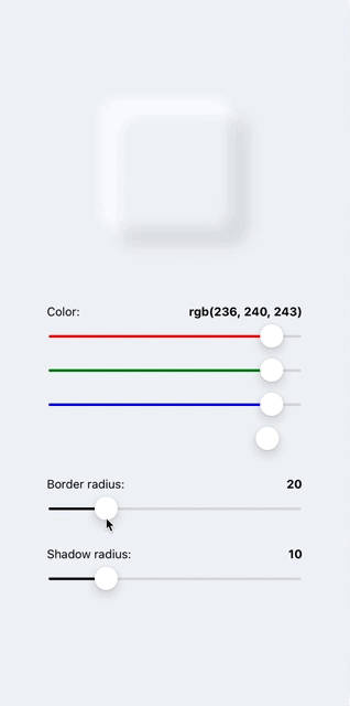
Neomorph / NeomorphFlex
Opacity of two shadows automaticly changing and depends of backgroundColor brightness.


import { Neomorph } from 'react-native-neomorph-shadows';

...

<Neomorph
  inner // <- enable shadow inside of neomorph
  swapShadows // <- change zIndex of each shadow color
  style={{
    shadowRadius: 10,
    borderRadius: 25,
    backgroundColor: '#DDDDDD',
    width: 150,
    height: 150,
  }}
>
  ...
</Neomorph>
Nested Neomorph
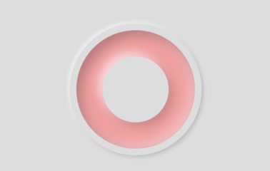
<Neomorph
  style={{
    shadowRadius: 3,
    borderRadius: 100,
    backgroundColor: '#DDDDDD',
    width: 200,
    height: 200,
    justifyContent: 'center',
    alignItems: 'center',
  }}
>
  <Neomorph
    inner
    style={{
      shadowRadius: 7,
      borderRadius: 90,
      backgroundColor: '#F19F9F',
      width: 180,
      height: 180,
      justifyContent: 'center',
      alignItems: 'center',
    }}
  >
    <Neomorph
      style={{
        shadowRadius: 7,
        borderRadius: 50,
        backgroundColor: '#DDDDDD',
        width: 100,
        height: 100,
      }}
    />
  </Neomorph>
</Neomorph>
Custom shadow colors of Neomorph
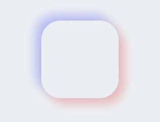
<Neomorph
  darkShadowColor="#FF3333" // <- set this
  lightShadowColor="#3344FF" // <- this
  style={{
    shadowOpacity: 0.3, // <- and this or yours opacity
    shadowRadius: 15,
    borderRadius: 50,
    backgroundColor: '#ECF0F3',
    width: 200,
    height: 200,
  }}
/>
Neomorph Blur

import { NeomorphBlur } from 'react-native-neomorph-shadows';

<NeomorphBlur
  style={{
    shadowRadius: 12,
    borderRadius: 70,
    backgroundColor: '#ECF0F3',
    width: 140,
    height: 140,
  }}
/>;
Animation
import { Animated } from 'react-native';
import { Shadow, Neomorph, NeomorphBlur } from 'react-native-neomorph-shadows';

const AnimatedShadow = Animated.createAnimatedComponent(Shadow);
const AnimatedNeomorph = Animated.createAnimatedComponent(Neomorph);
const AnimatedNeomorphBlur = Animated.createAnimatedComponent(NeomorphBlur);

...

<AnimatedShadow />
<AnimatedNeomorph />
<AnimatedNeomorphBlur />
Props
Shadow/ShadowFlex props
| Prop | Type | Default | Description |
|---|---|---|---|
| style | object | undefined | Like View/Layout style prop with a few difference. Flex not available. width & height is required. (None of this is about the ShadowFlex) |
| useArt | bool | false | If true, the component will use drawable shadow on both platform (iOS, Android) |
| inner | bool | false | If true, a shadow will be inside of component |
| children | node | undefined |
Neomorph/NeomorphFlex props
| Prop | Type | Default | Description |
|---|---|---|---|
| style | object | undefined | Like View/Layout style prop with a few difference. Flex not available. width & height is required. (None of this is about the NeomorphFlex) |
| swapShadows | bool | false | If true, the value of zIndex property both shadows will swap |
| inner | bool | false | If true, shadows will be inside of component |
| darkShadowColor | string | 'black' | Dark shadow color |
| lightShadowColor | string | 'white' | Light shadow color |
| children | node | undefined |