React Native New Feature
Simple and lightweight What's New style component that shows your React Native app new features.
Installation
With npm:
$ npm install react-native-new-feature --save
With yarn:
$ yarn add react-native-new-feature
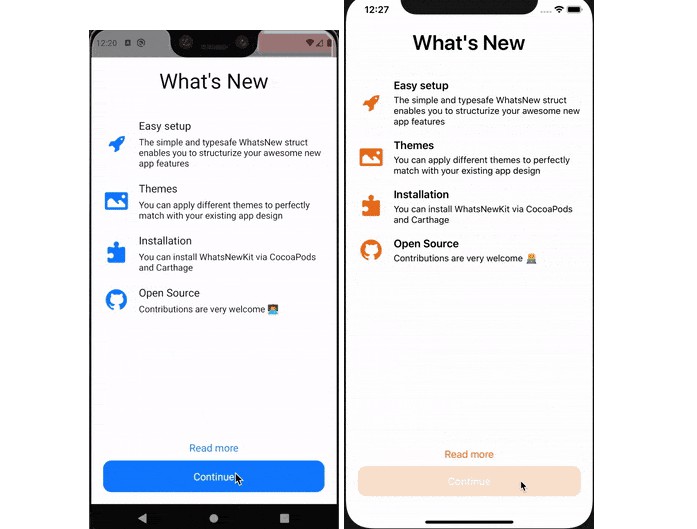
Basic usage
import NewFeature from 'react-native-new-feature'

const App = (props) => {
  const data = {
    title: {
      text: 'What\'s New',
    },
    items: [
      {
        title: {
          text: 'Easy setup',
        },
        subtitle: {
          text: 'The simple and typesafe WhatsNew struct enables you to structurize your awesome new app features',
        },
        image: {
          component: <Image source={require('./assets/icons8-approval-100.png')} style={{ width: 45, height: 45, tintColor: 'red' }}/>,
        }
      },
    ],
    detailButton: {
      text: 'Read more',
    },
    completionButton: {
      text: 'Continue',
    }
  }

  return (
    <NewFeature
      visible={true}
      title={data.title}
      items={data.items}
      detailButton={{
        ...data.detailButton,
      }}
      completionButton={{
        ...data.completionButton,
      }}
    />
  )
}
Customization
React Native New Feature can be fully customized as your need. Below is detail of sub components included and list of animations available:
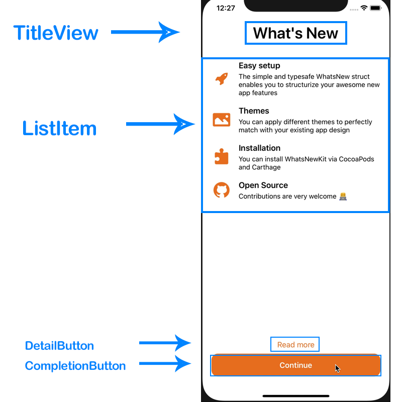
TitleView
Properties:
- text: string (required)
- color: string
- size: number
- weight: '600' // same as fontWeight property. default is '600'
Usage:
<NewFeature
  title={{
    text: 'Title',
    color: 'black',
    size: 35
  }}
  {...other props}
/>
ListItem
This component uses ScrollView to render list of new features, each row is a ItemView component which made from 3 sub-components ItemImage, ItemTitle and ItemSubtitle as described in picture below:
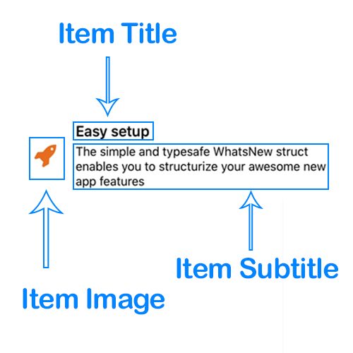
To customize these components,read the sections below.
Item Image
Properties:
- component(required): React component, usually is a <Image> or <Icon> ...,
Item Title and Item Subtitle
Properties:
- text: string (required)
- color: string // default is 'black' if don't specify
- size: number // default is 17 if don't specify
- weight: 'bold' // same as fontWeight property
Detail Button
Properties:
- text: string (required)
- color: string
- size: number
- weight: 'bold' // same as fontWeight property
- handler: function
Usage:
const myHandler = () => {
  console.log(1)
}

<NewFeature
  detailButton={{
    text: 'Read more',
    color: 'red',
    size: 17,
    handler: myHandler
  }}
  {...other props}
/>
Completion Button
Properties:
- text: string (required),
- color: string,
- size: number
- background: string,
- radius: number,
- weight: 'bold' // same as fontWeight property
- handler: function
Usage:
const myHandler = () => {
  console.log(1)
}

<NewFeature
  completionButton={{
    text: 'Read more',
    color: 'red',
    background: 'blue',
    radius: 14
    size: 17,
    handler: myHandler
  }}
  {...other props}
/>
Margin and Padding
margin and padding props are provided in order to help you have more control on layout. These props are applied to these components:
TitleViewItemImageItemTitleItemSubtitleDetailButtonCompletionButton
Usage:
<NewFeature
  title={{
    margin: {
      top: 1,
      right: 2,
      bottom: 3,
      left: 4
    },
    padding: {
      top: 5,
      right: 6,
      bottom: 7,
      left: 8
    }
  }}
  {...other props}
/>
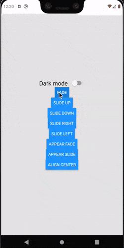
Animations
This package have 2 types of animations:
- Animation on root component appear
- Animation of the ListItem
Root component animation
Root component makes use of Modal component which is built-in of React Native
Usage:
<NewFeature
  appearAnimation={'fade'}
/>
appearAnimation is one of:
none(default if not specified)fadeslide
ListItem animation
Usage:
<NewFeature
  animation={'slide-down'}
/>
animation is one of:
none(default if not specified)fadeslide-upslide-downslide-rightslide-left
Orientation change support
By using purely React Native View flex layout, this component is auto-compatible when device orientation changed
Demo
A complete working demo is located at example folder
Contributing
To start developing with this project, simply run the following commands:
npm install # or yarn install (to install dependencies)

npm run watch # or yarn watch (to build this project in watch mode for development)

npm run build # or yarn build (to build project in production mode)