React Native sortable grid view
Sortable and editable react native grid view.
Installation
$ npm i react-native-sortable-gridview --save
or
$ yarn add react-native-sortable-gridview
Usage
Default

import SortableGridView from 'react-native-sortable-gridview'

...

<SortableGridview
  data={[
    {name: 'box1', backgroundColor: '#09f', color: '#fff'},
    {name: 'box2', backgroundColor: '#f60', color: '#fff'},
    {name: 'box3', backgroundColor: '#333', color: '#fff'},
    {name: 'box4', backgroundColor: '#rgba(255, 216, 58, 1)', color: '#333'},
    {name: 'box5', backgroundColor: '#rgba(0, 222, 144, 1)', color: '#fff'},
  ]}
  onDragStart={() => {
    console.log('Default onDragStart');
  }}
  onDragRelease={(data) => {
    console.log('Default onDragRelease', data);
  }}
  renderItem={(item, index) => {
    return (
      <View
        uniqueKey={item.name} // Important! Should add this props!!!
        onTap={() => {
          Alert.alert(`On Tap ${item.name}!`);
        }}
        style={[styles.item, {backgroundColor: item.backgroundColor}]}
      >
        <Text style={[styles.text, {color: item.color}]}>{item.name}</Text>
      </View>
    )
  }}
/>
Custom Layout

import SortableGridView from 'react-native-sortable-gridview'

...
<SortableGridview
  data={[
    {name: 'box1', backgroundColor: '#09f', color: '#fff'},
    {name: 'box2', backgroundColor: '#f60', color: '#fff'},
    {name: 'box3', backgroundColor: '#333', color: '#fff'},
    {name: 'box4', backgroundColor: '#rgba(255, 216, 58, 1)', color: '#333'},
    {name: 'box5', backgroundColor: '#rgba(0, 222, 144, 1)', color: '#fff'},
  ]}
  numPerRow={4} // let each row has four items. Default is 3
  aspectRatio={1.2} // let height = width * 1.2. Default is 1
  gapWidth={8} // let the gap between items become to 8. Default is 16
  paddingTop={8} // let container's paddingTop become to 8. Default is 16
  paddingBottom={8} // let container's paddingBottom become to 8. Default is 16
  paddingLeft={8} // let container's paddingLeft become to 8. Default is 16
  paddingRight={8} // let container's paddingRight become to 8. Default is 16
  onDragStart={() => {
    console.log('CustomLayout onDragStart');
  }}
  onDragRelease={(data) => {
    console.log('CustomLayout onDragRelease', data);
  }}
  renderItem={(item, index) => {
    return (
      <View uniqueKey={item.name} style={[styles.item, {backgroundColor: item.backgroundColor}]}>
        <Text style={[styles.text, {color: item.color}]}>{item.name}</Text>
      </View>
    )
  }}
/>
Custom sensitivity
sensitivity 500 miliseconds

sensitivity 150 miliseconds (Default)
import SortableGridView from 'react-native-sortable-gridview'

...

<SortableGridview
  data={[
    {name: 'box1', backgroundColor: '#09f', color: '#fff'},
    {name: 'box2', backgroundColor: '#f60', color: '#fff'},
    {name: 'box3', backgroundColor: '#333', color: '#fff'},
    {name: 'box4', backgroundColor: '#rgba(255, 216, 58, 1)', color: '#333'},
    {name: 'box5', backgroundColor: '#rgba(0, 222, 144, 1)', color: '#fff'},
  ]}
  sensitivity={500} // default 150(miliseconds)
  onDragStart={() => {
    console.log('CustomSensitivity onDragStart');
  }}
  onDragRelease={(data) => {
    console.log('CustomSensitivity onDragRelease', data);
  }}
  renderItem={(item, index) => {
    return (
      <View uniqueKey={item.name} style={[styles.item, {backgroundColor: item.backgroundColor}]}>
        <Text style={[styles.text, {color: item.color}]}>{item.name}</Text>
      </View>
    )
  }}
/>
Change selectAnimation and selectStyle

import SortableGridView from 'react-native-sortable-gridview'

...

<SortableGridview
  data={[
    {name: 'box1', backgroundColor: '#09f', color: '#fff'},
    {name: 'box2', backgroundColor: '#f60', color: '#fff'},
    {name: 'box3', backgroundColor: '#333', color: '#fff'},
    {name: 'box4', backgroundColor: '#rgba(255, 216, 58, 1)', color: '#333'},
    {name: 'box5', backgroundColor: '#rgba(0, 222, 144, 1)', color: '#fff'},
  ]}
  selectAnimation="shake" // scale, shake, none. default is scale
  selectStyle={{
    shadowColor: '#000',
    shadowOffset: {
      width: 0,
      height: 4,
    },
    shadowOpacity: 1,
    shadowRadius: 3.84,
    elevation: 5,
  }}
  onDragStart={() => {
    console.log('ChangeSelectAnimationSelectStyle onDragStart');
  }}
  onDragRelease={(data) => {
    console.log('ChangeSelectAnimationSelectStyle onDragRelease', data);
  }}
  renderItem={(item, index) => {
    return (
      <View uniqueKey={item.name} style={[styles.item, {backgroundColor: item.backgroundColor}]}>
        <Text style={[styles.text, {color: item.color}]}>{item.name}</Text>
      </View>
    )
  }}
/>
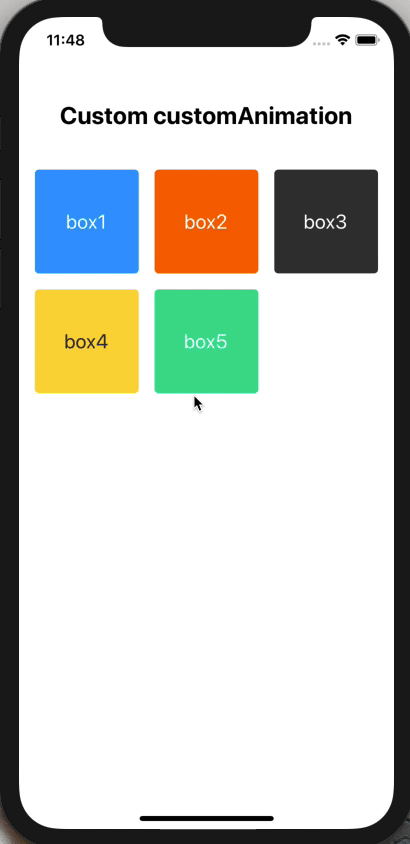
Custom customAnimation
import SortableGridView from 'react-native-sortable-gridview'

...

<SortableGridview
  data={[
    {name: 'box1', backgroundColor: '#09f', color: '#fff'},
    {name: 'box2', backgroundColor: '#f60', color: '#fff'},
    {name: 'box3', backgroundColor: '#333', color: '#fff'},
    {name: 'box4', backgroundColor: '#rgba(255, 216, 58, 1)', color: '#333'},
    {name: 'box5', backgroundColor: '#rgba(0, 222, 144, 1)', color: '#fff'},
  ]}
  customAnimation={{
    startTimingOption: {
      toValue: 1,
      duration: 500,
      easing: Easing.ease,
    },
    endTimingOption: {
      toValue: 0,
      duration: 0,
    },
    style: (animation) => {
      let onSelectRotateAnimation = {}
      let rotate = animation.interpolate({ // should set interpolate to animation
        inputRange: [0, .4, .6, 1], // only 0 to 1
        outputRange: ['0deg', '-15deg', '-30deg', '360deg'],
      });
      onSelectRotateAnimation = {
        transform: [{
          rotate: rotate,
        }],
      }
      return onSelectRotateAnimation;
    }
  }}
  onDragStart={() => {
    console.log('CustomAnimation onDragStart');
  }}
  onDragRelease={(data) => {
    console.log('CustomAnimation onDragRelease', data);
  }}
  renderItem={(item, index) => {
    return (
      <View uniqueKey={item.name} style={[styles.item, {backgroundColor: item.backgroundColor}]}>
        <Text style={[styles.text, {color: item.color}]}>{item.name}</Text>
      </View>
    )
  }}
/>
Item cover layout

import SortableGridView from 'react-native-sortable-gridview'

...

<SortableGridview
  data={[
    {name: 'box1', backgroundColor: '#09f', color: '#fff'},
    {name: 'box2', backgroundColor: '#f60', color: '#fff'},
    {name: 'box3', backgroundColor: '#333', color: '#fff'},
    {name: 'box4', backgroundColor: '#rgba(255, 216, 58, 1)', color: '#333'},
    {name: 'box5', backgroundColor: '#rgba(0, 222, 144, 1)', color: '#fff'},
  ]}
  onDragStart={() => {
    console.log('ItemCoverLayout onDragStart');
  }}
  onDragRelease={(data) => {
    console.log('ItemCoverLayout onDragRelease', data);
  }}
  renderItem={(item, index) => {
    return (
      <View uniqueKey={item.name} style={[styles.item, {backgroundColor: item.backgroundColor}]}>
        <Text style={[styles.text, {color: item.color}]}>{item.name}</Text>
      </View>
    )
  }}
  itemCoverStyle={{marginTop: -8, marginLeft: -8}}
  renderItemCover={(item, index) => {
    return (
      <TouchableOpacity
        style={styles.cover}
        onPress={() => {
          Alert.alert(`On Press ${item.name} Cover!`);
        }}
      >
        <Text style={{color: item.backgroundColor}}>{item.name} cover</Text>
      </TouchableOpacity>
    )
  }}
/>
Lock item layout

import SortableGridView from 'react-native-sortable-gridview'

...

<SortableGridview
  data={[
    {name: 'box1', backgroundColor: '#09f', color: '#fff'},
    {name: 'box2', backgroundColor: '#f60', color: '#fff'},
    {name: 'box3', backgroundColor: '#333', color: '#fff'},
    {name: 'box4', backgroundColor: '#rgba(255, 216, 58, 1)', color: '#333'},
    {name: 'box5', backgroundColor: '#rgba(0, 222, 144, 1)', color: '#fff'},
  ]}
  lockData={[
    {name: 'lock box1'},
    {name: 'lock box2'},
    {name: 'lock box3'},
    {name: 'lock box4'},
  ]}
  onDragStart={() => {
    console.log('LockItemLayout onDragStart');
  }}
  onDragRelease={(data) => {
    console.log('LockItemLayout onDragRelease', data);
  }}
  renderItem={(item, index) => {
    return (
      <View
        uniqueKey={item.name}
        style={[styles.item, {backgroundColor: item.backgroundColor}]}
        onTap={() => {
          Alert.alert(`On Tap ${item.name}!`);
        }}
      >
        <Text style={[styles.text, {color: item.color}]}>{item.name}</Text>
      </View>
    )
  }}
  renderLockItem={(item, index) => {
    return (
      <View
        uniqueKey={`${item.name}`}
        style={styles.lockItem}
        onTap={() => {
          Alert.alert(`On Tap ${item.name}!`);
        }}
      >
        <Text>{item.name}</Text>
      </View>
    )
  }}
/>
Lock item cover layout

import SortableGridView from 'react-native-sortable-gridview'

...

<SortableGridview
  data={[
    {name: 'box1', backgroundColor: '#09f', color: '#fff'},
    {name: 'box2', backgroundColor: '#f60', color: '#fff'},
    {name: 'box3', backgroundColor: '#333', color: '#fff'},
    {name: 'box4', backgroundColor: '#rgba(255, 216, 58, 1)', color: '#333'},
    {name: 'box5', backgroundColor: '#rgba(0, 222, 144, 1)', color: '#fff'},
  ]}
  lockData={[
    {name: 'lock box1'},
    {name: 'lock box2'},
    {name: 'lock box3'},
    {name: 'lock box4'},
  ]}
  onDragStart={() => {
    console.log('LockItemCoverLayout onDragStart');
  }}
  onDragRelease={(data) => {
    console.log('LockItemCoverLayout onDragRelease', data);
  }}
  renderItem={(item, index) => {
    return (
      <View
        uniqueKey={item.name}
        style={[styles.item, {backgroundColor: item.backgroundColor}]}
        onTap={() => {
          Alert.alert(`On Tap ${item.name}!`);
        }}
      >
        <Text style={[styles.text, {color: item.color}]}>{item.name}</Text>
      </View>
    )
  }}
  renderLockItem={(item, index) => {
    return (
      <View
        uniqueKey={`${item.name}`}
        style={styles.lockItem}
        onTap={() => {
          Alert.alert(`On Tap ${item.name}!`);
        }}
      >
        <Text>{item.name}</Text>
      </View>
    )
  }}
  lockItemCoverStyle={{marginTop: -8, marginLeft: -8}}
  renderLockItemCover={(item, index) => {
    return (
      <TouchableOpacity
        style={styles.cover}
        onPress={() => {
          Alert.alert(`On Press ${item.name} Cover!`);
        }}
      >
        <Text style={{color: item.backgroundColor}}>{item.name} cover</Text>
      </TouchableOpacity>
    )
  }}
/>
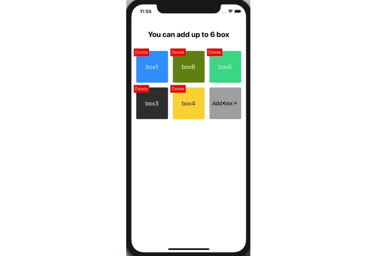
Final example

import SortableGridView from 'react-native-sortable-gridview'

...

class FinalExample extends Component {
  state = {
    data: [
      {name: 'box1', backgroundColor: '#09f', color: '#fff'},
      {name: 'box2', backgroundColor: '#f60', color: '#fff'},
      {name: 'box3', backgroundColor: '#333', color: '#fff'},
      {name: 'box4', backgroundColor: '#rgba(255, 216, 58, 1)', color: '#333'},
      {name: 'box5', backgroundColor: '#rgba(0, 222, 144, 1)', color: '#fff'},
    ],
    newId: 6, // New box's id should never be used.
  }
  render() {
    let lockData = [];
    if (this.state.data.length < 6) {
      lockData.push({
        name: 'Add box',
      })
    }
    return (
      <View>
        <Text style={styles.title}>You can add up to 6 box</Text>
        <SortableGridview
          data={this.state.data}
          lockData={lockData}
          onDragStart={() => {
            console.log('Default onDragStart');
          }}
          onDragRelease={(data) => {
            console.log('Default onDragRelease', data);
            this.setState({
              data,
            })
          }}
          renderItem={(item, index) => {
            return (
              <View
                uniqueKey={item.name}
                onTap={() => {
                  Alert.alert(`On Tap ${item.name}!`);
                }}
                style={[styles.item, {backgroundColor: item.backgroundColor}]}
              >
                <Text style={[styles.text, {color: item.color}]}>{item.name}</Text>
              </View>
            )
          }}
          itemCoverStyle={{marginTop: -8, marginLeft: -8}}
          renderItemCover={(item, index) => {
            return (
              <TouchableOpacity
                style={styles.delete}
                onPress={() => {
                  let data = [...this.state.data];
                  data.splice(index, 1);
                  this.setState({
                    data,
                  })
                }}
              >
                <Text style={styles.deleteText}>Delete</Text>
              </TouchableOpacity>
            )
          }}
          renderLockItem={(item, index) => {
            return (
              <View
                uniqueKey={`${item.name}`}
                style={styles.lockItem}
                onTap={() => {
                  Alert.alert(
                    'Add Picture?',
                    'Click Yes to append picture to array!',
                    [
                      {text: 'Cancel'},
                      {text: 'OK', onPress: () => {
                        let data = [...this.state.data];
                        const randomColor = `#rgba(${Math.round(Math.random() * 255)}, ${Math.round(Math.random() * 255)}, ${Math.round(Math.random() * 255)}, 1)`;
                        data.push({
                          name: `box${this.state.newId}`,
                          backgroundColor: randomColor,
                          color: '#fff'
                        })
                        this.setState({
                          data,
                          newId: this.state.newId + 1,
                        })
                      }},
                    ]
                  )
                }}
              >
                <Text style={styles.add}>{item.name}+</Text>
              </View>
            )
          }}
        />
      </View>
    )
  }
}
Properties
Note: Other properties will be passed down to underlying component.
| Props | Type | Description | Default |
|---|---|---|---|
data |
Array | Data's item will be param in renderItem function. | None |
lockData |
Array | Lock Data's item will be param in renderLockItem function. Lock item can't be drag and drog | None |
numPerRow |
Number | How many items should be render on one row | 3 |
aspectRatio |
Number | The aspect ratio. If aspectRatio value is 1.2, it means that height = width * 1.2. | 1 |
gapWidth |
Number | The gap between each item. | 16 |
paddingVertical |
Number | Container's paddingVertical. | 16 |
paddingHorizontal |
Number | Container's paddingHorizontal. | 16 |
sensitivity |
Number | Detection time, while user moving the item. | 150 (milisecond) |
selectAnimation |
String | The animation when user begin to drag. Valid values: none, scale, shake. |
scale |
selectStyle |
Object | Add some style to dragging item. | shadow style |
customAnimation |
Object | The way to custom select animation. There have three flag in customAnimation, startTimingOption, endTimingOption and style (function). startTimingOption and endTimingOption can set Animated.timing's option, and style is the function that you can set animation interpolate and return animated style. |
None |
onDragStart |
Function | When user start to drag item, this function will be trigger. | None |
onDragRelease |
Function | When user drog item, this function will be trigger. The has two params can be use in callback, current item's info and item's index in data array. | None |
renderItem |
Function | Item's layout. The has two params can be use in callback, current item's info and item's index in data array.important! Root element should has uniqueKey this props. And if want to add onPress event to root element, it should be change as onTap (Root element can be any type tag like, View, Image, Text...) |
None |
itemCoverStyle |
Object | Add custom style to item's cover component. | None |
renderItemCover |
Function | Item's cover layout. This props that user can't create an layout over item's layout, it means item's cover layout won't be hidden while it overflow the item's layout. | None |
renderLockItem |
Function | Lock item's layout. The Lock item can't be sortable (can't drag and drog) and can't drag normal items to lock items's sequence. The has two params can be use in callback, current item's info and item's index in data array. | None |
lockItemCoverStyle |
Object | Add custom style to lock item's cover component. | None |
renderLockItemCover |
Function | Lock item's cover layout. This props that user can't create an layout over lock item's layout, it means lock item's cover layout won't be hidden while it overflow the lock item's layout. | None |