react-native-masked-text
A simple masked text and input text component for React-Native.
This is a simple masked text (normal text and input text) component for React-Native.
Supported Versions
React-native: 0.32.0 or higher
Install
npm install react-native-masked-text --save
Usage (TextInputMask)
import React, { Component } from 'react'

// import the component
import { TextInputMask } from 'react-native-masked-text'

export default class MyComponent extends Component {
	constructor(props) {
		super(props)
	}

	componentDidMount() {
		// isValid method returns if the inputed value is valid.
		// Ex: if you input 40/02/1990 30:20:20, it will return false
		//	   because in this case, the day and the hour is invalid.
		let valid = this.myDateText.isValid();

		// get converted value. Using type=datetime, it returns the moment object.
		// If it's using type=money, it returns a Number object.
		let rawValue = this.myDateText.getRawValue();
	}

	render() {
		// the type is required but options is required only for some specific types.
		return (
			<TextInputMask
				refInput={(ref) => this.myDateText = ref;}
				type={'datetime'}
				options={{
					format: 'DD-MM-YYYY HH:mm:ss'
				}}
			/>
		)
	}
}
Props
type
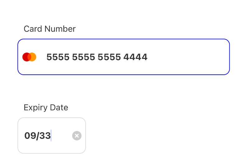
credit-card: use the mask 9999 9999 9999 9999. It accepts options (see later in this doc).
cpf: use the mask 999.999.999-99 and numeric keyboard.
cnpj: use the mask 99.999.999/9999-99 and numeric keyboard.
zip-code: use the mask 99999-999 and numeric keyboard.
only-numbers: accept only numbers on field with numeric keyboard.
money: use the mask R$ 0,00 on the field with numeric keyboard. It accepts options (see later in this doc).
cel-phone: use the mask (99) 9999-9999 or (99) 99999-9999 (changing automaticaly by length). It accepts options (see later in this doc).
datetime: use datetime mask with moment format (default DD/MM/YYYY HH:mm:ss). It accepts options (see later in this doc).
custom: use your custom mask (see the options props later in this doc).
onChangeText
Invoked after new value applied to mask.
/**
 * @param {String} text the text AFTER mask is applied.
*/
onChangeText(text) {
	// ...
}

<TextInputMask
	type={'only-numbers'}
	onChangeText={this.onChangeText.bind(this)} />
checkText
Allow you to check and prevent value to be inputed.
/**
 * @param {String} previous the previous text in the masked field.
 * @param {String} next the next text that will be setted to field.
 * @return {Boolean} return true if must accept the value.
*/
checkText(previous, next) {
	return next === 'your valid value or other boolean condition';
}

<TextInputMask
	type={'only-numbers'}
	checkText={this.checkText.bind(this)} />
customTextInput
You can use this prop if you want custom text input instead native TextInput component:
const Textfield = MKTextField.textfield()
  .withPlaceholder('Text...')
  .withStyle(styles.textfield)
  .build();


<TextInputMask
	refInput={(ref) => this.myDateText = ref;}
	type={'money'}
	style={styles.input}
	customTextInput={Textfield}
	placeholder="Enter text to see events"
/>
customTextInputProps
Some custom inputs like react-native-textinput-effects have to set properties in mount time. For these types of components we use this property.
import React from 'react'
import { StyleSheet, View } from 'react-native'

import { TextInputMask } from 'react-native-masked-text'
import { Kaede } from 'react-native-textinput-effects'

export default class App extends React.Component {
  constructor(props) {
    super(props)

    this.state = {
      birthday: ''
    }
  }

  render() {
    return (
      <View style={styles.container}>
        <TextInputMask
          refInput={(ref) => this.myDateText = ref;}
          // here we set the custom component and their props.
          customTextInput={Kaede}
          customTextInputProps={{
            style:{ width: '80%' },
            label:'Birthday'
          }}

          type={'datetime'}
          options={{
            format: 'DD-MM-YYYY HH:mm:ss'
          }}

          // don't forget: the value and state!
          onChangeText={birthday => this.setState({ birthday })}
          value={this.state.birthday} />
      </View>
    );
  }
}

const styles = StyleSheet.create({
	container: {
		flex: 1,
		backgroundColor: '#fff',
		alignItems: 'center',
		justifyContent: 'center'
	}
})
TextInput Props
You can use the native props of TextInput, with this in mind:
- onChangeText is intercepted by component.
- value is intercepted by component.
- if you pass keyboardType, it will override the keyboardType of masked component.
TextInput Methods
If you want to use the methods of the native TextInput, use the getElement() method:
export default class App extends React.Component {
    onGoFocus() {
        // when you call getElement method, the instance of native TextInput will returned.
        this._myTextInputMask.getElement().focus()
    }

    render() {
        return (
            <View style={styles.container}>
                <View>
                    <TextInputMask
                        ref={ref => (this._myTextInputMask = ref)}
                        type={'only-numbers'}
                        style={styles.input}
                    />
                </View>
                <View>
                    <Button
                        onPress={this.onGoFocus.bind(this)}
                        title="Go Focus Hue"
                        color="#841584"
                    />
                </View>
            </View>
        )
    }
}
Options
Some types accept options, use it like this: <TextInputMask type={'money'} options={{ unit: 'US$' }} />
For type={'money'}
- options={...}
precision(Number, default 2): the decimal places.separator(String, default ','): the decimal separator.delimiter(String, default '.'): the thousand separator.unit: (String, default 'R$'): the prefix text.suffixUnit(String, default ''): the suffix text.zeroCents(Boolean, default false): if must show cents.
For type={'cel-phone'}
- options={...}
withDDD(Boolean, default true): if the ddd will be include in the mask.dddMask(String, default '(99) '): the default mask applied ifwithDDDis true.
For type={'datetime'}
- options={...}
format(String, default DD/MM/YYYY HH:mm:ss): moment date format. It accepts the following:- DD/MM/YYYY HH:mm:ss
- DD/MM/YYYY
- MM/DD/YYYY
- YYYY/MM/DD
- HH:mm:ss
- HH:mm
- HH
- You can use all of dates with
-instead of/if you want
For type={'custom'}
- options={...}
{
	/**
	 * mask: (String | required | default '')
	 * the mask pattern
	 * 9 - accept digit.
	 * A - accept alpha.
	 * S - accept alphanumeric.
	 * * - accept all, EXCEPT white space.
	*/
	mask: '999#AAA',

	/**
	 * validator: (Function | optional | defaults returns true)
	 * use this funcion to inform if the inputed value is a valid value (for invalid phone numbers, for example). The isValid method use this validator.
	*/
	validator: function(value, settings) {
		return true
	},
	/**
	 * getRawValue: (Function | optional | defaults return current masked value)
	 * use this function to parse and return values to use what you want.
	 * for example, if you want to create a phone number mask (999) 999-99-99 but want to get only
	 * the numbers for value, use this method for this parse step.
	*/
	getRawValue: function(value, settings) {
		return 'my converted value';
	},
	/**
	 * translation: (Object | optional | defaults 9, A, S, *)
	 * the dictionary that translate mask and value.
	 * you can change defaults by simple override the key (9, A, S, *) or create some new.
	*/
	translation: {
		// this is a custom translation. The others (9, A, S, *) still works.
		// this translation will be merged and turns into 9, A, S, *, #.
		'#': function(val) {
			if (val === ' ') {
				return val;
			}

			// if returns null, undefined or '' (empty string), the value will be ignored.
			return null;
		},
		// in this case, we will override build-in * translation (allow all characters)
		// and set this to allow only blank spaces and some special characters.
		'*': function(val) {
			return [' ', '#', ',', '.', '!'].indexOf(val) >= 0 ? val : null;
		}
	}
}
For type={'credit-card'}
- options={...} *
obfuscated(Boolean, default false): if the mask must be9999 **** **** 9999
Methods
getElement(): return the instance of TextInput component.isValid(): if the value inputed is valid for the mask.- credit-card: return true if the mask is complete.
- cpf: return true if the mask is complete and cpf is valid.
- cnpj: return true if the mask is complete and cnpj is valid.
- zip-code: return true if the mask is complete.
- only-numbers: always returns true.
- money: always returns true.
- cel-phone: return true if the mask is complete.
- datetime: return true if the date value is valid for format.
- custom: use custom validation, if it not exist, always returns true.
getRawValue(): get the converted value of mask.- credit-card: return the array with the value parts. Ex:
1234 1234 1234 1234returns[1234, 1234, 1234, 1234]. - cpf: return the value without mask.
- cnpj: return the value without mask.
- zip-code: return the value without mask.
- only-numbers: return the value without mask.
- money: return the Number value. Ex:
R$ 1.234,56returns1234.56. - cel-phone: return the value without mask.
- datetime: return the
momentobject for the date and format. - custom: use custom method (passed in options). If it not exists, returns the current value.
- credit-card: return the array with the value parts. Ex:
Sample usage:
import React, { Component } from 'react'
import { StyleSheet, View } from 'react-native'
import { TextInputMask } from 'react-native-masked-text'

export default class App extends Component {
    state = {
        datetime: ''
    }
    render() {
        return (
            <View style={styles.container}>
                <TextInputMask
                    {/*First, set the reference*/}
                    ref={ref => (this._myDatetimeField = ref)}
                    style={styles.input}
                    type={'datetime'}
                    options={{
                        format: 'DD-MM-YYYY HH:mm:ss'
                    }}
                    placeholder={'datetime DD-MM-YYYY HH:mm:ss'}
                    value={this.state.datetime}
                    onChangeText={datetime => {
                        this.setState({ datetime })

                        // Now just use =)
                        console.log(this._myDatetimeField.getElement())
                        console.log(this._myDatetimeField.isValid())
                        console.log(this._myDatetimeField.getRawValue())
                    }}
                />
            </View>
        )
    }
}

const styles = StyleSheet.create({
    container: {
        flex: 1,
        justifyContent: 'center',
        alignItems: 'center',
        backgroundColor: '#F5FCFF'
    },
    input: {
        height: 50,
        width: '80%',
        borderColor: 'steelblue',
        borderWidth: 2
    }
})
Usage (TextMask)
import React, { Component } from 'react'

// import the component
import { TextMask } from 'react-native-masked-text'

export default class MyComponent extends Component {
    constructor(props) {
        super(props)
        this.state = {
            text: '4567123409871234'
        }
    }

    render() {
        // the type is required but options is required only for some specific types.
        // the sample below will output 4567 **** **** 1234
        return (
            <TextMask
                value={this.state.text}
                type={'credit-card'}
                options={{
                    obfuscated: true
                }}
            />
        )
    }
}
Props
The same of TextInputMask, but for React-Native Text component instead TextInput.
Warning: if the value not match the mask, it will not appear.
Methods
getElement(): return the instance of Text component.
Extra (MaskService)
If you want, we expose the MaskService. You can use it:
Methods
- static toMask(type, value, settings): mask a value.
type(String, required): the type of the mask (cpf,datetime, etc...)value(String, required): the value to be maskedsettings(Object, optional): if the mask type accepts options, pass it in the settings parameter
- static toRawValue(type, maskedValue, settings): get the raw value of a masked value.
type(String, required): the type of the mask (cpf,datetime, etc...)maskedValue(String, required): the masked value to be converted in raw valuesettings(Object, optional): if the mask type accepts options, pass it in the settings parameter
- static isValid(type, value, settings): validate if the mask and the value match.
type(String, required): the type of the mask (cpf,datetime, etc...)value(String, required): the value to be maskedsettings(Object, optional): if the mask type accepts options, pass it in the settings parameter
- static getMask(type, value, settings): get the mask used to mask the value
Ex:
import { MaskService } from 'react-native-masked-text'

var money = MaskService.toMask('money', '123', {
    unit: 'US$',
    separator: '.',
    delimiter: ','
})

// money -> US$ 1.23
Throubleshooting
- If the
es2015error throw by babel, try runreact-native start --reset-cache