react-native-tips
This module is used to guide your new comers throughout your app. Easily and Effectively.
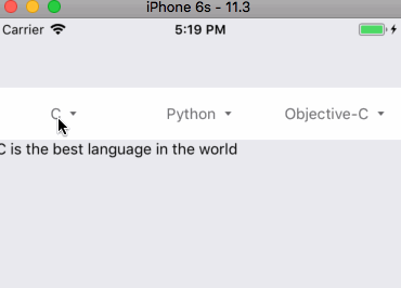
| Ios | Android |
|---|---|
 |
 |
Update to v0.0.8 - Deprecation warning
onRequestNextis deprecated. It will be removed in the next update. Be sure to replace it
byonRequestClosewhich does the same thing.
How to install
# Install via npm
npm install react-native-tips --save

# Install via yarn
yarn add react-native-tips
How to use it
To use it, just import it directly into your components
import Tips from 'react-native-tips'
Example
The most basic example of this module is to use it like this :
import React from 'react'
import { View, Button } from 'react-native'
import Tips from 'react-native-tips'


const MyButton = (props = {}) => (
  <View>
    <Tips
      visible
      text="This is a tips !"
    >
      <Button title="Hello world !">
    </Tips>
  </View>
)

export default MyButton
Configuration
Properties of Tips:
| Property | Type | Requirement | Description |
|---|---|---|---|
| children | node | Optional | The Tips children are elements that will be highlighted when the tips will be visible |
| childrenStyle | Object | Optional | Override the style of the container of the children |
| content | node | Optional | Use this property if you want to add more than a simple text inside your Tips. |
| contentStyle | Object | Optional | Override the style of the content of the Modal (used for positioning the highlighted elements and tips) |
| delay | Number | Optional (default: 250) | Add a delay before showing the Tips |
| modalStyle | Object | Optional | Override the style of the Modal Component (react-native) |
| offsetLeft | Number | Optional | Add an offset on the Tips in x axis. |
| offsetTop | Number | Optional | Add an offset on the Tips in y axis. |
| onRequestClose | function | Optional | Triggered when the user taps on the screen. |
| onRequestNext | function | Deprecated !!! Optional | Deprecated !!! Use onRequestClose instead. (See #waterfall-tips for more.) |
| position | enum (top, left, right, bottom or none) |
Default: top |
Define the position of your tips related to their children. |
| style | Object | Optional | Override the style of your tips |
| text | String | Optional | Text inside the Tips. |
| textStyle | Object | Optional | Override the style of the text inside the Tips |
| tooltipContainerStyle | Object | Optional | Override the style of the container of your tips (used for positionning) |
| visible | Boolean | Default: false |
Set the visibility of your Tips |
| enableChildrenInteraction | Boolean | Default: false |
If set to true, interation with children won't close the Tips |
Waterfall Tips
You sometimes need to show tips one after another. This module has a helper to execute this scheme. You can use
new Tips.Waterfall() to create a new helper that helps you to show/hide tips in a waterfall manner.
import React, { PureComponent } from 'react'
import { View, Button, Text } from 'react-native'
import Tips from 'react-native-tips'


export default class MyButton extends PureComponent {
  constructor(props) {
    super(props)

    // 1st step - Create your helper with keys that will represent your tips
    this.waterfallTips = new Tips.Waterfall([
      'myTips1', 'myTips2'
    ])

    this.state = {
      tipsVisible: null
    }

    // This method will trigger the changement of tips
    this.handleNextTips = this.handleNextTips.bind(this)
  }

  componentDidMount() {
    // the 'start' method will set the first Tips key into your state.
    this.setState({
      tipsVisible: this.waterfallTips.start()
    })
  }

  handleNextTips() {
    // the 'next' method will set the next tips key into your state until it has no more keys.
    this.setState({
      tipsVisible: this.waterfallTips.next()
    })
  }

  render() {
    const { tipsVisible } = this.state

    return (
      <View>
        <Tips
          visible={tipsVisible === 'myTips1'}
          onRequestClose={this.handleNextTips}
        >
          <Button text="My button">
        </Tips>

        <Tips
          visible={tipsVisible === 'myTips2'}
          onRequestClose={this.handleNextTips}
        >
          <Text>My text</Text>
        </Tips>
      </View>
    )
  }
}
Use Tips only one time
In most of the cases, you only want these tips when the user arrives for the first time on your app or when your app has been updated.
It is possible to do this with the Waterfall Tips helper :
  this.waterfallTips = new Tips.Waterfall(
    ['myTips1', 'myTips2'],
    {
      onEnd: async () => {
        await AsyncStorage.setItem('@Tips', true)
      }
    }
  )

  const isWaterfallAlreadyFinished = await AsyncStorage.getItem('@Tips')

  if (isWaterfallAlreadyFinished) {
    this.waterfallTips.options.disabled = true
  }
Options can be instanciated at the constructor or wherever you want.
methods of Tips.Waterfall:
| Method | Description |
|---|---|
| new Tips.Waterfall(indexes: Array< String >, options: optionsObject): Tips.Waterfall | Instanciate a new waterfallTips helper. |
| start(): String | Start the waterfall and set the first index as the current index. |
| isVisible(index: String): Boolean | Check if the index passed in parameter is the current index. |
| createIndex(index: String): String | Create a new index key. |
| next(): String | Set the next index as the current index. If it was the last key, the value will be null |
| previous(): String | Set the previous index as the current index. If it was the first key, the value will be the first key. |
options of Tips.Waterfall:
| Name | Type | Description |
|---|---|---|
| onIndexChange | Function (index: Boolean) |
Triggered when the index has changed. |
| onEnd | Function |
Triggered when all tips have been shown. |
| disabled | Boolean |
If true, the index will always return null and no Tips will be shown. |