react-native-utils-components
Utils components for react native.
Getting started
$ yarn add react-native-utils-components react-native-utils-toolkit
Start IOS
$ cd ios && pod install
Source code example
https://github.com/hoaphantn7604/react-native-utils-template-typescript
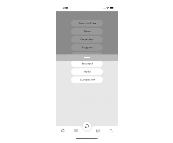
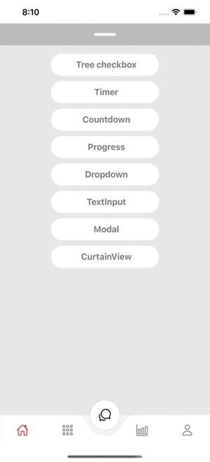
Demo
Hierarchy
| Props |
Params |
isRequire |
default |
| data |
Array |
Yes |
|
| textField |
String |
Yes |
|
| childField |
String |
Yes |
|
| onSelect |
()=> void |
Yes |
|
| buttonName |
String |
No |
|
| style |
ViewStyle |
No |
|
| buttonStyle |
ViewStyle |
No |
|
| buttonTextStyle |
TextStyle |
No |
|
| textStyle |
TextStyle |
No |
|
| iconColor |
String |
No |
black |
Example
    import { Hierarchy } from 'react-native-utils-components';
    const recursiveData = [
        {
            shopReportName: 'HCM1',
            shopCode: '2MFHCM1',
            shopType: '2',
            shopId: 1,
            shopName: 'MobiFone HCM1',
            childs: [
            {
                shopReportName: 'LQTĐ',
                shopCode: '2MFH10038',
                shopType: '3',
                shopId: 2,
                shopName: 'MBF Liên Quận Thủ Đức: Q.TĐ, Q.2, Q9, Q.Bình Thạnh',
                childs: [
                {
                    shopReportName: 'Q.TĐức',
                    shopCode: 'HCM_TDU',
                    shopType: '4',
                    shopId: 3,
                    shopName: 'Q.Thủ Đức',
                    childs: [
                    {
                        shopReportName: 'Q.BThạnh',
                        shopCode: 'HCM_BTH',
                        shopType: '4',
                        shopId: 4,
                        shopName: 'Q.Bình Thạnh',
                    },
                    {
                        shopReportName: 'Q.02',
                        shopCode: 'HCM_002',
                        shopType: '4',
                        shopId: 5,
                        shopName: 'Q.02',
                        childs: [
                        {
                            shopReportName: 'Q.09',
                            shopCode: 'HCM_0099',
                            shopType: '4',
                            shopId: 7,
                            shopName: 'Q.09',
                            childs: [
                            {
                                shopReportName: 'Q.09',
                                shopCode: 'HCM_00999',
                                shopType: '4',
                                shopId: 7,
                                shopName: 'Q.09',
                            },
                            ],
                        },
                        ],
                    },
                    {
                        shopReportName: 'Q.09',
                        shopCode: 'HCM_0099999',
                        shopType: '4',
                        shopId: 8,
                        shopName: 'Q.09',
                    },
                    ],
                },
                ],
            },
            ],
        },
    ];

    <Hierarchy
        data={recursiveData}
        textField="shopCode"
        childField="childs"
        textStyle={{color: 'black'}}
        iconColor="black"
        buttonName="Continute"
        buttonStyle={{backgroundColor: 'black'}}
        buttonTextStyle={{color: 'white'}}
        onSelect={item => {
            console.log(`Selected ${item.length} item`);
        }}
    />
StepProgress
| Props |
Params |
isRequire |
default |
| data |
Array |
Yes |
|
| style |
ViewStyle |
No |
|
| activeColor |
String |
No |
#32C5FF |
| inActiveColor |
String |
No |
#C6CDD8 |
| textColor |
String |
No |
#C6CDD8 |
| selectColor |
String |
No |
#FF9900 |
| textSize |
Number |
No |
16 |
| selectIndex |
Number |
No |
0 |
| onSelectIndex |
(index)=> Void |
No |
|
| iconTick |
Path |
No |
|
| Props |
Params |
isRequire |
default |
| data |
Array |
Yes |
|
| style |
ViewStyle |
No |
|
| tooltipStyle |
ViewStyle |
No |
|
| activeColor |
String |
No |
#32C5FF |
| inActiveColor |
String |
No |
#C6CDD8 |
| selectColor |
String |
No |
#FF9900 |
| textSize |
Number |
No |
16 |
| selectIndex |
Number |
No |
0 |
| onSelectIndex |
(index)=> Void |
No |
|
Progress
| Props |
Params |
isRequire |
default |
| data |
Array |
Yes |
|
| percent |
Number |
Yes |
|
| style |
ViewStyle |
No |
|
| height |
String |
No |
6 |
| border |
String |
No |
false |
Example
    import {
        StepProgress,
        TooltipProgress,
        Progress,
    } from 'react-native-utils-components';

    <StepProgress
        data={[
            {text: 'Step 1', status: true},
            {text: 'Step 2', status: true},
            {text: 'Step 3', status: false},
            {text: 'Step 4', status: false},
        ]}
        selectIndex={step}
        onSelectIndex={index => {
            setStep(index);
        }}
        activeColor="#32C5FF"
        inActiveColor="#C6CDD8"
        selectColor="#FF9900"
        textColor="gray"
        textSize={15}
    />

    <TooltipProgress
        data={[
            {stage: 'S1', text: 'Hello S1', status: true},
            {stage: 'S2', text: 'Hello S2', status: true},
            {stage: 'S3', text: 'Hello S3', status: true},
            {stage: 'S4', text: 'Hello S4', status: false},
            {stage: 'S5', text: 'Hello S5', status: false},
            {stage: 'S6', text: 'Hello S6', status: false},
        ]}
        activeColor="#32C5FF"
        inActiveColor="#C6CDD8"
        selectColor="#32C5FF"
        selectIndex={stage}
        onSelectIndex={index => {
            setStage(index);
        }}
    />

    <Progress
        data={[
            {color: 'red', percent: 33.33},
            {color: 'gray', percent: 33.33},
            {color: 'green', percent: 33.33},
        ]}
        percent={20}
        border
    />
Timer
| Props |
Params |
isRequire |
default |
| start |
Boolean |
Yes |
false |
| style |
ViewStyle |
No |
|
| textStyle |
TextStyle |
No |
|
| onTimes |
(seconds) => void |
No |
|
| onEnd |
(seconds) => void |
No |
|
Example
    import { Timer } from 'react-native-utils-components';

    <Timer
        style={styles.timer}
        textStyle={styles.timerText}
        start={true}
        onTimes={seconds => {
            console.log(seconds);
        }}
        onEnd={seconds => {
            console.log(seconds);
        }}
    />
Countdown
| Props |
Params |
isRequire |
default |
| seconds |
Number |
Yes |
|
| start |
Boolean |
Yes |
false |
| style |
ViewStyle |
No |
|
| textStyle |
TextStyle |
No |
|
| onTimes |
(seconds) => void |
No |
|
| onEnd |
(seconds) => void |
No |
|
Example
    import { Countdown } from 'react-native-utils-components';

    <Countdown
        seconds={100}
        style={styles.timer}
        textStyle={styles.timerText}
        start={true}
        onTimes={seconds => {
            console.log(seconds);
        }}
        onEnd={() => {
            console.log('End');
        }}
    />
Dropdown
| Props |
Params |
isRequire |
default |
| data |
Array |
Yes |
|
| labelField |
String |
Yes |
|
| valueField |
String |
Yes |
|
| onChange |
(item) => void |
Yes |
|
| style |
ViewStyle |
No |
|
| labelStyle |
TextStyle |
No |
|
| textStyle |
TextStyle |
No |
|
| iconColor |
String |
No |
|
| activeColor |
String |
No |
|
| headerStyle |
ViewStyle |
No |
|
| textErrorStyle |
TextStyle |
No |
|
| value |
Item |
No |
|
| label |
String |
No |
|
| placeholder |
String |
No |
|
| maxHeight |
Number |
No |
|
| textError |
String |
No |
|
| renderLeftIcon |
() => JSX.Element |
No |
|
| renderTickIcon |
() => JSX.Element |
No |
|
Example
    import { Dropdown } from 'react-native-utils-components';

    const [dropdown, setDropdown] = useState(null);

    <Dropdown
        data={[
            {label: 'Item 1', value: '1'},
            {label: 'Item 2', value: '2'},
            {label: 'Item 3', value: '3'},
            {label: 'Item 4', value: '4'},
            {label: 'Item 5', value: '5'},
            {label: 'Item 6', value: '6'},
            {label: 'Item 7', value: '7'},
            {label: 'Item 8', value: '8'},
        ]}
        labelField="label"
        valueField="value"
        label="Title"
        placeholder="Select item"
        value={dropdown}
        onChange={item => {
          setDropdown(item);
          console.log('selected', item);
        }}
    />
TextInput
| Props |
Params |
isRequire |
default |
| value |
String |
No |
|
| label |
String |
No |
|
| placeholder |
String |
No |
|
| placeholderTextColor |
String |
No |
#000 |
| style |
ViewStyle |
No |
|
| labelStyle |
TextStyle |
No |
|
| inputStyle |
TextStyle |
No |
|
| iconStyle |
ImageStyle |
No |
|
| textErrorStyle |
TextStyle |
No |
|
| TextStyle |
String |
No |
|
| secureTextEntry |
String |
No |
|
| autoCapitalize |
String |
No |
|
| keyboardType |
KeyboardTypeOptions |
No |
|
| multiline |
Boolean |
No |
|
| autoFocus |
Boolean |
No |
|
| editable |
Boolean |
No |
|
| maxLength |
Number |
No |
|
| showIcon |
Boolean |
No |
true |
| currency |
Boolean |
No |
false |
| unitCurrency |
String |
No |
|
| numeric |
Boolean |
No |
false |
| onChangeText |
(value) => void |
Yes |
|
| onBlur |
(e) => void |
No |
|
| onFocus |
(e) => void |
No |
|
| renderLeftIcon |
() => JSX.Element |
No |
|
| renderRightIcon |
() => JSX.Element |
No |
|
Example
    import { TextInput } from 'react-native-utils-components';

    <TextInput
        label="Normal"
        placeholder="Placeholder"
        placeholderTextColor="gray"
        onChangeText={(text: string) => {
          console.log(text);
        }}
    />
Modal
| Props |
Params |
isRequire |
default |
| visible |
Boolean |
Yes |
|
| style |
ViewStyle |
No |
|
| headerStyle |
ViewStyle |
No |
|
| backgroundColor |
String |
No |
|
| transparent |
Boolean |
No |
|
| maxHeight |
Number |
No |
|
| supportedOrientations |
Array |
No |
|
| onRequestClose |
() => void |
No |
|
| renderHeader |
JSX.Element |
No |
|
Example
    import { Modal } from 'react-native-utils-components';

    <Modal
        transparent
        visible={true}
        supportedOrientations={['landscape', 'portrait']}
        onRequestClose={() => {}}
    >
        <View/>
    </Modal>
CurtainView
| Props |
Params |
isRequire |
default |
| show |
Boolean |
No |
false |
| style |
ViewStyle |
No |
|
| backgroundColor |
String |
No |
transparent |
| maxHeight |
Number |
Yes |
|
| position |
'top' or 'bottom' |
No |
'top' |
| renderHeader |
JSX.Element |
No |
|
| onShow |
(status)=> void |
No |
|
Example
    import { CurtainView } from 'react-native-utils-components';

    <CurtainView maxHeight={400} backgroundColor='white'>
        <View style={{ flex: 1 }} />
    </CurtainView>
GitHub
https://github.com/hoaphantn7604/react-native-utils-components