React Native Settings Screen
This library takes a JavaScript object that describes your settings and turns it into a beautiful component ready to be used.

Installation
This package is pure JavaScript but it has a peer dependency on react-native-vector-icons.
yarn add react-native-settings-screen react-native-vector-icons
react-native link react-native-vector-icons
If you already have react-native-vector-icons in your dependency, just run yarn add react-native-settings-screen.
Usage
import { SettingsScreen } from "react-native-settings-screen"
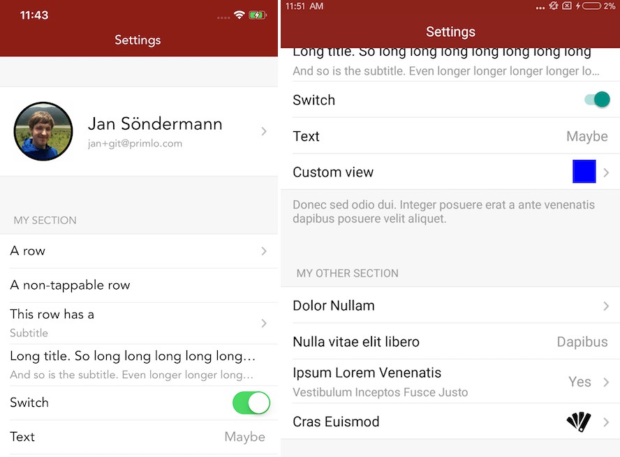
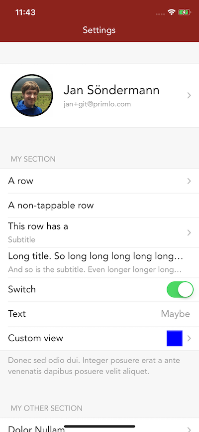
SettingsScreen takes a data prop; an object that describes the content of your settings. You can learn more about the format of this object in this file. The screen on the example screenshots above was generated from this object:
const data: SettingsData = [
  { type: 'CUSTOM_VIEW', key: 'hero', render: this.renderHero },
  {
    type: 'SECTION',
    header: 'My Section'.toUpperCase(),
    footer:
      'Donec sed odio dui. Integer posuere erat a ante venenatis dapibus posuere velit aliquet.',
    rows: [
      {
        type: 'SIMPLE',
        title: 'A row',
        onPress: () => {},
        showDisclosureIndicator: true,
      },
      { type: 'SIMPLE', title: 'A non-tappable row' },
      {
        type: 'SIMPLE',
        onPress: () => {},
        title: 'This row has a',
        subtitle: 'Subtitle',
        showDisclosureIndicator: true,
      },
      {
        type: 'SIMPLE',
        onPress: () => {},
        title: 'Long title. So long long long long long long long',
        subtitle:
          'And so is the subtitle. Even longer longer longer longer longer',
      },
      {
        type: 'SWITCH',
        title: 'Switch',
        value: true,
        onValueChange: () => {},
      },
      {
        type: 'TEXT',
        onPress: () => {},
        title: 'Text',
        text: 'Maybe',
      },
      {
        type: 'CUSTOM',
        onPress: () => {},
        title: 'Custom view',
        render: () => (
          <View
            style={{
              width: 30,
              height: 30,
              backgroundColor: 'blue',
            }}
          />
        ),
        showDisclosureIndicator: true,
      },
    ],
  },
  {
    type: 'SECTION',
    header: 'My Other Section'.toUpperCase(),
    rows: [
      {
        type: 'SIMPLE',
        onPress: () => {},
        title: 'Dolor Nullam',
        showDisclosureIndicator: true,
      },
      {
        type: 'TEXT',
        onPress: () => {},
        title: 'Nulla vitae elit libero',
        text: 'Dapibus',
      },
      {
        type: 'TEXT',
        onPress: () => {},
        title: 'Ipsum Lorem Venenatis',
        subtitle: 'Vestibulum Inceptos Fusce Justo',
        text: 'Yes',
        showDisclosureIndicator: true,
      },
      {
        type: 'CUSTOM',
        onPress: () => {},
        title: 'Cras Euismod',
        render: () => (
          <Icon
            style={{ marginTop: 3, marginRight: 6 }}
            name="colours"
            size={32}
            color="black"
          />
        ),
        showDisclosureIndicator: true,
      },
    ],
  },
  {
    type: 'SECTION',
    header: 'My Third Section'.toUpperCase(),
    rows: [
      {
        type: 'SIMPLE',
        onPress: () => {},
        title: 'Single row',
        showDisclosureIndicator: true,
      },
    ],
  },
  {
    type: 'CUSTOM_VIEW',
    render: () => (
      <Text
        style={{
          alignSelf: 'center',
          fontSize: 18,
          color: '#999',
          marginBottom: 40,
          marginTop: -30,
          fontFamily,
        }}
      >
        v1.2.3
      </Text>
    ),
  },
]