RN-TourGuide
A flexible tourguide for your react native app!
Installation
yarn add rn-tourguide
yarn add react-native-svg
react-native link react-native-svg
If you are using Expo:
expo install react-native-svg
Usage
import {
TourGuideProvider, // Main provider
TourGuideZone, // Main wrapper of highlight component
TourGuideZoneByPosition, // Component to use mask on overlay (ie, position absolute)
useTourGuideController, // hook to start, etc.
} from 'rn-tourguide'
// Add <TourGuideProvider/> at the root of you app!
function App() {
return (
<TourGuideProvider {...{ borderRadius: 16 }}>
<AppContent />
</TourGuideProvider>
)
}
const AppContent = () => {
const iconProps = { size: 40, color: '#888' }
// Use Hooks to control!
const {
canStart, // a boolean indicate if you can start tour guide
start, // a function to start the tourguide
stop, // a function to stopping it
eventEmitter, // an object for listening some events
} = useTourGuideController()
// Can start at mount ?
// you need to wait until everything is registered ?
React.useEffect(() => {
if (canStart) {
// ? test if you can start otherwise nothing will happen
start()
}
}, [canStart]) // ? don't miss it!
React.useEffect(() => {
eventEmitter.on('start', () => console.log('start'))
eventEmitter.on('stop', () => console.log('stop'))
eventEmitter.on('stepChange', () => console.log(`stepChange`))
return () => eventEmitter.off('*', null)
}, [])
return (
<View style={styles.container}>
{/*
Use TourGuideZone only to wrap your component
*/}
<TourGuideZone
zone={2}
text={'A react-native-copilot remastered! ?'}
borderRadius={16}
>
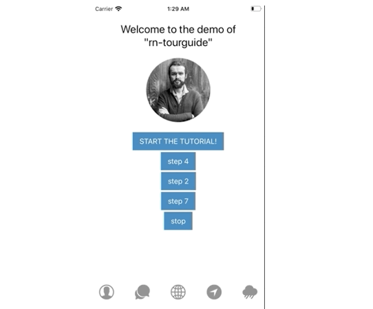
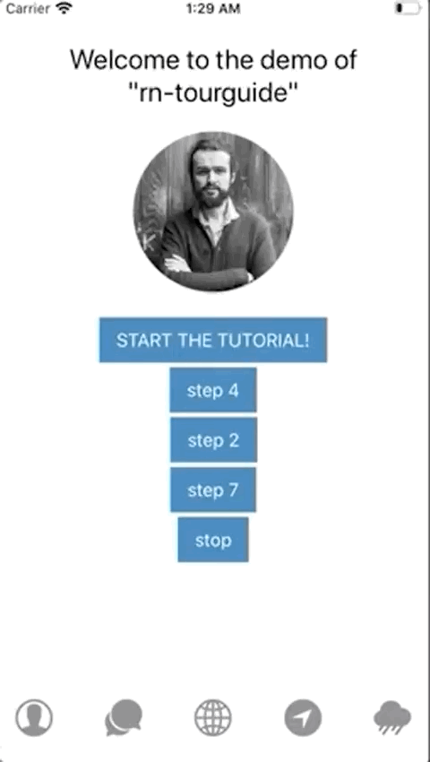
<Text style={styles.title}>
{'Welcome to the demo of\n"rn-tourguide"'}
</Text>
</TourGuideZone>
<View style={styles.middleView}>
<TouchableOpacity style={styles.button} onPress={() => start()}>
<Text style={styles.buttonText}>START THE TUTORIAL!</Text>
</TouchableOpacity>
<TourGuideZone zone={3} shape={'rectangle_and_keep'}>
<TouchableOpacity style={styles.button} onPress={() => start(4)}>
<Text style={styles.buttonText}>Step 4</Text>
</TouchableOpacity>
</TourGuideZone>
<TouchableOpacity style={styles.button} onPress={() => start(2)}>
<Text style={styles.buttonText}>Step 2</Text>
</TouchableOpacity>
<TouchableOpacity style={styles.button} onPress={stop}>
<Text style={styles.buttonText}>Stop</Text>
</TouchableOpacity>
<TourGuideZone
zone={1}
shape='circle'
text={'With animated SVG morphing with awesome flubber ??'}
>
<Image source={{ uri }} style={styles.profilePhoto} />
</TourGuideZone>
</View>
<View style={styles.row}>
<TourGuideZone zone={4} shape={'circle'}>
<Ionicons name='ios-contact' {...iconProps} />
</TourGuideZone>
<Ionicons name='ios-chatbubbles' {...iconProps} />
<Ionicons name='ios-globe' {...iconProps} />
<TourGuideZone zone={5}>
<Ionicons name='ios-navigate' {...iconProps} />
</TourGuideZone>
<TourGuideZone zone={6} shape={'circle'}>
<Ionicons name='ios-rainy' {...iconProps} />
</TourGuideZone>
<TourGuideZoneByPosition
zone={7}
shape={'circle'}
isTourGuide
bottom={30}
left={35}
width={300}
height={300}
/>
</View>
</View>
)
}
TourGuide props:
interface TourGuideZoneProps {
  zone: number // A positive number indicating the order of the step in the entire walkthrough.
  isTourGuide?: boolean // return children without wrapping id false
  text?: string // text in tooltip
  shape?: Shape // which shape
  maskOffset?: number // offset around zone
  borderRadius?: number // round corner when rectangle
  startAtMount?: boolean //  start at mount
  children: React.ReactNode
}

type Shape = 'circle' | 'rectangle' | 'circle_and_keep' | 'rectangle_and_keep'

export interface TourGuideProviderProps {
  tooltipComponent?: React.ComponentType<TooltipProps>
  tooltipStyle?: StyleProp<ViewStyle>
  labels?: Labels
  androidStatusBarVisible?: boolean
  backdropColor?: string
  verticalOffset?: number
  wrapperStyle?: StyleProp<ViewStyle>
  maskOffset?: number
  borderRadius?: number
  animationDuration?: number
  children: React.ReactNode
}

interface TooltipProps {
  isFirstStep?: boolean
  isLastStep?: boolean
  currentStep: Step
  labels?: Labels
  handleNext?(): void
  handlePrev?(): void
  handleStop?(): void
}

interface Labels {
  skip?: string
  previous?: string
  next?: string
  finish?: string
}
In order to start the tutorial, you can call the start function from useTourGuideController hook:
function HomeScreen() {
  const { start } = useTourGuideController()

  React.useEffect(() => {
    start()
  }, [])


  render() {
    // ...
  }
}

export default HomeScreen
If you are looking for a working example, please check out this link.
Custom tooltip component
You can customize the tooltip by passing a component to the copilot HOC maker. If you are looking for an example tooltip component, take a look at the default tooltip implementation.
const TooltipComponent = ({
  isFirstStep,
  isLastStep,
  handleNext,
  handlePrev,
  handleStop,
  currentStep,
}) => (
  // ...
);

<TourGuideProvider {...{tooltipComponent: TooltipComponent}}>
// ...
</TourGuideProvider>
Custom tooltip styling
You can customize tooltips style:
const style = {
  backgroundColor: '#9FA8DA',
  borderRadius: 10,
  paddingTop: 5,
}

<TourGuideProvider {...{ tooltipStyle: style }}>
// ...
</TourGuideProvider>
Custom mask color
You can customize the mask color - default is rgba(0, 0, 0, 0.4), by passing a color string to the copilot HOC maker.
<TourGuideProvider {...{ backdropColor: 'rgba(50, 50, 100, 0.9)' }}>
  // ...
</TourGuideProvider>
Custom labels (for i18n)
You can localize labels:
<TourGuideProvider
  {...{
    labels: {
      previous: 'Vorheriger',
      next: 'Nächster',
      skip: 'Überspringen',
      finish: 'Beenden',
    },
  }}
>
  // ...
</TourGuideProvider>
Listening to the events
Along with start(), useTourGuideController passes copilotEvents function to the component to help you with tracking of tutorial progress. It utilizes mitt under the hood, you can see how full API there.
List of available events is:
start— Copilot tutorial has started.stop— Copilot tutorial has ended or skipped.stepChange— Next step is triggered. PassesStepinstance as event handler argument.