react-native-modest-checkbox
A customizable checkbox component for React Native that supports setting a custom image or component as the checkbox. Inspired by react-native-checkbox.
Install
$ npm install --save react-native-modest-checkbox
$ yarn add react-native-modest-checkbox
Usage
// ... Imagine imports here
import CheckBox from 'react-native-modest-checkbox'

export default class App extends Component {
  render() {
    return (
      <View style={styles.container}>
        <CheckBox
          label='Text for checkBox'
          onChange={(checked) => console.log('Checked!')}
        />
      </View>
    );
  }
}

const styles = StyleSheet.create({
// Imagine some amazing styles right here..
})

AppRegistry.registerComponent('App', () => App);
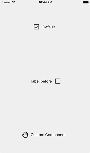
You can use your own images for the checkbox states:
<CheckBox checkedImage={require('./path/to/image.png')} uncheckedImage={require('./path/to/otherImage.png')} />
It can also be used with your own components for the checkbox states:
// Using react-native-vector-icons

<CheckBox
  checkedComponent={<Icon name="hand-peace-o" size={25} color="#222" />}
  uncheckedComponent={<Icon name="hand-paper-o" size={25} color="#222" />}
  label='Custom Component'
  onChange={(checked) => console.log('Checked!')}
/>
Props
| Property | Description | Default Value |
|---|---|---|
checkedComponent |
Custom component representing the checked state | <Text>Checked</Text> |
uncheckedComponent |
Custom component representing the unchecked state | <Text>Unchecked</Text> |
checked |
Checked value of checkbox | false |
checkboxStyle |
Styles applied to the checkbox | { width: 30, height: 30 } |
label |
Text that will be displayed next to the checkbox | 'Label' |
labelBefore |
Flag if label should be before the checkbox | false |
labelStyle |
Styles applied to the label | {fontSize: 16, color: '#222'} |
numberOfLabelLines |
The number of lines over which the label will be displayed | 1 |
containerStyle |
Styles applied to the container of label & checkbox | { flexDirection: 'row', alignItems: 'center'} |
checkedImage |
Image representing checked state (e.g. require('./path/to/image.png')) |
checked.png |
uncheckedImage |
Image representing unchecked state (e.g. require('./path/to/image.png')) |
unchecked.png |
onChange |
Callback that will be invoked when the checked state has changed. receives a object with name & checked properties as arguments |
none |