react-native-sectioned-multi-select
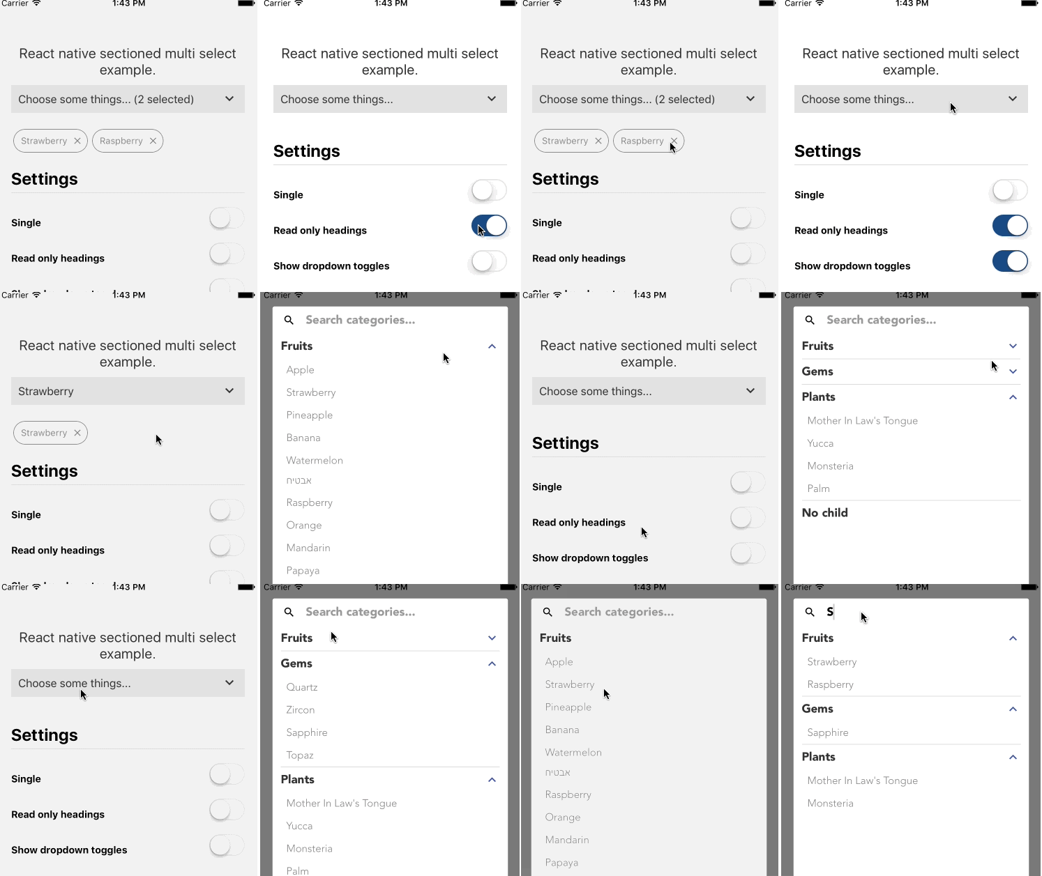
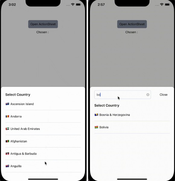
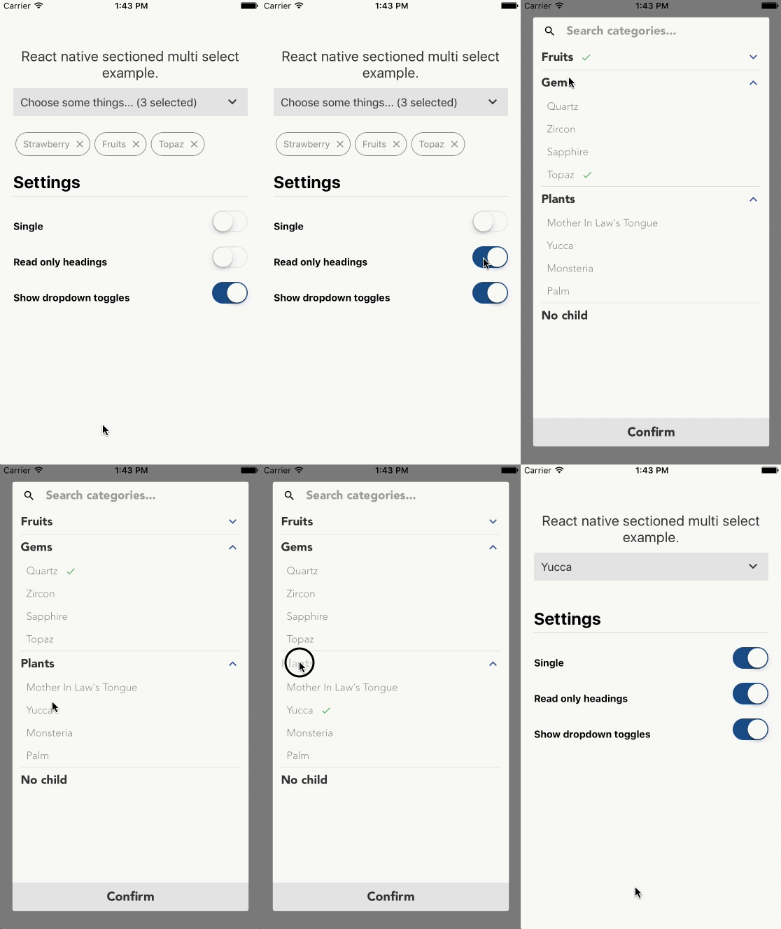
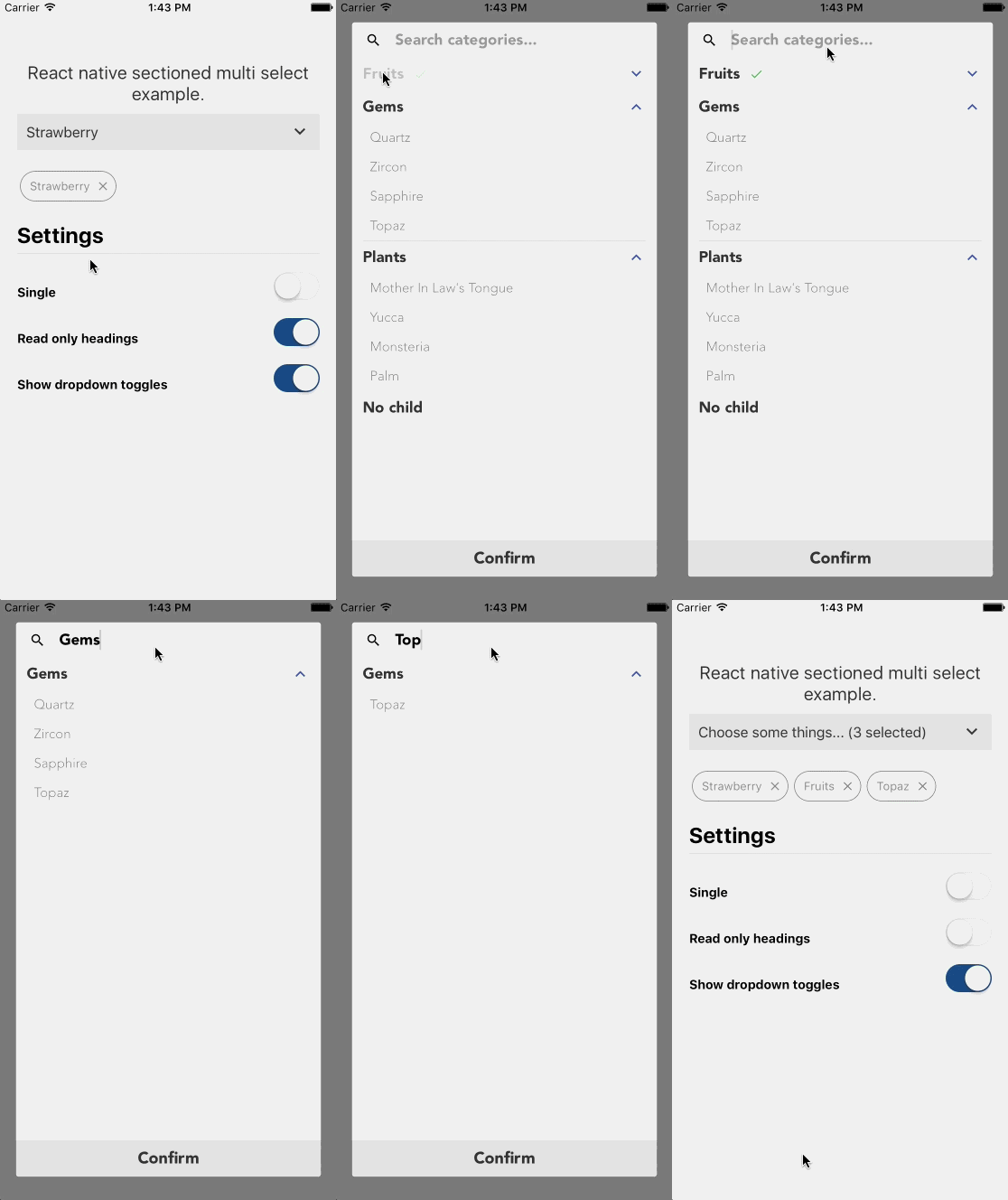
A multi (or single) select component with support for sub categories, search, chips. It's intended for long-ish lists, as it opens in a Modal (I might make this optional in the future).
This is based on https://github.com/toystars/react-native-multiple-select. The problems I had were that I needed it to be in a modal, because of nested ScrollViews not working on Android, and I needed to display categories with sub-categories.
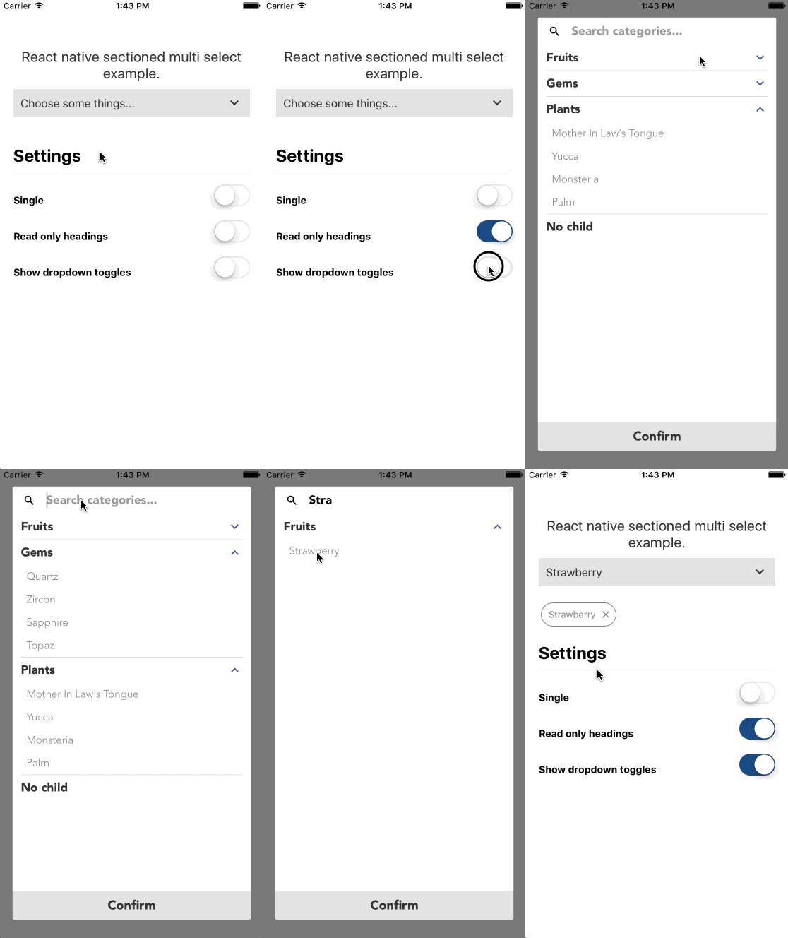
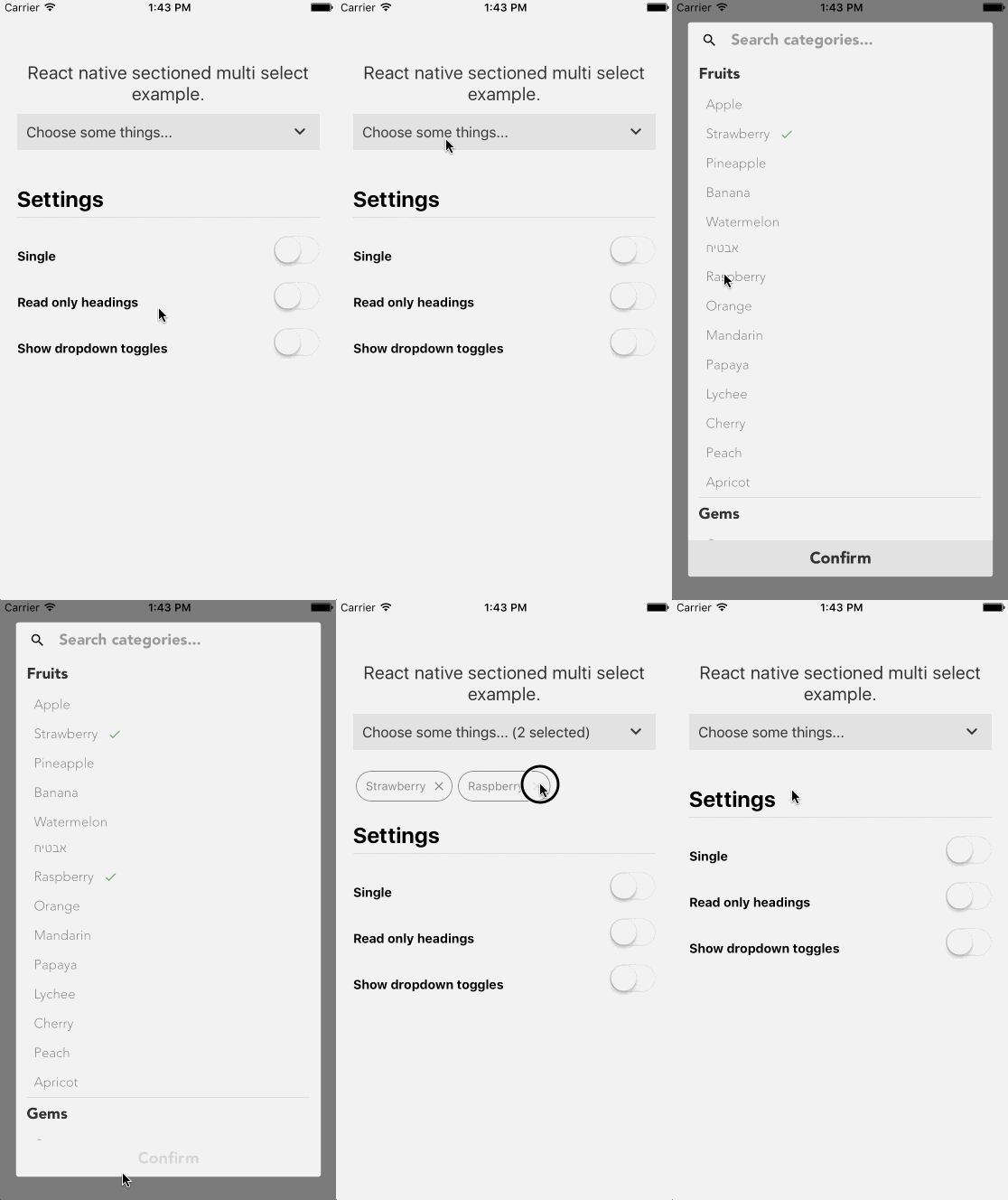
Usage
npm i -S react-native-sectioned-multi-select
react-native-vector-icons package is required, set it up if you haven't already.
Required props:
items | array
uniqueKey | string
onSelectedItemsChange | function
import React, { Component } from 'react';
import {
  View
} from 'react-native';
import SectionedMultiSelect from 'react-native-sectioned-multi-select';

const items = [
  {
    name: "Fruits",
    id: 0,
    children: [{
        name: "Apple",
        id: 10,
      },{
        name: "Strawberry",
        id: 17,
      },{
        name: "Pineapple",
        id: 13,
      },{
        name: "Banana",
        id: 14,
      },{
        name: "Watermelon",
        id: 15,
      },{
        name: "Kiwi fruit",
        id: 16,
      }]
  },
  {
    name: "Gems",
    id: 1,
    children: [{
        name: "Quartz",
        id: 20,
      },{
        name: "Zircon",
        id: 21,
      },{
        name: "Sapphire",
        id: 22,
      },{
        name: "Topaz",
        id: 23,
      }]
  },
  {
    name: "Plants",
    id: 2,
    children: [{
        name: "Mother In Law\'s Tongue",
        id: 30,
      },{
        name: "Yucca",
        id: 31,
      },{
        name: "Monsteria",
        id: 32,
      },{
        name: "Palm",
        id: 33,
      }]
  },
]

export default class App extends Component {
  constructor(){
    super()
    this.state = {
      selectedItems: [],
    }
  }
  onSelectedItemsChange = (selectedItems) => {
    this.setState({ selectedItems });
  }

  render() {
    return (
      <View>

        <SectionedMultiSelect
          items={items}
          uniqueKey='id'
          subKey='children'
          selectText='Choose some things...'
          showDropDowns={true}
          readOnlyHeadings={true}
          onSelectedItemsChange={this.onSelectedItemsChange}
          selectedItems={this.state.selectedItems}
        />

      </View>
    );
  }
}
You can programatically remove all items by setting up a ref to the component:
<SectionedMultiSelect
    ...
    ref={SectionedMultiSelect => this.SectionedMultiSelect = SectionedMultiSelect}
/>
and then use the _removeAllItems function:
onPress={() => this.SectionedMultiSelect._removeAllItems()}
You can open the modal programatically with the _toggleSelector() method:
onPress={() => this.SectionedMultiSelect._toggleSelector()}
Items
Your items should have a uniqueKey(default: 'id') and a displayKey (default: 'name').
Any child items of that item should be in subKey, and they will have uniqueKey and displayKey properties. As you can see from the example above, my items all have a unique id property and the child items is an array within the subKey property.
Sub categories are optional, there's no need to have subKey items if you don't want to.
Props
Props, there are lots.
Main
| Prop | Default | type | Desc |
|---|---|---|---|
| uniqueKey | 'id' | string | the unique key for your items |
| subKey | 'sub' | string | the array of sub items within items |
| displayKey | 'name' | string | the key for the display name / title of the item |
| selectedItems | [] | array | the selected items |
| onSelectedItemsChange | function | function that runs when an item is toggled | |
| onSelectedItemObjectsChange | function | function that returns the selected items as their original objects instead of an array of ids | |
| onCancel | function | function that runs when the confirm button is pressed | |
| onConfirm | function | function that runs when the cancel button is pressed |
Options
| Prop | Default | type | Desc |
|---|---|---|---|
| single | false | bool | allow only one selection |
| showDropDowns | true | bool | whether to allow dropdown toggles to show/hide the sub items (if false, sub items are always shown) |
| showChips | true | bool | whether to show the chips of the selected items |
| hideSelect | false | bool | hide the select component |
| showCancelButton | false | bool | Show a cancel button next to the confirm button. Dismisses modal and removes all selected items. |
| readOnlyHeadings | false | bool | whether the parent items can be pressed or not. If true and showDropdowns is true, pressing the parent item will toggle the dropdown |
| hideSearch | false | bool | hide the search bar entirely |
| selectChildren | false | bool | if true, selecting a parent item will automatically select its children |
| highlightChildren | false | bool | if true, selecting a parent item will automatically highlight its children (but the child ids won't be broadcast to the selectedItems state) |
| showRemoveAll | false | bool | Whether to show a Remove all chip at the beginning of the selected items chips |
| modalSupportedOrientations | ['landscape', 'portrait'] | array | The supportedOrientations of the Modal |
| modalAnimationType | 'fade' | string | The animation type of the Modal (fade or slide) |
Customization
| Prop | Default | type | Desc |
|---|---|---|---|
| selectText | 'Select' | string | the text for the select component |
| confirmText | 'Confirm' | string | the text for the confirm button |
| selectedText | 'selected' | string OR function | the text that follows the number of items selected |
| searchPlaceholderText | 'Search categories...' | string | the placeholder text for the search input |
| removeAllText | 'Remove all' | string | Text for optional remove all button |
| noResultsComponent | <Text>Sorry, no results</Text> |
object | the component to display when the search results are empty |
| loadingComponent | <View style={{marginTop:20, alignItems:'center', justifyContent:'center'}}> <ActivityIndicator/> </View> |
object | the component to display when the items are empty |
| selectToggleIconComponent | Material keyboard-arrow-down |
object | The icon to the right of the dropdown in its initial state ) |
| searchIconComponent | Material search |
object | The search input icon (default Magnifying glass) |
| selectedIconComponent | Material check |
object | The icon to the left of the selected item (default Checkmark) |
| dropDownToggleIconUpComponent | Material keyboard-arrow-up |
object | The parent dropdown icon in closed state |
| dropDownToggleIconDownComponent | Material keyboard-arrow-down |
object | The parent dropdown icon in opened state |
| cancelIconComponent | Material cancel |
object | The cancel button's inner component |
| styles | {} | object | Styles object - see styles section |
| colors | {...} | object | colors object - see colors section |
| itemFontFamily | Avenir / normal - bold | object | font family for the parent items. Can be a regular style object |
| subItemFontFamily | Avenir / normal - 200 | object | font family for the sub items. Can be a regular style object |
| searchTextFontFamily | Avenir / normal - 200 | object | font family for the search input. Can be a regular style object |
| confirmFontFamily | Avenir / normal - bold | object | font family for the confirm button. |
| numberOfLines | null | number | numberOfLines for label text |
Colors
You can pass a colors object to theme it how you like.
These are the available colors and their defaults:
| Name | Default | Description |
|---|---|---|
| primary | #3f51b5 | used for the dropdown toggle icon, the no results text and the background of the confirm button. |
| success | #4caf50 | used for the selected checkmark icon. |
| cancel | #1A1A1A | used for the cancel button background |
| text | #2e2e2e | Parent item text color |
| subText | #848787 | Sub item text color |
| selectToggleTextColor | #333 | Select button text color |
| searchPlaceholderTextColor | #999 | Search input placeholder text color |
| searchSelectionColor | rgba(0,0,0,0.2) | Search input text selection color |
| itemBackground | #fff | parent item background color |
| subItemBackground | #ffffff | sub item background color |
| chipColor | #848787 | chip color |
| disabled | #d7d7d7 | Selected icon color for sub items when highlight children is used |
Styles
You can pass a styles object to style it how you like.
These are the styles you can change:
container
listContainer
selectToggle
selectToggleText
item
subItem
itemText
subItemText
searchBar
center
separator
subSeparator
chipContainer
chipText
chipIcon
searchTextInput
scrollView
button
confirmText
selectedItem
cancelButton
