react-native-picker-select
A Picker component for React Native which emulates the native select interfaces for iOS and Android
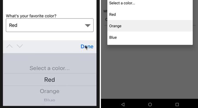
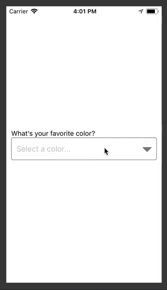
For iOS, we are wrapping a TextInput component. You can pass down your custom styling to match your other inputs.
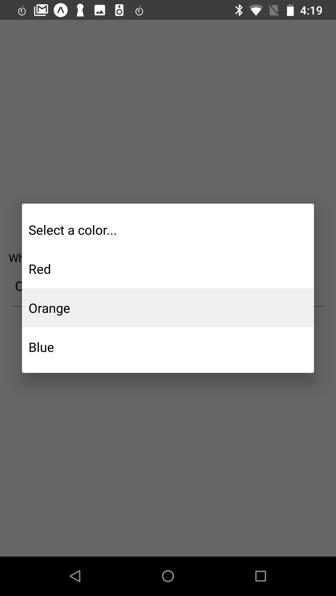
For Android, we are using the native Picker component, but adding a pseudo-underline to emulate a typical TextInput. Additional styling can be passed down also to further customize the appearance.
For either platform, you can alternatively pass down a child element that will be wrapped in a touchable area, triggering the picker.
Getting Started
Installing
npm install react-native-picker-select
Versioning
| Component | RN |
|---|---|
| >= 3.0.0 | >= 0.55.3 |
| < 3.0.0 | < 0.55.3 |
Props
| Name | Type | Description | Required? | iOS / Android |
|---|---|---|---|---|
| onValueChange | function | Callback which returns value, index |
Y | Both |
| items | array | _ The items for the component to render. Each item should be in the following format:{label: 'Orange',value: 'orange',key: 'orange'}_ The label and the value are required, but the key will be based upon the label if it isn't included * The value can be any data type |
Y | Both |
| placeholder | object | _ An override for the default placeholder object with a label of Select an item... and a value of null_ An empty object can be used if you'd like to disable the placeholder entirely |
N | Both |
| disabled | boolean | Disables interaction with the component | N | Both |
| value | any | Will attempt to locate a matching value from the items array by checking each item's value property. If found, it will update the component to show that item as selected. If the value is not found, it will default to the first item. |
N | Both |
| style | object | Style overrides for most parts of the component. More details below. | N | Both |
| hideDoneBar | boolean | Hides the bar with tabbing arrows and Done link to exit the modal. While this is typical on select elements on the web, the interface guidelines does not include it. |
N | iOS |
| hideIcon | boolean | Hides the floating downward arrow on the right side of the input box | N | iOS |
| onUpArrow / onDownArrow | function | _ Presence enables the corresponding arrow _ Closes the picker * Calls the callback provided |
N | iOS |
Styling
- iOS
- The component wraps a TextInput without styling. In the style prop, pass a style object named
inputIOSto style the input - Alternatively, you can pass children (such as a custom button or input) for the component to wrap
- Other styles that can be modified for iOS are named
viewContainer,icon,done,modalViewTop,modalViewMiddle,modalViewBottom, andplaceholderColor
- The component wraps a TextInput without styling. In the style prop, pass a style object named
- Android
- The default Picker component acts similiarly to a TextInput until it is tapped, although it does not include an underline
- We emulate a typical underline, which can be modified with a style object named
underline - The main input can be modified with the style object named
inputAndroid - Alternatively, you can pass children (such as a custom button or input) for the component to wrap
- Other styles that can be modified for Android are named
viewContainerandplaceholderColor
Testing
This component has been tested on React Native v0.51 - v0.55
Future Plans
- [ ] Update Android picker to look closer to platform's
<select>