react-native-picklist
A picklist page support single or multi select, single or multi level data, and display.
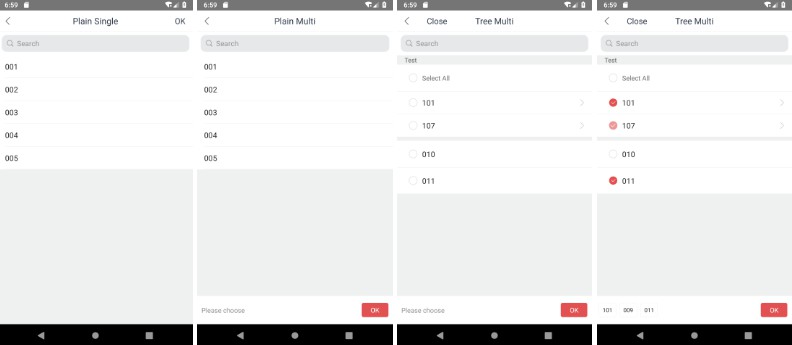
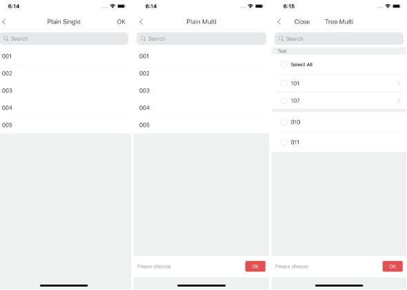
This is a picklist page. It supports:
- single-level or multi-level data
- single-select or multi-select
- show or hide the internal components
- customize the UI component
- search in the data automaticlly
- section style page
Install
Install by Yarn:
yarn add react-native-picklist
Install by NPM:
npm install --save react-native-picklist
Usage
Import the module in the file:
import PickList from 'react-native-picklist';
You can set the following properties or see example project to learn how to use it.
Properties
Required:
title: string: Page title.data: object | object[]: Data to show. We will construct a virtual root node to contain it.
Optional:
firstTitleLine?: string: First item displayed inPickListTitleLinewhen it has the multi-level data and show the title line.multilevel?: boolean: Has multi-level data or not. Default isfalse.multiselect?: boolean: Is multi-select or not. Default isfalse.onFinish?: (nodes: Tree[]) => void: Pass the selected items when finish selecting.rightTitle?: string: Button title on the right corner.rightClick?: () => void: Button click callback on the right corner.renderRow?: (treeNode: Tree, props: PickList.props) => JSX.Component: Customize a row display. You can override this property to make the list readonly. Default implement is inPickListDefaultRow.js.renderSeparator?: () => JSX.Component: Customize cell separator.renderSectionSeparator?: () => JSX.Component: Customize section separator.renderHeader?: (state: PickList.state) => JSX.Component: Customize header of page.showBottomView?: boolean: Show bottom bar or not.showSearchView?: boolean: Show search bar or not.showTitleLine?: boolean: Show title line at the header or not.showAllCell?: boolean: Show select all or deselect all cell or not.showCount?: boolean: Show not leaf item's children count and selected count.directBackWhenSingle?: boolean: Directly go back to previous page or not when single-select single-level data.searchPlaceholder?: string: Placeholder of search bar.selectedIds?: array: Initial selected item's identifier list.selectable?: (treeNode: Tree) => boolean: Can a tree node selectable or not.childrenKey?: string: Children key of tree node.idKey?: string: Identifier key of tree node.labelKey?: string: Label key of tree node.searchKeys?: string[]: Normal search keys of tree node.sort?: (a: Tree, b: Tree) => -1 | 0 | 1: Sort method for data list.splitFunc?: (arr: Tree[]) => Tree[][]: Split method when generate sections of data list.width?: number: Page width.
Example Project
You can open the example project by following steps:
cd example.- Use
yarnornpm installto install the modules. - For iOS, you should run
pod installiniosdirectory. - Run
npm run bundle:iosornpm run bundle:androidto bundle the package. - Run
npm startin a seperate terminal. - Use
XcodeorAndroid Studioto open the project inexample/iosorexample/android. - Run the project.