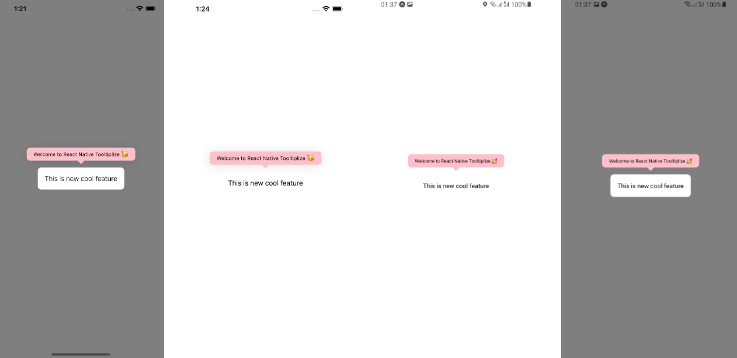
React Native: Native Tooltips
This library is a React Native bridge around native tooltips. It allows you to create simple tip views.
Note: Android SDK 27 > is supported
| Android: florent37/ViewTooltip |
|---|
 |
| iOS: calm/SexyTooltip |
|---|
Before we dive into on how to use this library. We would like to thank all the contributor of florent37/ViewTooltip & calm/SexyTooltip libraries for providing such a awesome nice, cool library
Getting started
-
npm install react-native-tooltips --save -
$ react-native link react-native-tooltips
Usage
import RNTooltips from 'react-native-tooltips';
- React Way
<RNTooltips text={"Long Press Description"} visible={this.state.visible} reference={this.state.reference} />
- API Way
RNTooltips.Show(
    this.state.reference,
    {
        text: 'Long Press Description'
    }
)
Props
| Prop | Type | Default | Note |
|---|---|---|---|
text |
string |
Text which needs to be displayed | |
position: Android |
number |
Position of the tooltip view. On iOS it is auto adjustable | |
align: Android |
number |
Alignment of tooltip | |
autoHide |
bool |
Should tip view get auto dismiss | |
duration |
number |
Duration after which tooltip view should be dismissed | |
clickToHide: iOS |
bool |
On click should tooltip view be dismissed | |
corner |
number |
Radius of corner | |
tintColor |
string |
Color of tooltip view background | |
textColor |
string |
Color of text | |
textSize |
number |
Size of text displayed | |
gravity |
number |
Gravity of text | |
visible |
bool |
Should tooltip be displayed | |
shadow |
bool |
Shadow on tooltip view | |
reference |
object |
Reference of react component of which you need tooltip | |
onHide |
func |
Callback function invoked on tooltip hide |