react-native-tooltiplize
react native tooltip like never before, using leading packages like react-native-reanimated v2, framer-motion, and @gorhom/portal
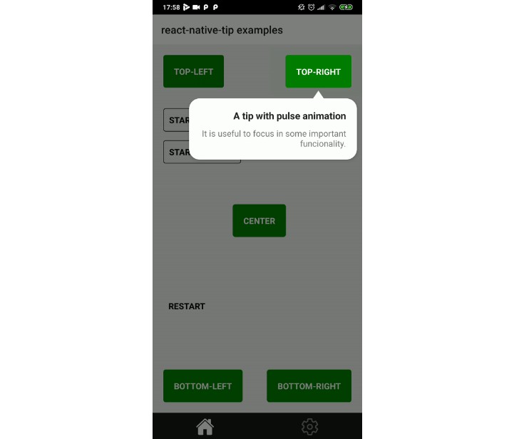
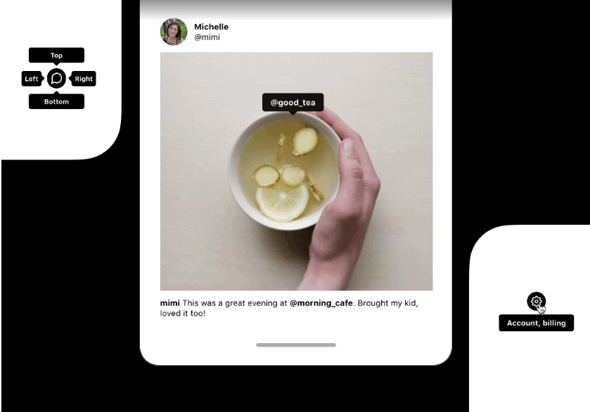
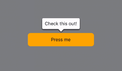
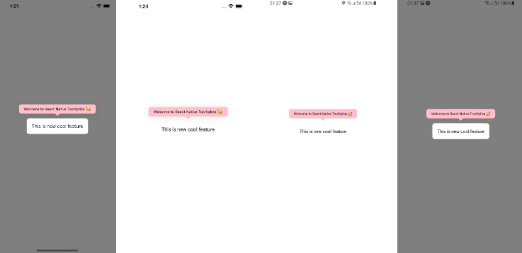
Preview
| With Overlay (iOS) | Without Overlay (iOS) | Without Overlay (Android) | With Overlay (Android) |
|---|---|---|---|
 |
 |
 |
 |
Features
- iOS, Android, and Web!!!
- Fully customizable
- Simple and Clean API
- Works for all
reanimated‘s v2 versions - Far away from
Modalissues - 60 FPS
- Less boilerplate
- Built for already in production app
- And more…
Installation
yarn add react-native-tooltiplize
Peer Dependencies
This library needs some peer dependencies to work properly. You need to install them in your project.
-
for
react-native-cliusers:-
install peer dependencies:
yarn add react-native-reanimated @gorhom/portal
-
For iOS:
cd ios && pod install
-
-
for
expousers:
expo install react-native-reanimated @gorhom/portal
Usage
you first need to wrap your app with PortalProvider from @gorhom/portal to provide a context for the Portal.
import { PortalProvider } from '@gorhom/portal';

const App = () => {
  return (
    <PortalProvider>
      <App />
    </PortalProvider>
  );
};
then you can use the Tooltip component
import React from 'react';
import Tooltip from 'react-native-tooltiplize';
import { PortalProvider } from '@gorhom/portal';
import { View, TouchableOpacity, StyleSheet, Text } from 'react-native';

const App = () => {
  const [isVisible, toggle] = React.useReducer((state) => !state, false);

  const renderContent = React.useCallback(() => {
    return (
      <TouchableOpacity style={styles.tooltipContainer} onPress={toggle}>
        <Text style={styles.tooltipText}>
          Welcome to React Native Tooltiplize ?
        </Text>
      </TouchableOpacity>
    );
  }, []);

  return (
    <PortalProvider>
      <View style={styles.container}>
        <Tooltip
          position="top"
          offset={8}
          renderContent={renderContent}
          isVisible={isVisible}
          withOverlay
          onDismiss={toggle}
          pointerStyle={styles.pointer}
          pointerColor="green"
        >
          <TouchableOpacity onPress={toggle} style={styles.newFeature}>
            <Text style={styles.newFeatureText}>This is new cool feature</Text>
          </TouchableOpacity>
        </Tooltip>
      </View>
    </PortalProvider>
  );
};

export default App;

const styles = StyleSheet.create({
  container: {
    flex: 1,
    justifyContent: 'center',
    alignItems: 'center',
  },
  tooltipContainer: {
    paddingHorizontal: 16,
    paddingVertical: 8,
    borderRadius: 8,
    shadowColor: '#000',
    shadowOffset: {
      width: 0,
      height: 2,
    },
    shadowOpacity: 0.1,
    shadowRadius: 12,
    elevation: 5,
    backgroundColor: 'green',
  },
  tooltipText: {
    fontSize: 12,
    color: 'white',
  },
  pointer: { width: 16, height: 8 },
  newFeature: {
    backgroundColor: 'white',
    padding: 16,
    borderRadius: 8,
  },
  newFeatureText: {
    fontSize: 16,
  },
});
Props
| Name | Type | ? | Default | Description |
|---|---|---|---|---|
isVisible |
boolean |
✅ | undefined |
Determines whether the tooltip is visible or not. |
renderContent |
() => ReactNode |
✅ | undefined |
the content of the tooltip |
children |
ReactNode |
✅ | undefined |
the children component that the tooltip will point to |
withOverlay |
boolean |
❌ | undefined |
whether or not to render overlay behind the children and the Tooltip |
onDismiss |
() => void |
❌ | undefined |
a function to be called when the user presses on the overlay |
overlayStyle |
ViewStyle |
❌ | undefined |
a style object to customize how Overlay looks |
offset |
number |
❌ | 0 |
a distance added between the Tooltip and the children, Please note that the Pointer size is calculated separately |
pointerStyle |
ViewStyle |
❌ | undefined |
a style object to customize Pointer looks, Please note: the only available styles in only width and height |
pointerColor |
string |
❌ | "#000000" |
The Pointer‘s color |
position |
string |
❌ | top |
top, bottom, left, and right, to control the placement of the Tooltip |
timingConfig |
WithTimingConfig |
❌ | { duration: 300 } |
the timing config for animating opening and closing of the Tooltip and Overlay, Please note: that is from react-native-reanimated |
childrenStyle |
ViewStyle |
❌ | undefined |
the style of children |
TODO:
- Handle Safe Area and Window dimensions
- Adding Support for more animation types
- Unit Testing
- Adding Cool pointer using
react-native-svgwith optional dependencies
Big Thanks ? :
this package is heavily inspired from:
Contributing
See the contributing guide to learn how to contribute to the repository and the development workflow.
License
MIT