react-native-modal-datetime-picker
A declarative cross-platform react-native datetime-picker.
This library exposes a cross-platform interface for showing the native date-picker and time-picker inside a modal.
You will have an unified user experience, you won't have to worry anymore about testing the device platform and you won't have to programmatically call the Android TimePicker/DatePicker APIs.
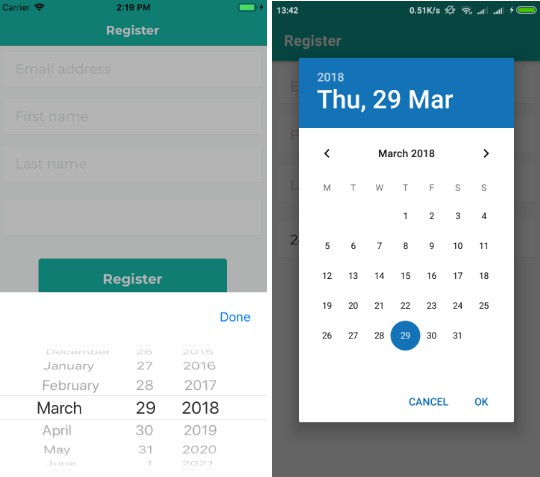
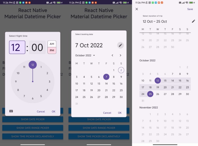
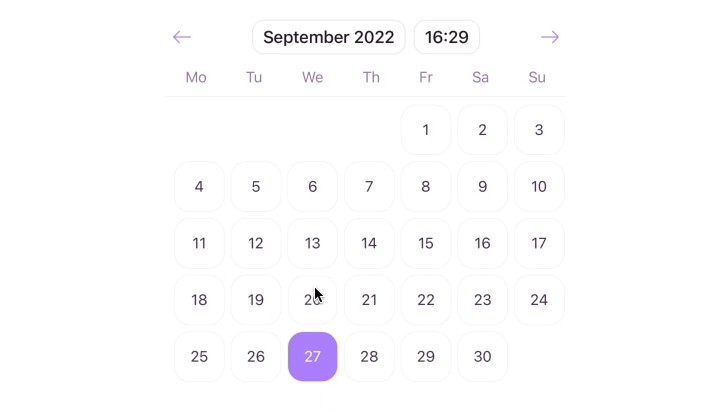
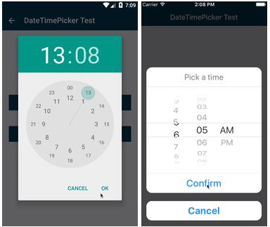
Demo


Setup
This library is available on npm, install it with npm install --save react-native-modal-datetime-picker or yarn add react-native-modal-datetime-picker.
Usage
import React, { Component } from 'react';
import { Text, TouchableOpacity, View } from 'react-native';
import DateTimePicker from 'react-native-modal-datetime-picker';

export default class DateTimePickerTester extends Component {
  state = {
    isDateTimePickerVisible: false,
  };

  _showDateTimePicker = () => this.setState({ isDateTimePickerVisible: true });

  _hideDateTimePicker = () => this.setState({ isDateTimePickerVisible: false });

  _handleDatePicked = (date) => {
    console.log('A date has been picked: ', date);
    this._hideDateTimePicker();
  };

  render () {
    return (
      <View style={{ flex: 1 }}>
        <TouchableOpacity onPress={this._showDateTimePicker}>
          <Text>Show DatePicker</Text>
        </TouchableOpacity>
        <DateTimePicker
          isVisible={this.state.isDateTimePickerVisible}
          onConfirm={this._handleDatePicked}
          onCancel={this._hideDateTimePicker}
        />
      </View>
    );
  }

}
Available props
| Name | Type | Default | Description |
|---|---|---|---|
| cancelTextIOS | string | 'Cancel' | The text on the cancel button on iOS |
| cancelTextStyle | style | The style of the cancel button text on iOS | |
| confirmTextIOS | string | 'Confirm' | The text on the confirm button on iOS |
| confirmTextStyle | style | The style of the confirm button text on iOS | |
| customCancelButtonIOS | node | A custom component for the cancel button on iOS | |
| customConfirmButtonIOS | node | A custom component for the confirm button on iOS | |
| neverDisableConfirmIOS | bool | false | If true, do not disable the confirm button on any touch events; see #82 |
| customTitleContainerIOS | node | A custom component for the title container on iOS | |
| customDatePickerIOS | node | A custom component that will replace the default DatePicker on iOS (Example) | |
| datePickerContainerStyleIOS | style | The style of the container on iOS | |
| reactNativeModalPropsIOS | object | Additional props for react-native-modal on iOS | |
| date | obj | new Date() | Initial selected date/time |
| isVisible | bool | false | Show the datetime picker? |
| mode | string | 'date' | Datepicker? 'date' Timepicker? 'time' Both? 'datetime' |
| datePickerModeAndroid | string | 'calendar' | Display as 'spinner' or 'calendar' |
| onConfirm | func | REQUIRED | Function called on date or time picked. It returns the date or time as a JavaScript Date object |
| onHideAfterConfirm | func | () => {} | Called after the hiding animation if a date was picked |
| pickerRefCb | func | Called after picker has mounted, contains a ref | |
| onCancel | func | REQUIRED | Function called on dismiss |
| titleIOS | string | 'Pick a date' | The title text on iOS |
| titleStyle | style | The style of the title text on iOS | |
| minimumDate | Date | undefined | Min Date. Does not work with 'time' picker on Android |
| maximumDate | Date | undefined | Max Date. Does not work with 'time' picker on Android |
| is24Hour | bool | true | If false, the picker shows an AM/PM chooser on Android |
| minuteInterval | integer | 1 | Interval for time picker on iOS |
All the DatePickerIOS props are also supported!
Frequently Asked Questions
The component is not working as expected
Under the hood react-native-modal-datetime-picker uses react-native original DatePickerAndroid, TimePickerAndroid and DatePickerIOS.
Before reporting a bug, try swapping react-native-datetime-picker with react-native original date/time pickers and, if the issue persists, check if it has already been reported as a react-native issue.
How can I show the timepicker instead of the datepicker?
Just set the mode prop to time.
You can also display both the datepicker and the timepicker in one step by setting the mode prop to datetime.
Why is the selected start date being shown in the input field of the end date?
If you have both a start date/time and end date/time picker on the same screen, you will need to have showDateTimePicker, hideDateTimePicker, and handleDatePicked functions for both.
showStartDateTimePicker = () => this.setState({ startDateTimePickerVisible: true });

showEndDateTimePicker = () => this.setState({ endDateTimePickerVisible: true });

hideStartDateTimePicker = () => this.setState({ startDateTimePickerVisible: false });

hideEndDateTimePicker = () => this.setState({ endDateTimePickerVisible: false });

handleStartDatePicked = (date) => {
  console.log('A date has been picked: ', date);
  this.hideStartDateTimePicker();
};

handleEndDatePicked = (date) => {
  console.log('A date has been picked: ', date);
  this.hideEndDateTimePicker();
};
How do I change the color of the Android date and time pickers?
This is more a React-Native specific question than a react-native-modal-datetime-picker one.
See issue #29 and #106 for some solutions.
How to set 24 hours in iOS ?
The is24Hour prop is only available on Android but you use a small hack for enabling it on iOS by setting the app's default timezone as en_GB.
To do so, edit your AppDelegate.m file, and add [[UIDatePicker appearance] setLocale:[[NSLocale alloc]initWithLocaleIdentifier:@"en_GB"]]; to application didFinishLaunchingWithOptions
Notes
Remember to always set the isVisible prop to false in both the onConfirm and onCancel props (like in the example above).
Under the hood this library is using react-native-modal for the iOS modal implementation.
Pull requests and suggestions are always welcome!