react-native-whc-toast
A react native module to show toast alert, it works on iOS and Android.
Installation
- 1.Run
npm install react-native-whc-toast --save - 2.
import Toast from 'react-native-whc-toast'
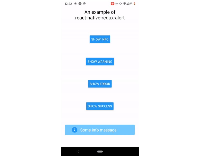
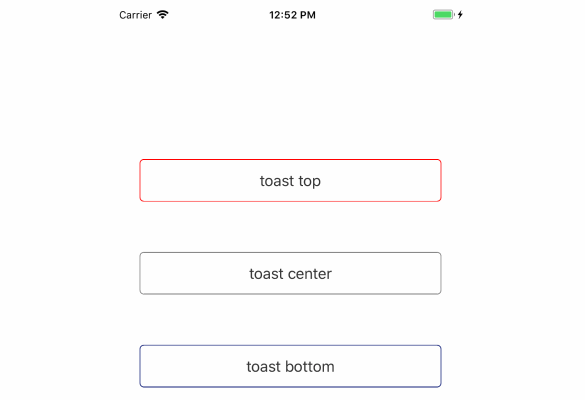
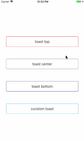
Demo
Getting started
Add react-native-whc-toast to your js file.
import Toast from 'react-native-whc-toast'
Inside your component's render method, use Toast:
 render() {
         return (
             <View style={styles.container}>
                 ...
                 <Toast ref="toast"/>
             </View>
         );
 }
Then you can use it like this:
1.default display bottom:
 /// alert toast bottom
 this.refs.toast.show('hello toast');
 /// or
 this.refs.toast.showBottom('hello toast');
2.display top:
 /// alert toast bottom
 this.refs.toast.showTop('hello toast');
 /// or
 this.refs.toast.show('hello toast', Toast.Duration.long, Toast.Position.top);
3.display center:
 /// alert toast center
 this.refs.toast.showCenter('hello toast');
 /// or
 this.refs.toast.show('hello toast', Toast.Duration.long, Toast.Position.center);
Basic usage
render() {
        return (
            <View style={styles.container}>
                <TouchableHighlight
                    onPress={()=>{
                        this.refs.toast.show('hello toast');
                    }}>
                    <Text>Start Toast</Text>
                </TouchableHighlight>
                <Toast ref="toast"/>
            </View>
        );
    }
Custom Toast
render() {
        return (
            <View style={styles.container}>
                <TouchableHighlight
                    onPress={()=>{
                        this.refs.toast.show('hello toast', Toast.Duration.long, Toast.Position.bottom);
                    }}>
                    <Text>Start toast</Text>
                </TouchableHighlight>
                <Toast
                    ref="toast"
                    style = {styles.toast}
                    textStyle = {styles.text},
                    position = {Toast.Position.bottom}
                    fadeInDuration = {300}
                    fadeOutDuration = {300}
                    duration = {Toast.Duration.long}
                    opacity = {0.9}
                    positionValue = {100}
                />
            </View>
        );
    }
API
| Position | Description |
|---|---|
| Position.top | toast show top |
| Position.center | toast show center |
| Position.bottom | toast show bottom |
| Duration | Description |
|---|---|
| Duration.short | toast default show short duration |
| Position.long | toast default show long duration |
| Position.infinite | toast alway show |
| Props | Type | Optional | Default | Description |
|---|---|---|---|---|
| style | ViewPropTypes.style | true | {} | Custom default toast style |
| textStyle | Text.propTypes.style | true | {} | Custom default toast text style |
| position | Toast.Position | true | Toast.Position.bottom | Custom default toast show position |
| fadeInDuration | PropTypes.number | true | 300 | Custom default toast fade in duration |
| fadeOutDuration | PropTypes.number | true | 300 | Custom default toast fade out duration |
| duration | Toast.Duration | true | Toast.Duration.long | Custom default toast show duration |
| opacity | PropTypes.number | true | 0.9 | Custom default toast fade in or fade out opacity animation |
| positionValue | PropTypes.number | true | 100 | Custom default toast show top, bottom margin |
| Method | Type | Optional | Description |
|---|---|---|---|
| show(message, duration, position) | function | true | show toast custom position default bottom |
| showTop(message, duration) | function | true | show toast top |
| showCenter(message, duration) | function | true | show toast center |
| showBottom(message, duration) | function | true | show toast bottom |
| close(isNow) | function | true | hide toast |