react-native-redux-alert
A Redux based toast message provider crafted for React Native.
Features
- 100% written in JS, thus makes it compatible both with Expo and pure React Native.
- Simple, easy to set up and use.
- Customisable.
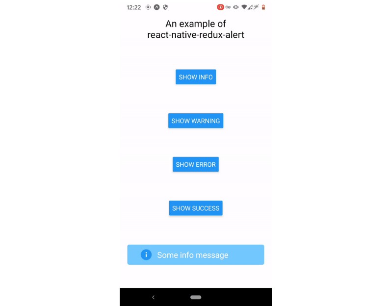
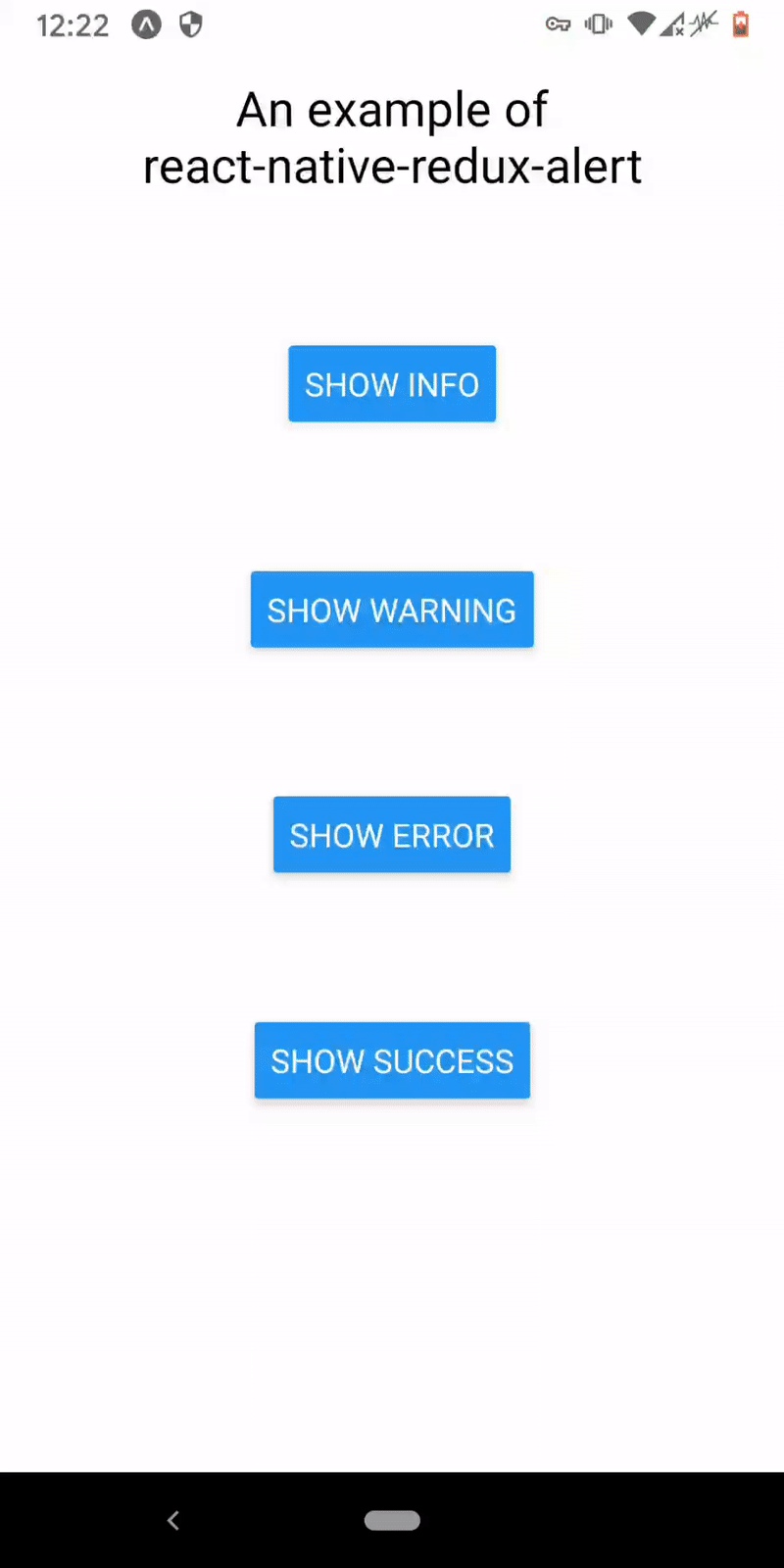
Demo
Installation
$ npm install --save react-native-redux-alert
Peer dependencies
This package expect the following peer dependencies:
  "react": "^17.0.2"
  "react-native": "^0.64.1"
  "react-redux": "^7.2.4"
  "redux": "^4.1.0"
So make sure that you have those installed too!
Usage
First you have to add the alertReducer to your store:
import { createStore, combineReducers } from 'redux'
import { alertReducer } from 'react-native-redux-alert'

const reducers = combineReducers({
  alertReducer,
})

export default createStore(reducers)
Then mount the Alert into the component where you're going to use it - usually it's the root component:
import React from 'react'
import { Provider } from 'react-redux'
import { SafeAreaView } from 'react-native'
import { Alert } from 'react-native-redux-alert'

import store from './src/redux/store'
import Home from './src/Home'

const App = () => (
  <Provider store={store}>
    <SafeAreaView style={{ flex: 1 }}>
      <Home />
      <Alert />
    </SafeAreaView>
  </Provider>
)
That's all! Easy, right? Next you are able to call the toast messages by dispatching the appropriate action, like on this example:
import React from 'react'
import { Button, View } from 'react-native'
import { actions } from 'react-native-redux-alert'

const Home = ({ dispatch }) => {
  const warningHandler = () => {
    dispatch(actions.showWarning('A warning message!', 2500))
  }

  return (
    <View>
      <Button title={'Warn'} onPress={warningHandler} />
    </View>
  )
}
API
Alert component
react-native-redux-alert provides several API's, one of them is the Alert component.
It's the component which displays the toast messages you're passing into actions, hence why it should be always placed in the project's root.
Alert's props
containerStyles<object>: the styles, which are applied to Alert's container.textStyles<object>: the styles, which are applied to the text, show in the Alert box.iconStyles<object>: the styles, which are applied to icon inside the container.useNativeDriver<bool>: whetheruseNativeDrivershould be applied to the Aminations or not, default:true.showIcon<bool>: should the icon be displayed near the text or not, default:true.transition<'fade'>: the transition animation type. Currentlyfadeis the only one supported.animated<bool>: whether Alerts should be animated or not, default:true.
Actions
Currently, there are 5 actions available: 1 base action - show, and 4 actions which are basically the aliases for it: showError, showSuccess, showWarning and showInfo.
show params
message<string>: the message to display.duration<number>: how long should message be displayed in milliseconds, default:5000.type<'info' | 'success' | 'warning' | 'error'> - the type of the message, default:info.
aliases params
message<string>: the message to display.duration<number>: how long should message be displayed in milliseconds, default:5000.
types and transitions
react-native-redux-alert provides objects which specify what options are supported by the Alert component.
typesobject contains information about the types of messages supported.transitionsobject contains information about the transitions supported by the Alert component.