responsive-native
Responsive applications are a big challenge for mobile developers.
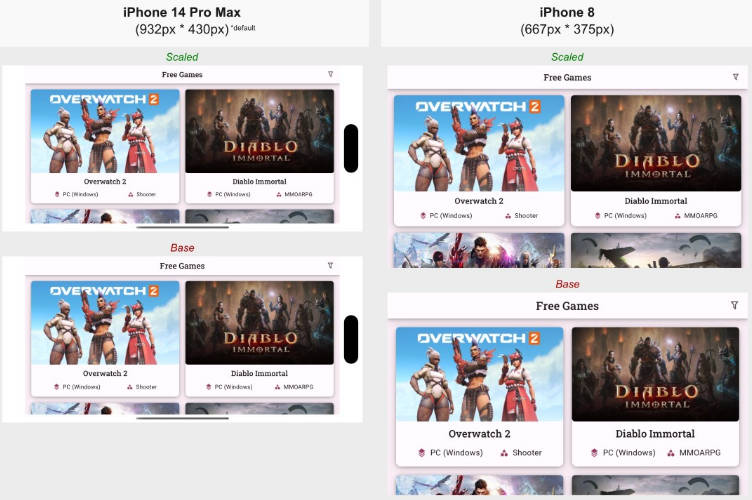
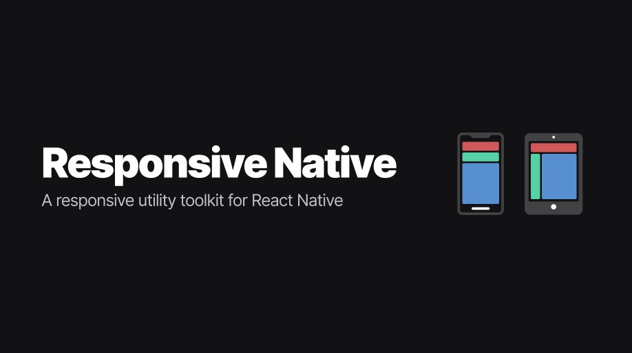
Most of the mobile devices have different dimensions and densities, so using absolute units like pixels ('px') can cause elements to have different sizes than expected.
As iPhones, for example, have a higher pixel density than Android phones, if you use 16px in a Text, it will look much larger on Android than on iOS.
This library aims to solve this problem by converting this value from px to rem. The value in rem is calculated with some variables such as device width and height, thus providing a much more proportional interface.
It also includes an easy way to create Media Queries just like the web environment but based on breakpoints as inside mobile devices we do not need to deal a lot with screen resizing while the app is running.
Getting started
Install the library using:
yarn add responsive-native react-native-safe-area-context
The lib react-native-safe-area-context must be installed.
Wrap the application with the provider
You can import the ScreenProvider and wrap the whole App with it then all child components will be able to consume and use the responsive functions.
Set the baseFontSize
ScreenProvider receives a optional baseFontSize prop that corresponds to the value of 1rem. By default 1rem = 16px, but depending on your UI, you would prefer setting this to a different value to provide an easier way to achieve some values in spacings or sizes.
import { ScreenProvider } from 'responsive-native';
import { SafeAreaProvider } from 'react-native-safe-area-context';

export default function App() {
  return (
    <SafeAreaProvider>
      <ScreenProvider baseFontSize={16}>
        { ... }
      </ScreenProvider>
    </SafeAreaProvider>
  )
}
ScreenProvider depends on SafeAreaProvider, from react-native-safe-area-context, so put SafeAreaProvider around ScreenProvider.
Library hooks
useRem
Transforms a rem value to the best pixel value based on the device width, height and accessibility preferences.
The useRem hook receives as first param the value in rem that will be converted to pixels. The second optional parameter is shouldScale that is a boolean (defaults to false) that tells if the fontScale defined by the user device should be used in the conversion (if you're using rem to define font sizes, you might want to use this as true).
_You can read a little more about fontScale _here
export function MyComponent() {
  const rem = useRem();

  return (
    <View style={styles.container}>
      <Text style={[styles.text, { fontSize: rem(1.5, true) }]}>Hello World!</Text>
    </View>
  );
}
useMediaQuery
Returns true if the conditions match the device.
The useMediaQuery hook receive as params:
{
  platform: 'ios' | 'android' | 'web' | 'windows' | 'macos';
  minBreakpoint: 'sm' | 'md' | 'lg' | 'xlg';
  maxBreakpoint: 'sm' | 'md' | 'lg' | 'xlg';
}

export function MyComponent() {
  const showSideNav = useMediaQuery({
    minBreakpoint: 'lg',
  });

  return (
    <View style={styles.container}>
      { showSideNav ? <SideNav /> : <DefaultNav /> }
    </View>
  );
}
useBreakpointValue
Returns the desired value based on the breakpoint.
You can pass different values so your interface will adapt devices different sizes. The useBreakpointValue hook can return any value, including JSX elements. The base value is always required and will be used if the device breakpoint was not matched by the other rules.
export function MyComponent() {
  const textByBreakpoint = useBreakpointValue({
    sm: "I'm a small device",
    md: "I'm a medium device",
    base: "I will be used in any larger device than md",
  });

  return (
    <View style={styles.container}>
      <Text style={styles.text}>{textByBreakpoint}</Text>
    </View>
  );
}
useScreen
Returns an object with important information about the device screen.
{
  padding: {
    top: number;
    bottom: number;
    left: number;
    right: number;
  };
  breakpoint: {
    size: 'sm' | 'md' | 'lg' | 'xlg';
    maxWidth: number;
  };
  pixelRatio: number;
  fontScaleFactor: number;
  baseFontSize: number;
}
You might want use useScreen to get information like padding so you can use it on Header or TabBar components so it doesn't stay under non-clickable areas.
Integration
styled-components
If you're using styled-components, you can integrate this library functionality into your ThemeProvider.
Create a new ThemeProvider based on this example and use it instead of the standard styled-components ThemeProvider.
Typescript
If you're using TypeScript, you'll have to add the responsive-native functions along with your theme typings, just follow the example.
Usage
import styled from 'styled-components/native';

export const Container = styled.Text`
  font-size: ${({ theme }) => theme.screen.rem(12)}px;
`;
We know, this is the shortest syntax, so we created an example VSCode snippet so you can add it inside VSCode and just type 'rem' and it will autocomplete for you.