sharingan-rn-modal-dropdown
A simple and customizable react-native dropdown created using react-native-modal and react-native-paper.
Features
- Single, Group, and Multiselect Dropdowns
- Follows Material Design spec
- Highly customizable
- Easy to integrate with formik and redux-form
- Implemented using react-native-modal
- Fully typed with TypeScript
Demo
Installation
Open a Terminal in the project root and run:
yarn add sharingan-rn-modal-dropdown
npm install sharingan-rn-modal-dropdown
Quick Start
import React, { useState } from 'react';
import { ScrollView, StyleSheet, View } from 'react-native';
import {
Dropdown,
GroupDropdown,
MultiselectDropdown,
} from 'sharingan-rn-modal-dropdown';
export const data = [
{
value: '1',
label: 'Tiger Nixon',
employee_salary: '320800',
employee_age: '61',
avatarSource: require('./ddicon.png'),
},
{
value: '2',
label: 'Garrett Winters',
employee_salary: '170750',
employee_age: '63',
avatarSource: {
uri: 'https://img.icons8.com/color/344/circled-user-male-skin-type-5.png',
},
},
{
value: '3',
label: 'Ashton Cox',
employee_salary: '86000',
employee_age: '66',
avatarSource: {
uri: 'https://img.icons8.com/color/344/circled-user-male-skin-type-5.png',
},
},
{
value: '4',
label: 'Cedric Kelly',
employee_salary: '433060',
employee_age: '22',
avatarSource: {
uri: 'https://img.icons8.com/color/344/circled-user-male-skin-type-5.png',
},
},
];
export const groupData = [
{
title: 'Apple',
data: [
{
value: '233',
label: 'iPhone SE(2020)',
avatarSource: {
uri: 'https://img.icons8.com/cute-clipart/2x/iphone-x.png',
},
},
{
value: '242',
label: 'iPhone 11',
avatarSource: {
uri: 'https://img.icons8.com/cute-clipart/2x/iphone-x.png',
},
},
{
value: '24w',
label: 'iPhone 12',
avatarSource: {
uri: 'https://img.icons8.com/cute-clipart/2x/iphone-x.png',
},
},
{
value: '99',
label: 'iPhone 12 Mini',
avatarSource: {
uri: 'https://img.icons8.com/cute-clipart/2x/iphone-x.png',
},
},
],
},
{
title: 'Google',
data: [
{
value: '19',
label: 'Pixel 3a',
avatarSource: {
uri: 'https://img.icons8.com/cute-clipart/344/android.png',
},
},
{
value: '20',
label: 'Pixel 3',
avatarSource: {
uri: 'https://img.icons8.com/cute-clipart/344/android.png',
},
},
{
value: '21',
label: 'Pixel 3 xl',
avatarSource: {
uri: 'https://img.icons8.com/cute-clipart/344/android.png',
},
},
{
value: '16',
label: 'Pixel 4',
avatarSource: {
uri: 'https://img.icons8.com/cute-clipart/344/android.png',
},
},
{
value: '17',
label: 'Pixel 4a',
avatarSource: {
uri: 'https://img.icons8.com/cute-clipart/344/android.png',
},
},
{
value: '18',
label: 'Pixel 5',
avatarSource: {
uri: 'https://img.icons8.com/cute-clipart/344/android.png',
},
},
],
},
];
const Example = () => {
const [valueMS, setValueMS] = useState<string[]>([]);
const [valueSS, setValueSS] = useState('');
const [valueGS, setValueGS] = useState('');
const onChangeMS = (value: string[]) => {
setValueMS(value);
};
const onChangeSS = (value: string) => {
setValueSS(value);
};
const onChangeGS = (value: string) => {
setValueGS(value);
};
return (
<View
style={{
flexDirection: 'column',
height: '100%',
}}
>
<ScrollView>
<View style={styles.container}>
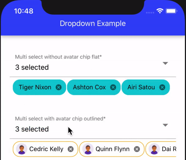
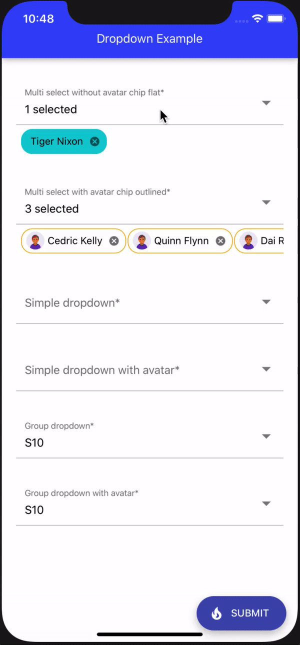
<MultiselectDropdown
label="Multi select with avatar chip outlined"
data={data}
enableSearch
enableAvatar
chipType="outlined"
value={valueMS}
onChange={onChangeMS}
/>
</View>
<View style={styles.container}>
<Dropdown
label="Simple dropdown"
data={data}
enableSearch
value={valueSS}
onChange={onChangeSS}
/>
</View>
<View style={styles.container}>
<GroupDropdown
label="Group dropdown with avatar"
data={groupData}
enableSearch
enableAvatar
value={valueGS}
onChange={onChangeGS}
/>
</View>
</ScrollView>
</View>
);
};
const styles = StyleSheet.create({
container: {
paddingTop: 30,
marginLeft: 20,
marginRight: 20,
flex: 1,
},
buttonView: {
display: 'flex',
justifyContent: 'center',
flexDirection: 'row',
marginTop: 10,
},
});
export default Example;
API reference
The package exports a Dropdown, GroupDropdown, and MultiselectDropdown, components which is the one you'd use to render the dropdowns.
Props (common)
label (required)
Set the dropdown field label.
required
Set whether the dropdown is required or not and an asterisk symbol will be added with the label for indication. Also, it can be used with the error.
disabled
Enable and Disable the dropdown
floating
Open the dropdown like the modal.
enableSearch
Enable search field for the dropdown.
error
Set whether the dropdown has an error or not. The error field will work only when the required field is enabled.
onBlur
Call back function onClosing the dropdown modal.
elevation
Control the elevation for the dropdown container view.
borderRadius
Control the border radius for the dropdown container view.
activityIndicatorColor
Changes the loader indicator color.
searchPlaceholder
Search area filed placeholder text.
rippleColor
Change the ripple color.
helperText
Set the helper text for the dropdown, this will be visible only when the dropdown field turned into an error field.
errorColor
Set the dropdown error color.
showLoader
Show or hide loader for the dropdown container.
itemTextStyle
Change the text view style for the dropdown item.
itemContainerStyle
Change the dropdown item container view style.
animationIn
Modal open animation type same as react-native-modal.
animationInTiming
Modal open animation duration same as react-native-modal.
animationOut
Modal close animation duration same as react-native-modal.
supportedOrientations
Modal supported orientations same as react-native-modal.
parentDDContainerStyle
Dropdown parent container style.
emptyListText
- String: Message to be shown when the dropdown is empty.
or - React Node: to completely change the empty component.
enableAvatar
Enable or disable avatar for the dropdown items.
avatarSize
Set the avatar view size.
paperTheme
Since the dropdown build on top of Native Paper you can over write the theme by passing your own native paper theme, for more info refer https://callstack.github.io/react-native-paper/theming.html
textInputStyle
Dropdown input style.
mainContainerStyle
Dropdown main container style.
underlineColor
Change TextInput Under Line color.
disableSelectionTick
Disable the selected item tick mark.
textInputPlaceholder
Change TextInput Placeholder text.
textInputPlaceholderColor
Change TextInput Placeholder color.
selectedItemTextStyle
Change the selected text view style for the dropdown item.
selectedItemViewStyle
Change the selected item view style for the dropdown item.
removeLabel
Remove TextInput label.
Note: Empty string must be passed since label is a required field
mode
Mode of the TextInput.
flat(default) - flat input with an underline.outlined- input with an outline.
In outlined mode, the background color of the label is derived from colors.background in theme or the backgroundColor style. This component render TextInputOutlined or TextInputFlat based on that props
Remove TextInput label. Note: Empty string must be passed since label is a required field
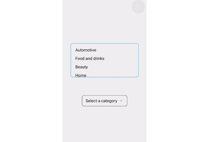
Props (Simple Dropdown)
value (required)
Set the dropdown value (only string or number based on the data node value), can be used in redux-form or formik.
data (required)
Collection of object items to render the group dropdown.
const data = [
  {
    value: '1',
    label: 'Tiger Nixon',
    avatarSource: require('./ddicon.png'),
  },
  {
    value: '2',
    label: 'Garrett Winters',
    avatarSource: {
      uri:
        'https://img.icons8.com/color/344/circled-user-female-skin-type-6.png',
    },
  },
];
onChange
Call back function onSelecting the dropdown value. It will return the selected item value.
disableSort
Enable or disable sorting for the dropdown items.
defaultSortOrder
Set the sorting order for the dropdown items
asc(default)desc
Props (Group Dropdown)
value (required)
Set the group dropdown value (only string or number based on the data node value), can be used in redux-form or formik.
data (required)
Collection of object items to render the group dropdown.
Sample
const data = [
 {
   title: 'Apple',
   data: [
     {
       value: 'iphonese',
       label: 'iPhone SE(2020)',
       avatarSource: require('./ddicon.png'),
     },
     {
       value: '23',
       label: 'iPhone X',
       avatarSource: {
         uri: 'https://img.icons8.com/emoji/344/mobile-phone.png',
       },
     },
   ],
 }
}
onChange
Call back function onSelecting the dropdown value. It will return the selected item value.
stickySectionHeadersEnabled
Keep the group header sticky or not.
headerContainerStyle
Dropdown group header container view style.
headerContainerStyle
Dropdown group header text style.
Props (Multiselect Dropdown)
value (required)
Set the multiselect dropdown value(only array of string[] or number[] based on the data node value) . Aslo, can be used in redux-form or formik
data (required)
Collection of object items to render the group dropdown.
const data = [
  {
    value: '1',
    label: 'Tiger Nixon',
    avatarSource: require('./ddicon.png'),
  },
  {
    value: '2',
    label: 'Garrett Winters',
    avatarSource: {
      uri:
        'https://img.icons8.com/color/344/circled-user-female-skin-type-6.png',
    },
  },
];
onChange
Call back function onSelecting the dropdown value. It will return the selected item value.
disableSort
Enable or disable sorting for the dropdown items.
defaultSortOrder
Set the sorting order for the dropdown items
asc(default)desc
chipType
Mode of the chip.
flat- flat chip without outline.outlined- chip with an outline.
chipTextStyle
Change chip label text style.
chipStyle
Change the chip view style.
emptySelectionText
Change the selection section empty text value.