react-native-step-by-step-process
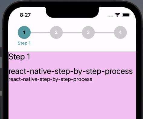
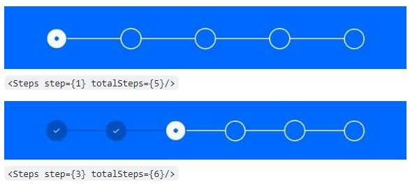
A simple and fully customizable & fully adaptive UI with Android, iOS, iPad React Native component that implements a process steps UI.
- Unlimitaed Stpes Support.
- Each steps content is displayed inside of a Stps view with lable.
- Fully customizable buttons are displayed at the bottom of the component to navigate between steps.
- Provided
useProcessHook will help to get & set current step indexs & more. - Constantly bug fixing and improvement supported & will support continuously.
| iOS | Android |
|---|---|
 |
Installation
If using yarn:
yarn add react-native-step-by-step-process
If using npm:
npm i react-native-step-by-step-process
Usage
import { ProcessContainer, createProcess, useProcess} from 'react-native-step-by-step-process';
First create Screen Component which will look like below and wrrap that with ProcessContainer and pass initial Number Of Steps to initialNumberOfSteps.
import React from 'react';
import {ProcessContainer} from 'react-native-step-by-step-process';

import ProcessStepsCompoents from '../components/ProcessStepsCompoents';

const ProcessStepsScreen = () => {
  return (
    <ProcessContainer initialNumberOfSteps={5}>
      <ProcessStepsCompoents />
    </ProcessContainer>
  );
};

export default ProcessStepsScreen;
Simply create process using createProcess method which will return Process Object and using that Process Object, place a <Process.Step /> tag for each desired step within the <Process.ProcessFlow /> wrapper.
import React from "react";
import { Text, View } from "react-native";
import {createProcess, useProcess} from 'react-native-step-by-step-process';

const Process = createProcess();

const ProcessStepsCompoents = () => {
  const {currentStep, activeStep} = useProcess();

  return (
    <View>
      <Process.ProcessFlow>
        <Process.Step>
            <View style={{ alignItems: 'center' }}>
                <Text>Step 1!</Text>
            </View>
        </Process.Step>
        <Process.Step>
            <View style={{ alignItems: 'center' }}>
                <Text>Step 2!</Text>
            </View>
        </Process.Step>
        <Process.Step>
            <View style={{ alignItems: 'center' }}>
                <Text>Step 3!</Text>
            </View>
        </Process.Step>
        <Process.Step>
            <View style={{ alignItems: 'center' }}>
                <Text>Step 4!</Text>
            </View>
        </Process.Step>
        <Process.Step>
            <View style={{ alignItems: 'center' }}>
                <Text>Step 4!</Text>
            </View>
        </Process.Step>
      </Process.ProcessFlow>
    </View>
  );
};

export default ProcessStepsCompoents;
Current Step Error and Validation Handling
The errors should be used if there’s a need for validation and error handling when clicking the next button. If you would like to prevent the next step from being rendered, Just return true or false from onNext function and onPrevious function. See below example below :
Example usage of validation check:
import React from "react";
import { Text, View } from "react-native";
import {createProcess, useProcess} from 'react-native-step-by-step-process';

const Process = createProcess();

const ProcessStepsScreen = () => {
  const {currentStep, activeStep} = useProcess();

  const onPressNextInStep = (nextStepIndex) => {
    if(nextStepIndex === 2){
        return true; // This will prevent the next step from being rendered
    }
  }

  return (
      <Process.ProcessFlow
        activeStepIconColor={'#60a4ac'}
        labelStyle={{color: '#60a4ac'}}
        nextBtnStyle={{backgroundColor: '#60a4ac'}}
        nextBtnTextStyle={{color: 'black'}}
        previousBtnStyle={{backgroundColor: '#60a4ac'}}
        previousBtnTextStyle={{color: 'black'}}
        nextBtnText={t('txtProceed')}
        previousBtnText={t('back')}
        onNext={onPressNextInStep}>
        <Process.Step
            label={t('txtFillStepDate')}
            showFirstStepPreviousButton={true}>
            <View style={{ alignItems: 'center' }}>
                <Text>Step 1!</Text>
            </View>
        </Process.Step>
            <View style={{ alignItems: 'center' }}>
                <Text>Step 2!</Text>
            </View>
        </Process.Step>
            <View style={{ alignItems: 'center' }}>
                <Text>Step 3!</Text>
            </View>
        </Process.Step>
            <View style={{ alignItems: 'center' }}>
                <Text>Step 4!</Text>
            </View>
        </Process.Step>
      </Process.ProcessFlow>
  );
};

export default ProcessStepsScreen;
Documentation
process Steps Component
| Name | Description | Default | Type |
|---|---|---|---|
| activeStepIconColor | Color of the active step icon | transparent | String |
| completedStepIconColor | Color of the completed step icon | #4bb543 | String |
| activeStepNumColor | Color of the active step number | black | String |
| disabledStepNumColor | Color of the disabled step number | white | String |
| completedCheckColor | Color of the completed step checkmark | white | String |
| isComplete | Set all Steps to active state | false | Boolean |
process Step Component
| Name | Description | Default | Type |
|---|---|---|---|
| label | Title of the current step to be displayed | null | String |
| onNext | Function called when the next step button is pressed | null | Func |
| onPrevious | Function called when the previous step button is pressed | null | Func |
| onSubmit | Function called when the submit step button is pressed | null | Func |
| nextBtnText | Text to display inside the next button | Next | String |
| previousBtnText | Text to display inside the previous button | Previous | String |
| finishBtnText | Text to display inside the button on the last step | Submit | String |
| nextBtnStyle | Style object to provide to the next/finish buttons | { textAlign: ‘center’, padding: 8 } | Object |
| nextBtnTextStyle | Style object to provide to the next/finish button text | { color: ‘#007aff’, fontSize: 18 } | Object |
| nextBtnDisabled | Value to disable/enable next button | false | Boolean |
| previousBtnStyle | Style object to provide to the previous button | { textAlign: ‘center’, padding: 8 } | Object |
| previousBtnTextStyle | Style object to provide to the previous button text | { color: ‘#007aff’, fontSize: 18 } | Object |
| previousBtnDisabled | Value to disable/enable previous button | false | Boolean |
| removeBtnRow | Used to render the process step without the button row | false | Boolean |
| showFirstStepPreviousButton | Used to render the previous button in first step | false | Boolean |
Contributing
Pull requests are always welcome! Feel free to open a new GitHub issue for any changes that can be made.
Author
License
MIT


