React Native Segmented Progress Bar
A React Native progress bar that animates and draws the progress in a circular path. The progress bar indicator can move in number of segments to imply the percentage of the progress.
The following are customizable:
- The circular track color
- Indicator color
- Number of segments PS: we recommend you to use a maximum value of 10
- Center element can be customized (e.g. you can pass a component that will be rendered)
- Stroke width of a single segment
- Radius of the component
Installing
With npm
npm install @baby-journey/rn-segmented-progress-bar --save
With yarn
yarn add @baby-journey/rn-segmented-progress-bar
Usage
Step 1: import the package
import RNSegmentedProgressBar, { RunAnimationHandler } from '@baby-journey/rn-segmented-progress-bar';
Step 2: create a ref
const circularProgressRef = React.useRef<RunAnimationHandler>(null);
Step 3: use the ref in a useEffect and run
React.useEffect(() => {
    circularProgressRef?.current?.run({
      progress: 75,
    });
  }, []);
Step 4: include the component as follows
<RNSegmentedProgressBar
  ref={segmentedProgressBarRef}
  radius={114}
  strokeWidth={14}
  segmentsGap={30}
  segments={4}
/>
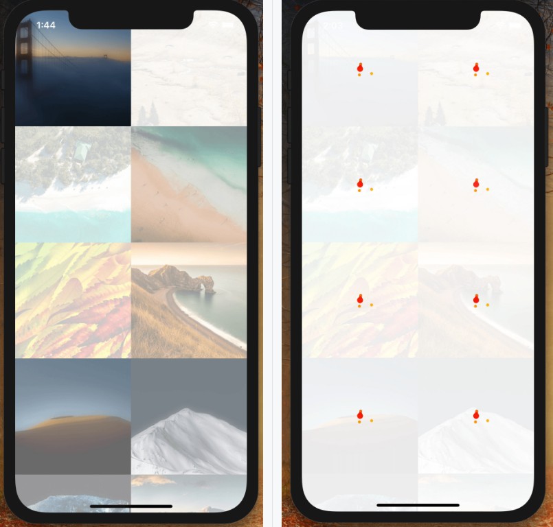
Examples
- Single circle

- Mutiple segments

- Multiple segments with progress circle

Props
| Prop | Description | Type | Default Value | Required |
|---|---|---|---|---|
| radius | Radius of the progress indicator | Number | 100 | True |
| strokeWidth | Thickness of the circular track | Number | 10 | True |
| tintColor | Color of the circular track | rgba | #FFEDE1 | False |
| fillColor | Color of the progress indicator | rgba | #F39E93 | False |
| segments | Number of segments | Number | 3 | False |
| segmentsGap | Gap between segments | Number | 0 | False |
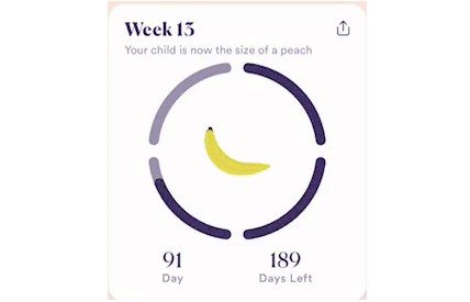
| centerComponent | A component used to display the percentage of the progress | React.ReactNode | – | False |
| indicator | A colored progression path which shows the completed percentage | Object. Refer IndicatorProps interface given below. | – | False |
Indicator interface:

interface IndicatorProps {
  show?: boolean;
  radius?: number;
  strokeWidth?: number;
  color?: string;
}
License
Author
- BabyJourney – BabyJourney